
Check out this screenshot:
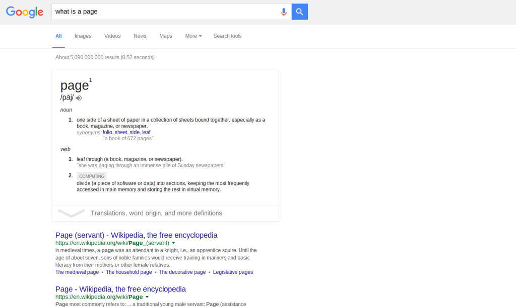
Okay, let’s cover the basics. This is a webpage. At the bottom of the image there are the familiar list of blue links that lead to other webpages. Below those links are more links, and finally navigation at the bottom of the page to go to the next page of search results. Unsurprisingly, there are over 5 billion “hits” for the query – so there are a lot of pages. But the search engine organizes these in order of relevancy – that’s what makes a search engine like Google so useful, of course.
But Google evidently does not think that links sorted by relevancy is useful enough – so they went a step further. They introduced “cards.” These are relatively new features of Google searches (and they can also be found in a lot Google products with “material design”, such as Google Now.) They are discrete, framed, drop-shadowed rectangles that tries to distill the most useful information related to a search. In the example above, Google provides the definition of what a page is in a card.
In a way, this card is a page within a page. That is, there is the webpage of search results and – floating and framed just below the search field – is a page in the form of a “card.” It is easy to see how cards are a response to the information overload that even relevancy-based sorting still produces. Put simply, a bunch of blue links with descriptions can be a lot more than is needed. As Andrew Piper notes in general about digital reading, “There is just too much stuff on the screen now” (p. 26). Interestingly, these Google cards can be viewed as an evolution of pages, especially in the context of Piper’s notion of pages as frames: “Pages are an attempt to grasp that which is around us, to bring it down to size, to order it” (49). This sounds exactly like what Google does with its various cards. What is intriguing is just how small these cards are – the “bring[ing] it down to size” is so small that Google’s framed results resemble more of an index card than a book page…
Bibliography:
Piper, Andrew. “Turning the Page (Roaming, Zooming, Streaming).” In Book Was There: Reading in Electronic Times. University of Chicago Press, 2012.
David, looking back over this something struck me – the visual similarity of Google’s top hit ‘card’ with a traditional library card catalogue card. With its large title at the top and then descriptive information following, as well as implied links (in the online case hyperlinks) to the most relevant/useful information. Although here the work – if we can call it that? – is being done by a computer, instead of a reference librarian. I won’t get into the relative values of either or, although I think this is an interesting choice, and maybe a deliberate one?