the ghostly disruption of Google hands

GH

http://theartofgooglebooks.tumblr.com/

A couple weeks ago I briefly mentioned the issue of ghostly Google book scanners’ hands appearing in digitized versions of Google’s books. I think this is a great opportunity to delve further into a complex example of content and container merging, or perhaps more appropriately, colliding. In this case, Google’s attempts to seamlessly reproduce, for free, ‘the most comprehensive index of full-text books’ is being disrupted, and in quite revealing ways.

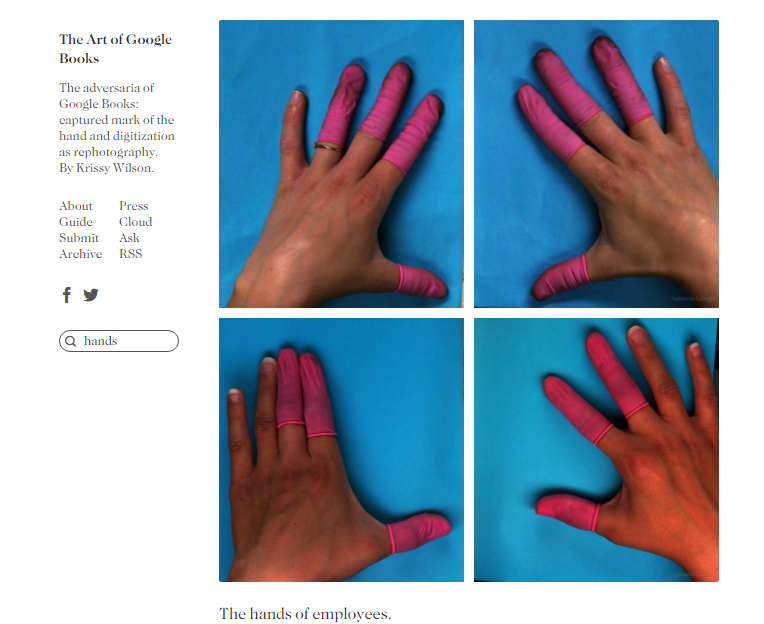
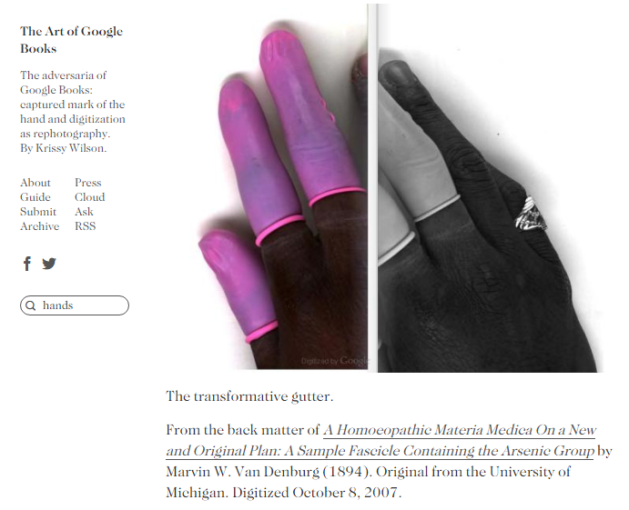
Reactions to the hands have been fascinating – they have been called ‘disturbing’, ‘creepy’, and ‘eery’ (Goldsmith, 2013; Marshall, 2014). Some have felt that the hot pink ‘finger condoms’ are the most jarring aspect of the images (Moore, 2009). There is a feeling of disembodiment here – one blogger, Phil Patton, likened finding the hand obscuring the page with disgust: “The suddenness of its appearance suggested scanning as an unclean process; I thought with horror of the guy who found a finger in his bowl of fast food chili.” (in Moore, 2009). This notion of ‘cleanliness’, or the assumed mechanized process of digitizing books, shows another side to these reactions – they inadvertently reveal much about public opinion regarding the digitization of books and issues of authenticity. A BuzzFeed article titled “21 Google Book Scans That Bring Surprising Intimacy To The Digital Book World” hints at the obfuscation of the very human work that goes into digitization projects (human, and therefore, prone to error).

The sheer volume of books being scanned has been to blame for the many “glitches, not least the scattering of pink fingers” (Moore, 2009). One Wired article reproduced a photo of a worker’s hand with the caption, “Overworking your book-scanning crew much, Google?” (Beschizza, 2007). Another blog coined the phenomenon as ‘finger spam’ and “called on Google to ensure its scanning is more reliable if it wants to make money from on-demand publishing” (Moore, 2009). Whitney Anne Trettien has pointed out of annotations in print-on-demand books that, “the history promised by this POD facsimile remains inaccessible, its ostensibly transparent textuality obscured through the process of digitization. Multiple scans have deformed its turn-of-the-century typography; the open system of earlier annotations — an invitation to discourse with the page, and with the past — has hardened to a pixelated crust. Rather than humanizing the book for its readers, then, these fixed annotations render it more alien, since they never allow it to transcend its own objectness, to dissolve into the immediacy of text” (2013, par. 23).

Kenneth Goldsmith points out that, “Something new is happening here that brings together widespread nostalgia for paperbound books with our concerns about mass digitization,” he feels that “the obsession with digital errors in Google Books arises from the sense that these mistakes are permanent, on the record” (2013).

GH2

http://theartofgooglebooks.tumblr.com/

If we look deeper though, past initial feelings of affront, there is something insidiously revealed by the presence of these hands; they make manifest the otherwise invisible labour of Google book scanners. Goldsmith writes that, “it’s easy to forget that they’re the work of an army of invisible laborers—the Google hands” (2013). Most importantly, these hands speak to issues of class and race within Google’s labour practices. Leah Henrickson has noted, “Once you start looking at pictures of Google book-scanners’ hands, you’re bound to (pretty quickly) recognize a trend: most of these book-scanners seem to be people of colour. Women of colour, in particular” (2014).

Avi Solomon has noted that, “If you search Google Images for ‘Google books fingers’ you get poignant images (to my lights) of scanner worker bee hands. Makes me value the massive, anonymous and underpaid effort that goes into maintaining the ‘digital’ economy” (in Frauenfelder, 2009). In 2007, Andrew Norman Wilson, an ex-contractor of Google, while working at the Google campus, decided to learn more about Google’s data-entry workers, or ‘ScanOps’, those responsible for the digitization of these books. He captured some footage of the workers leaving their shifts, and was fired for issues of privacy shortly after. His video has become an art installation called “Workers Leaving the Googleplex” (see here: https://vimeo.com/15852288), a play on the Lumière Brothers’ 1895 “Workers Leaving the Factory” (Goldsmith, 2013). In addition Wilson has created a larger art project entitled “ScanOps” (http://www.andrewnormanwilson.com/ScanOps.html), which has been displayed in galleries, featuring “large, saturated color photos of those same workers’ hands” (Goldsmith, 2013). His efforts also remind us that “we, too, are contributing our own labor to the company’s bottom line” (Goldsmith, 2013). While true, in some ways, the transformation of these hands into art objects further objectifies them as something of note – and who is profiting from that? Wilson is not the only one to undertake artistic endeavours related to these hands – artist Benjamin Shaykin has published a book called “Google Hands” (http://benjaminshaykin.com/Google-Hands) that also reproduces the images. Krissy Wilson, creator of the blog “The Art of Google Books” (http://theartofgooglebooks.tumblr.com/) has noted that “The Art of Google Books can serve as a tool for people that digitize books, explicating much of what can go wrong in the photographic process, as well as standing alone as a gallery of aesthetic images” (in Fleischer, 2012).

This is a rich topic, one that I would like to explore more in depth than I have a chance to here (maybe I’ll be rerouting my final paper topic?!), that has much to tell us about beliefs of the sanctity of physical books, the so-called ‘flawless’, mechanized process of digitization, and the very real human beings that hold, manipulate, work, and (sometimes, if just by accident) reveal themselves, superimpose, obscure, and comment on the material they reproduce.

References:

Beschizza, Rob. (2007). Google books adds workers’ hands to classics. Wired. http://www.wired.com/2007/12/google-books-ad/.

Fleischer, Victoria. (2012). Q&A: The art of Google books. http://www.pbs.org/newshour/art/qa-the-art-of-google-books/.

Frauenfelder, Mark. (2009). Scans of google books with fingers in them. Boingboing. http://boingboing.net/2009/10/22/scans-of-google-book.html.

Goldsmith, Kenneth. (2013). The artful accidents of google books. The New Yorker. http://www.newyorker.com/books/page-turner/the-artful-accidents-of-google-books.

Henrickson, Leah. (2014). The darker side of digitization. Book History, Illuminated. https://bhilluminated.wordpress.com/2014/03/20/google-book-scanners/.

Marshall, Chelsea. (2014). 21 Google book scans that bring surprising intimacy to the digital book world. BuzzFeed. http://www.buzzfeed.com/chelseamarshall/google-book-scans-than-bring-surprising-intimacy-to-the-d#.rrB1brmDp.

Moore, Matthew. (2009). Google book ‘finger condoms’ cause mirth. The Telegraph. http://www.telegraph.co.uk/technology/google/6396896/Google-Book-finger-condoms-cause-mirth.html.

Shaykin, Benjamin. (2009). Google hands. http://benjaminshaykin.com/Google-Hands.

Trettien, Whitney Anne. (2013). A deep history of electronic textuality: The case of English reprints Jhon Milton Areopagitica. Digital Humanities Quarterly (7) 1. http://www.digitalhumanities.org/dhq/vol/7/1/000150/000150.html.

Wilson, Andrew Norman. (2011). Workers leaving the Googleplex. https://vimeo.com/15852288.

——. (2012). ScanOps. http://www.andrewnormanwilson.com/ScanOps.html.

Wilson, Krissy. The art of Google books. http://theartofgooglebooks.tumblr.com/.

Week 8: Content and Containers

The interaction between content and container is very evident in the world of webcomics. Webcomics are, obviously, comics published on the internet. The experience of reading them is mediated through web browsers and screen size. As well, they exist in their own webspaces that serve not only as the container for the comic, but as an advertising and promotional space for the author(s).

For this post I will look at two webcomics that I read fairly regularly: Hark! A Vagrant by Kate Beaton and Strong Female Protagonist by Brennan Lee Mulligan and Molly Ostertag.

Both have been collected in trade paperbacks, which allow them to be read like a regular comic. This is a stark contrast to their online form. In a bound volume, each comic “page” occupies one whole physical page. Online, each comic “page” has its own web page, but depending on the size and magnification of your browser window, the entire page cannot be displayed. While in a book the page can be viewed in its entirety, on the internet it must be scrolled through and is often truncated, cut off and framed by the browser window. The container mediates the reading experience, often impeding it.

Strong Female Protagonist, issue 6, page 27

Webcomics do not just exist as straight pages, however. They occupy a space that is as much for advertising as it is for displaying content. Sometimes this aspect of the container is discrete.

Screen Shot 2016-03-11 at 11.02.47 AM

The website header for SFP is mostly occupied by the title and update information. There are small buttons, in the same style as the navigation buttons further down, that lead to the shop and a page to make donations. The advertising is there, but it is unobtrusive and blends in with the content.

In contrast, the header of Hark! A Vagrant is predominantly advertising and it is very noticeable.

Screen Shot 2016-03-11 at 11.10.05 AM

The advertisements are for Kate Beaton’s books and other products related to her comics. Though three buttons are drawn in the same style as her comics, they are in eye-catching colour while her strips are in black-and-white. As well, the “support” (or donation) link is bolded, and options to donate or buy are located right after the link to the description of the comic.

These aspects of the container unapologetically draw attention to themselves. However, the emphasis on the words “order” and “new” may in fact be ironic. Beaton has a dry sense of humour and is often self-deprecating. By making her ads so dominant, she could be critiquing the necessity of ads in the first place. Or, she could just be excited about her books, t-shirts, and stuffed ponies (I know I am).

In looking at these examples, it becomes evident that there is no real line between content and container in the world of webcomics. The content is mediated and imposed upon by the container until it is extricated from it and situated in a new container, the trade paperback.

Links:

Hark! A Vagrant: http://harkavagrant.com/

Strong Female Protagonist: http://strongfemaleprotagonist.com/issue-6/page-27-5/

Consumer tracking & YouTube

While ruminating on the relationship between content and containers, my mind kept returning to YouTube. In this week’s readings, Whitney Ann Trettien (2013) writes about “artifacts that seem to skirt the peripheries of the average user’s experience in fact occupy a central position within the digital marketplace, exposing the processes of mediation and communication circuits upon which network capitalism depends.” One place where the invisible infrastructure of network capitalism is apparent is the tracked search.

As other YouTubers will attest, the place of advertisements on the site has changed over time. Once one video ends, another will begin almost immediately, creating a continuous play list. In between these videos, advertisements will occasionally play. Normally I do not pay much attention to advertising on the internet, ads are after all commonplace; however, around the time I was planning my wedding, the ads were suddenly all wedding-themed. This shift in content was jarring, and made YouTube’s ability to track my searches obvious.

While I am aware my searches are being tracked on most sites, this sudden shift in ad content, so clearly linked to changes in my recent searching activity, made the surveillance visible. It was a reminder that the continuous flow of content available on YouTube is determined by my search habits and the site’s ability to monitor what I watch. For a moment the infrastructure of logarithms and code designed to make a profit at my expense was obvious.

***

References:
Trettien, Whitney Anne. “A Deep History of Electronic Textuality: the Case of English Reprints of John Milton’s Areopagitica.” Digital Humanities Quarterly 7, no. 1 (2013).

Week 8: Distortion in Google Maps

The example I ended up with this week looks at instances of digital images being unintentionally distorted in Google Maps. There are some pretty bizarre examples that can be viewed when looking at certain locations, which a digital artist named Kyle F. Williams has captured collectively after scouring Google Maps. I have included a couple of examples below (Figure 1 & 2), but if you want to see a bit more you can check out this article. They are sometimes comical, but mostly just strange, and definitely worth having a look at or trying to find your own. I believe this is a suitable example because it shows the contents of Google Maps having been, quite literally, disrupted (or perhaps disembodied is the more appropriate term) by the technology being used to capture it.

Wk8BlogPostImage Wk8BlogPostImage2

Fig. 1 & Fig. 2 Source: Doug Bolton/ Kyle F. Williams/Google Maps, (The Independent, 2016)

This happens because of errors in the stitching of the panoramas taken by the Google Street View technology, making the end result at odds with Google’s goal of creating a seamless panorama that can situate the viewer within a locale in a life-like way. It is also an interesting example because it only reflects one layer of the containers involved in Google maps, which is at the level of production and capturing of the photos, rather than a glitch within the software itself. However this still has real repercussions since Google’s photography in this circumstance is intended to be a faithful vehicle of representation.

In A Deep History of Electronic Textuality, Whitney Anne Trettien remarks on the pros and cons of reproduction in photography in relation to print when she notes that, “even as photography helped far-flung bibliographers collaborate on collating versions, it also threatened to disrupt the field with forgeries and even devalue the work of bibliography itself” (para.4). This only serves to highlight the fact that the difference between intention and result can be vast when seeking to represent something as a digital image. Ultimately these are inaccuracies that interrupt the experience the user is meant to have, and these images from Google Maps demonstrate that the experience is especially jarring when the object being represented is supposed to be reality.

Bibliography

Bolton, Doug. “Artist Captures Bizarre Distorted Images on Google Maps.”    The Independent, 18 Feb. 2016. <http://www.independent.co.uk/life-style/gadgets-and-tech/news/google-maps-photo-spheres-kyle-f-williams-keelayjams-a6881396.html>.

Trettien, Whitney Anne. “A Deep History of Electronic Textuality: The Case of Eng/ish Reprints Jhon Milton Areopagitica.” Digital Humanities Quarterly. Volume 7 Number 1, 2013. <http://www.digitalhumanities.org/dhq/vol/7/1/000150/000150.html#shillingsburg1996b>.


Wearable Technologies : Seamless integration between the Digital and Physical Worlds

For this week’s blog post, instead of looking at how the seamless world of content is disrupted by that which contains it, I am going to look at how wearable technologies can potentially do the opposite of that by seamlessly integrating the digital and physical world.

A brief history of wearable computing

Steve Mann is a pioneer and inventor of wearable technologies from the early 90’s. Some refer to him as the father of wearables since they have been a part of his life and body since the 1980’s. He has tackled issues such as privacy, sousveillance, and cyborg-law (Wikipedia, 2016). One of his inventions developed at the MIT Media Lab from 1994-1998, Sixth Sense, is a gesture-based wearable device that comprises of a camera, mirror, and projector worn around the neck (Wikipedia, 2016). His designs were further developed by Pranav Mistry in 2012. It is named Sixth Sense because it supplies extra information directly to the user, in addition to their five senses (Wikipedia, 2016).

Sixth Sense (not the movie…)

I will focus on the design of Sixth Sense by Pranav Mistry and some of the ideas for the device. Pranav’s logic is that we interact with our environment with our five senses that give us information and parses knowledge of the world around us. His idea is to bring information from the digital world to the physical world without the reliance on either physical-based mediums such as paper or digitally on a screen (Mistry, 2010). We should be able to interact with our world using natural hand gestures that we are all familiar with. For example, taking a picture by making a rectangle with our fingers. By projecting information onto any physical surface a person could browse the web or send an email. Pranav’s TED Talk on Sixth Sense shows you all the possibilities of the device.

Breaking the container

The rise of mobile devices and computing have tied us to either a space or device that mediates our experiences through a screen. I found Sixth Sense to be interesting because it seamlessly integrates the digital world with the physical one. For example, in his TED Talk, Pranav is reading a newspaper; the device scans the picture in the headline about a Presidential speech and the video of the talk can be played right on the surface of the paper being held. There was no need to use another device to look up the video or additional information. Every task can be done through the device around your neck using the materials around you and natural hand gestures. Instead of having to carry a dedicated e-reader, tablet, or physical book any surface can be used to project text. If a surface is not available the hand can be used as well. I find something like this extremely useful and it plays with the idea of containers by eliminating the need for them. The spheres of physical and digital are no longer separated by different devices but are seamlessly integrated into one medium. It will be very exciting to see where the development of this technology goes.

References

Mistry, Pranav. (2010). Sixth Sense: Integrating information with the Real World. http://www.pranavmistry.com/projects/sixthsense/

Wikipedia contributors, “SixthSense,” Wikipedia, The Free Encyclopedia, https://en.wikipedia.org/w/index.php?title=SixthSense&oldid=706133763 (accessed March 10, 2016).

Wikipedia contributors, “Steve Mann,” Wikipedia, The Free Encyclopedia, https://en.wikipedia.org/w/index.php?title=Steve_Mann&oldid=708447748 (accessed March 10, 2016).

Essay workshopping

http://cdn.static-economist.com/sites/default/files/images/print-edition/20120414_LDD001_0.jpg
Source: Illustration by Dave Simonds. “Open Sesame” in The Economist.

A few weeks ago, I wrote about a pretty edgy journal, New Criticals. What really struck me about this journal is the way it abandoned the format of a traditional, academic journal. Although it is not peer-reviewed (there’s very little information about the selection process), it is run by qualified people and has contributions from well-regarded academics.

What New Criticals got me thinking about is the impact of design on sense of rigor in academia. Most open access journals conform to the format and design of paid academic journals. I am interested in looking into some journals out in the left field to see how the choice of design impacts their use and the contributors and readers who engage with it.

I don’t know if this is a feasible project; however, as more and more scholarly communication moves online (and even onto social networks), it would be interesting to look at how various journals are adapting to new forms of reading and new expectations of aesthetics.

Some journals that I’ve been looking at are:

Hybrid pedagogy: A digital journal of learning, teaching, and technology

First Monday

New Criticals

Ada: Gender, new media, & technology

Third space: A journal of feminist theory & culture


Content and Containers

Thinking about the relationship between content and containers immediately drew my mind to native advertising. Native advertising refers to sponsored content which is presented in the same typeface, layout, and tone as the rest of the content in the magazine, newspaper, website, etc. – the container in which it sits (Bakshi, 2015).

Although most people have encountered native advertising (an example is any sponsored Buzzfeed post), many people fail to recognize native advertising as advertising; instead, they identify it as an article (Lazauskas, 2015). Of the people in this study, 62% of respondents felt that a news site loses credibility when it publishes native ads (Lazauskas, 2015).

However, it’s not only that the website loses credibility when people figure out it has native ads. What’s more troubling is the fact that many people will mistake these ads for articles, which can lead to a lot of misunderstanding and a spread of false or biased information.

The blurred lines of between advertising and editorial content has not been without critique:

What interests me in native advertising is how the container can make content misleading. Its job is to blend visually and tonally into the container; however, by doing this, it disrupts the overall content and, seemingly, the authority or reputation of the publication.


Boom Mics and Other Movie “Mistakes”

There are entire websites devoted to instances when elements of the production of a film (which forms the container) accidentally appears in the final film (the content). I’m looking at you, MovieMistakes.com. More than a typo in a book, or broken code on a website, a visible mistake in a film – such as the reflection of a camera in a doorknob – is more uncanny. Why? My assessment is that film is ostensibly a more immersive medium, its artifice not being as apparent as a bunch of pages with ink on them, for example.

Here is a nifty video that outlines some of the intrusions of films’ productions within the film itself (caution: there is some PG-13-level gore in the scenes between 4:00-5:00 minutes in the Gladiator scenes):

Careful attention to detail during the shooting and editing phases is required to ensure these mistakes don’t take the viewer “out of the story.” And certain shots with mirrors become a bit of a technical hurdle when telling a story in film – think of all the shots that were never attempted or scraped because of worrying about the fourth wall being broken because of simple reflections.

Interestingly, in faux-documentaries TV shows like The Office and Arrested Development this intrusion is played with from time to time. Namely, there are running gags – or maybe you could just call them stylistic flourishes – of boom mics entering the frame, intentionally. So whereas mistakes in the films shown in the above clip are accidentally turned into content, those same mistakes are turned into content in those shows intentionally. The container and content become messily combined.

Bibliography

Screen Rant. “10 Movie Mistakes That Slipped Through Editing.” Online video. 11 July 2015. YouTube. https://www.youtube.com/watch?v=_TWbD3MKfM. 10 March 2016.

Week 8: Content & Containers – A Question of Quality

My examples for this week’s discussion of blurring the line between content and container are less textual, or book-based, and more audiovisual, but still relate to the digital context. The first is from a documentary entitled “The Life and Times of Allen Ginsberg,” directed by Jerry Aronson. I studied this film for my Managing Audiovisual Materials course last summer, and while watching it I noted that the clips of video interview footage with Ginsberg himself are of very poor quality. At times, tracking lines or static lines (as us VHS kids are familiar with) would show up in the picture. I am unsure whether this was due to mismanagement in preservation or simply old age or a low-quality format, but in any case it was quite distracting for the viewer. I think this is a good example of the container superimposing itself onto the content, as it calls attention to the medium in a very obvious way.

Another example which is somewhat similar, but takes place in another medium, is the phenomenon of pages which lose quality after being photocopied, and then photocopied again, etc. I was reminded of this annoying phenomenon recently in my drawing class, when my teacher provided us with a copy of a photo which had clearly been used before, and recopied from a copy, as someone had drawn gridlines on it. While this issue can easily be avoided by keeping a clean master to copy from, it happens often. Both of these examples demonstrate the container showing up in the content in a negative way, and drawing attention to the processes behind the object’s creation. In fact, I would argue that it tells a sort of story about the life of the object, in terms of where it has been and how it has arrived at its current location.

Content and Containers: Working Class Hero

The John Lennon song Working Class Hero features tonal changes at 0:10 and 0:30 sec (within the clip), which indicate the addition of a separate piece of music recorded in John Lennon’s home. In this release of the song the container and method of recording comes through in the poor transition between the two pieces of music due to poor editing and producing choices.

With personal recording becoming so easy and relatively cheap to do that it can be done on an app or an iPad musician and singers are able to produce and disperse music at an exceptionally fast rate, any where, any time. With good quality music production software and the potential for what can be created this method of music production is exploding.

Though new software creates great music quality does it mean the songs being recorded are any better? Without a professional eye it is much easier for amateurs to make production mistakes and a great deal of the art and finesse is lost (Pixelsound, 2016). I would argue that the digitization and ease of personal production of music can be likened to the movement from manuscripts to the industrialization of the printing press. As music production and books are modernized the craftsmanship is lost and with quick creation careless errors increase.

However I would also argue that these mistakes and mishaps are not all negative. From printing mistakes special issues are created and book history is made. Eventually these become sought after rare books for collections and can become apart of reader history. Can the same not be said for this issue of Working Class Hero. Songs can be endlessly re-recorded  and released and phones allow for live capturing of a song at concerts. This means a hundred versions of the same song can be found on the internet. The little eccentricities in a song make make it unique and can become apart of the songs history.

Furthermore the format in which a song is held- vinyl, CD or mp3- can impact the users experience with the song and that user may feel differently about the song in each format. The graininess of a song on vinyl may impact the user differently from a clear digital format. In this way the container of the song can make it more or less desirable and influence the listener.

Link to the segment of the song that features the tonal shift and other examples of producing mistakes at:

http://www.hometracked.com/2007/08/23/10-recording-bloopers-that-made-the-album/

Reference:

Pixelsound. (2016). How technology has changed the music recording  world…Forever. Retrieved from http://www.pixelsound.com/how-technology-has-changed-the-music-recording-world-forever.html