I know this post is long. But I promise it’s mainly pictures!
As I was thinking about a reinvented page this week, I immediately thought of journals. A lot of the research I’ve had to do recently has led me to open access journals. Most journals (open access or not) still look relatively similar: a bare-bones frame with browsing and search options and a view of the article in PDF or HTML. They are, in most cases, designed to be downloaded or printed.
As I was looking for articles one particular journal stood out: New Criticals
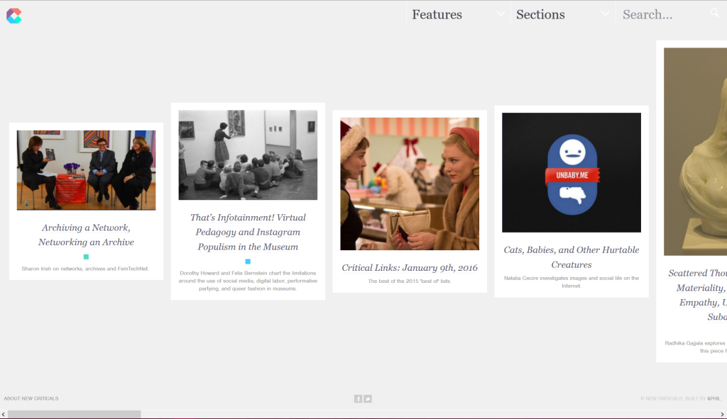
New Criticals is not a peer-reviewed journal but it is scholarly in focus and features articles by academics, artists, and others on a variety of topics. The first thing that struck me about this page is how minimalist it looks. It took me a while to figure out what New Criticals was and I’m still not 100% sure since their “About” page only says: “New criticism of all that exists” and short biographies of the “Producers” (“About New Criticals”).
I was going to use the word modern instead of minimalist in the description. However, after reading Andrew Piper’s “Turning the Page (Roaming, Zooming, Streaming),” I couldn’t stop thinking about the “crowdedness of the digital page” (45) as the modern webpage. The sparsity of the New Criticals website creates a digital page where “marginalia don’t blink” (Piper 46).
In fact, the minimalist format emphasises the idea of “roaming” on the “plane” (Piper 56). Even the way that the content is organized encourages this digital roaming by steering clear of traditional categories and advanced search functions.
This is an example of the read_only section:
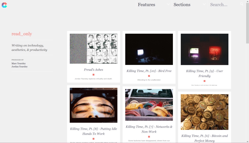
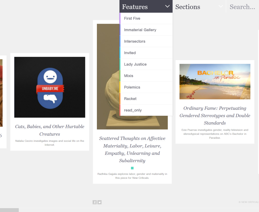
The minimal descriptions and the unconventional subject names force readers to look through the posts and various webpages to orient themselves.
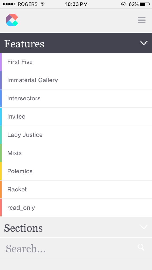
I’ve included images of the website from my PC and my phone because the responsive design creates another way to decide on your experience of the pages. I’ve found it a lot easier to navigate the site on my phone.
The flexibility of the design also allows readers to choose whether they wish to read pages or scrolls.
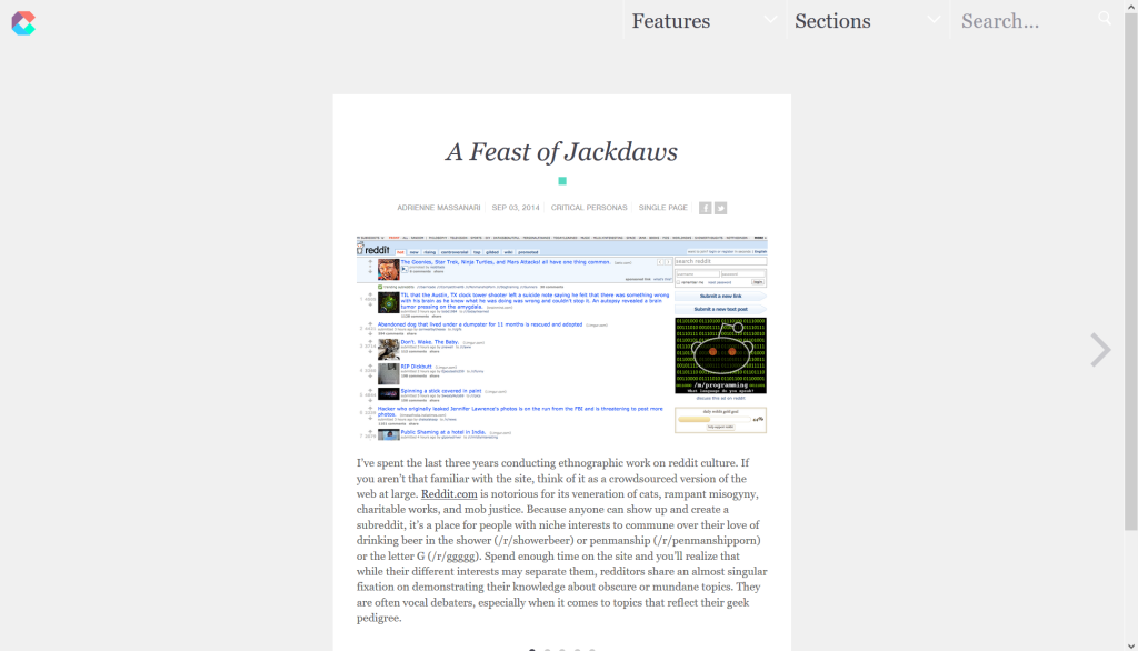
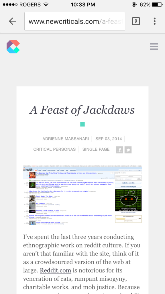
This experience is quite different from a journal such as First Monday (an open access peer-reviewed journal), which does not have responsive design and follows a more traditional layout.
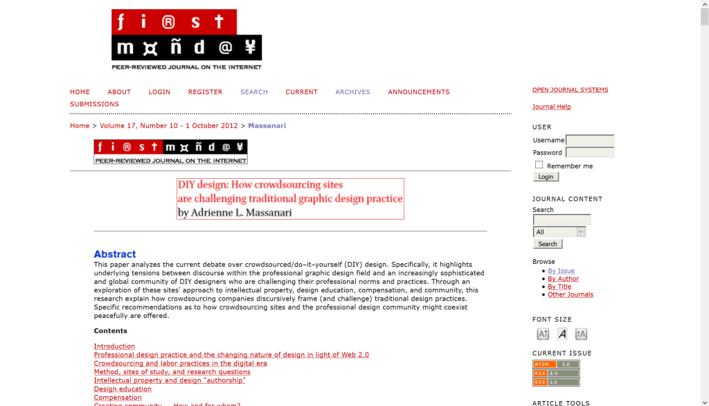
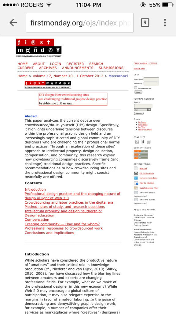
Of course, New Criticals and First Monday have different mandates and purposes, so it makes sense that the functionalities would be different. It was interesting encountering Massanari’s articles (both scholarly) on the two websites.
What really struck me about New Criticals is that even on the smaller phone screen, where the images take much more room, there is still a sense of an uncrowded page, very different from the usual crowdedness of the web. It also made me thing about design and the sense of rigor in academia, but that’s a whole other discussion.
“About New Criticals.” New Criticals. Web. 24 Feb. 2016.
First Monday: Peer-Reviewed Journal on the Internet. Great Cities Initiative of the University of Illinois at Chicago.
New Criticals. Web. 24 Feb. 2016.
Piper, Andrew. “Turning the Page (Roaming, Zooming, Streaming).” Book Was There: Reading in Electronic Times. Chicago: University of Chicago Press, 2012. 60-76.
