Week 11: The Death of the Book

If I could go back in time and tell the people of an era one really important thing about the future of books and reading, it would simply be that books are not going to die. With this message, I could travel back to a variety of different time periods, because there have been many instances of moral panics over “the death of the book” (i.e. Théophile Gautier in 1835 France; Marshall McLuhan circa 1966).

The intent behind this message would primarily be to allay these poor book lovers’ fears regarding the death of the book. Think of the time and energy that could have been saved and redirected into more creative writing endeavours if people hadn’t fixated on arguing over this issue (not to say that what people wrote about the matter in all of these different periods is not interesting in and of itself!). I wish I could tell them that books will change, and while some will embrace this change, books as they were known in times past will continue to flourish, and people will continue to read them. If they had known this, perhaps more people would have been encouraged to write books, to write more books, or to write different books.

As we have learned in this course, print books are not going to die, and e-books are not going to take over. Even if they did, works would still get read, even if the format might change slightly (or drastically). In any case, other technologies such as newspaper, radio, or TV will not replace books and reading: the need for books is strong and the love for them is ever-present.

Week 10: Musings on Ownership (& Minimalism!)

An example which comes to mind for this week’s discussion question took place a few years ago in my Book History seminar with Scott Schofield. We were studying digital texts, and I wanted to compare a couple print editions of Kerouac’s On the Road (namely the first edition and the 50th anniversary “Original Scroll” edition) to the digital “Amplified Edition” (http://www.penguin.com/static/pages/features/amplified_editions/on_the_road.php). This e-edition was only available for iPads, and since I didn’t have one at the time, I borrowed one from the Inforum. I purchased it on the device from the App Store, and used it as needed for my paper. The issue came about when I had to return the iPad and realized that I would likely be saying goodbye to my purchase. There may have been some way (or maybe there still is?) to access it through iTunes, since I believe it was connected with my Apple ID, but I never figured it out. I sometimes wonder if the app is still on that Inforum iPad, and if anyone ever opens it up and gets some use out of it (I hope so!).

This fleeting period of ownership got me thinking about how much we ever really own things. A recent foray into minimalism has shifted the way I think about how humans relate to material objects, and whether or not this relationship is always entirely healthy. Do we own things, or do they own us? In many cases we use things to define our identities, which I would argue can be dangerous: what happens when our identities or interests change? An example which was discussed in class some weeks ago is the phenomenon of humans being the only species to collect books we don’t read (ha ha). This is very true though– we place books on our shelves to create a certain identity for ourselves, but how authentic is that identity if we have never (and may never) read them? For this reason, and a million others, I love libraries. We can read a book without feeling tied to it for life.

Tool libraries and “libraries of things” are a great way to extend this model to material items other than books. Similarly, I know of some minimalists who use Craigslist as a storage locker (check out these guys: http://www.theminimalists.com/). That is, they sell an item which they rarely use (say, a table saw), and if they find themselves needing one again, they just buy another from Craigslist, and sell it right back for the same price when they are done. I think this notion of borrowing things rather than owning them is useful when contemplating how we should be interacting with objects.

On a more bookish note (or e-bookish note), it makes me think of how we borrow e-books from libraries. So many non-library folks simply don’t understand why there are limits on how many people can borrow an e-book at once, and why they can only borrow it for as long as a regular library book. They think that since it is a digital version, there should be an endless supply of copies and loan periods. While we know there is a simple answer related to copyright laws, I think their impatience with the system exposes some of the unhealthy habits we are developing in the digital world, namely that we want things now and we want them without limits. I wonder where we will find ourselves if we continue to indulge these “more more more” ideologies of consumption.

Week 9: Final Project – XML Continued…

For the final assignment, Professor Galey is allowing Aneta and I to continue our encoding assignment. The XML challenge was my first foray into coding, and I discovered that I really love it! Something about the nit-picky nature of coding really jived with me; I enjoy work in which very careful attention to detail is needed. I have always liked editing, and have an eye for small mistakes, which seem to jump off the page at me. Ever since the assignment, I have been trying to figure out how I can do more coding projects that will produce something meaningful and substantive. (If anyone is interested in joining, I’m hoping to attend a Ladies Learning Code session or two in the near future: http://ladieslearningcode.com/)

A friend of mine who took this course a couple of years ago told me that for the final assignment, he and his partner took their XML document and created an interface for it. This seemed like a perfect fit for Aneta and I, because while we were coding, we had a lot of questions about what the decisions we were making would really look like in a finished product. We felt like we left a lot of loose ends on this front, and we were curious to see how they would play out. We also wanted to know how to proceed with turning the XML into something more tangible, and we actually started playing around with the TEI header and thinking about things like cascading style sheets. The goals for this assignment, therefore, are twofold: to get some closure on our unanswered questions, and to learn how to turn raw XML into a finished product by way of CSS/HTML. We are eager to get started, and excited about the anticipated results.

Week 8: Content & Containers – A Question of Quality

My examples for this week’s discussion of blurring the line between content and container are less textual, or book-based, and more audiovisual, but still relate to the digital context. The first is from a documentary entitled “The Life and Times of Allen Ginsberg,” directed by Jerry Aronson. I studied this film for my Managing Audiovisual Materials course last summer, and while watching it I noted that the clips of video interview footage with Ginsberg himself are of very poor quality. At times, tracking lines or static lines (as us VHS kids are familiar with) would show up in the picture. I am unsure whether this was due to mismanagement in preservation or simply old age or a low-quality format, but in any case it was quite distracting for the viewer. I think this is a good example of the container superimposing itself onto the content, as it calls attention to the medium in a very obvious way.

Another example which is somewhat similar, but takes place in another medium, is the phenomenon of pages which lose quality after being photocopied, and then photocopied again, etc. I was reminded of this annoying phenomenon recently in my drawing class, when my teacher provided us with a copy of a photo which had clearly been used before, and recopied from a copy, as someone had drawn gridlines on it. While this issue can easily be avoided by keeping a clean master to copy from, it happens often. Both of these examples demonstrate the container showing up in the content in a negative way, and drawing attention to the processes behind the object’s creation. In fact, I would argue that it tells a sort of story about the life of the object, in terms of where it has been and how it has arrived at its current location.

Week 7: How We Read, and Why

Like Kali, I would say that in general I read for pleasure on paper, and for work on screen. This likely has something to do with my perceived association between computers and schoolwork or professional work. There is something about a computer screen that doesn’t let me relax; it screams “responsibilities” and even when I am performing personal computer tasks such as checking email or Facebook, I always wish I were doing something different instead.

This may be why I have tended to stick with reading journal articles for school on screen rather than printing them out. Printed texts, to me, are for pleasure. (While articles can sometimes be pleasurable to read, they are still associated with the “work” category in my mind.) Books read for personal pleasure, however, belong in print, for me at least. I also prefer reading print versions of magazines, simply because I love those glossy pages and the act of flipping through them… On the occasions when I buy books (not too often, but sometimes), they are print versions, and ditto for when I borrow books from the library.

I have yet to borrow an e-book from a library: this is largely due to the fact that I prefer the aesthetics of reading print books, but also partly because physically going to the library is an activity that brings me joy. As an aspiring librarian, I love the library as a physical space, and I get excited to go there, even when it is simply to return a book or pick up a hold. There is something wonderful about that moment when you finish a book and get to choose your next, and the library is often a part of this process for me. As such, I don’t see my preferences regarding reading methods and borrowing books rather than buying them changing anytime soon.


Week 6: The Reinvented Page – The Dreamlife of Letters

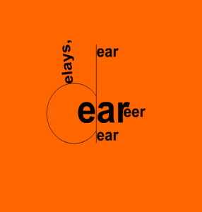
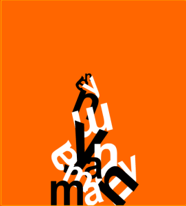
After hearing Professor Galey talk about the digital experiments over at Coach House Books, I decided to poke around on their website to see if any digital versions were open to the public. There are a great number of digital titles which can be accessed free of charge (http://chbooks.com/online), but the one I will discuss here is an animated poem called The Dreamlife of Letters, by Brian Stefan Kims (http://archives.chbooks.com/online_books/dreamlife_of_letters/).

Based on the author’s introduction to the poem, he wanted to write something that was different from the “antique “concrete” mode” and he explains that it is not interactive, rather “much more like a short film than an interactive piece, and there didn’t seem any natural place to let the viewer in that way.” It runs about 11 minutes in total, and is composed using the words from another version of the poem, rearranged to be listed in alphabetical order.

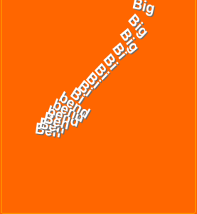
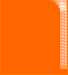
It’s difficult to explain how the animation plays out, as it is so different from page to page. (My use of the word page here could be contested, as the poem plays out on a single window screen, but I am counting each time the screen is shown blank and filled up again as a separate “page” for the purposes of this discussion.) Sometimes the words come in from left to right, sometimes from top to bottom or vice versa. Other times words start in the middle of the page and work outwards, and still others words are pushed off to one side or appear diagonally. In any case, the conventional text block of a page which reads from left to right and top to bottom is challenged. So too is the concept of the margin, as evidenced by the page in which “me” is repeated, column-style, down the far right side.

Screen Shot 2016-02-26 at 10.13.09 AM Screen Shot 2016-02-26 at 10.08.15 AM

Screen Shot 2016-02-26 at 10.21.29 AM Screen Shot 2016-02-26 at 10.06.53 AM

While there is a good amount of white space (or orange space, in this case) in each “page” or frame, the whole page is used over the course of the poem. No holds are barred in terms of where letters can appear, or how they can appear. Because of this, I think Brian Stefan Kims succeeded in innovating the page, and indeed innovating our notions of how a digital text can be presented to a reader or “viewer.” Since the poem plays out as a video, there is no allowance for different reading paces, or breaks, as a matter of fact, since there is no speed option or “pause” button. The reader is left at the mercy of the author, as opposed to the other way around.

Week 5: Encoding Roads Not Taken – French Hotel Card

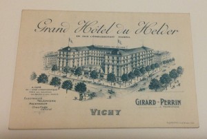
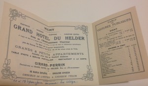
For the encoding assignment, Aneta and I have chosen to do an excerpt from my 1907 Baedeker’s Guide for Southern France. Tucked into the front of the book is a hotel card for the Grand Hôtel du Helder in Vichy, which we contemplated using for the assignment but decided against it. The hotel card is essentially a little brochure advertising the hotel and its services. Here is a picture of the cover:

IMG_0534

The recto:

IMG_0535

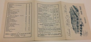
And the verso:

IMG_0537

As you can see, the front cover and the left two panels from the recto advertise the hotel, its services, and its main features (location, views, proximity to the établissement thermal de Vichy, room types, languages spoken, etc.). There is a two-panel table of fees for taxis to various destinations (aller-retour), drawn by one horse or two, and a one-panel table showing entrance fees for the casino and theatre.

We had thought it would be an interesting document to encode, but thought twice when we realized how much the two-panel advertisement focused on form, and how little on content. Given the varying sizes of the fonts and the degree of white space, much of the page is dedicated to aesthetics. The tables contain more information, but we didn’t want to spend all of our time figuring out how to depict the information from the table. We opted, finally, to use a few pages of the Baedeker’s guide itself; its content is more substantial given how dense the text is (see Aneta’s post for pictures). Since it is a pocket-sized travel guide, Baedeker (the author and publisher) evidently wanted to cram as much information in as possible. While the hotel card remains an interesting artifact, we wanted something a little meatier for our project.

Week 4: TEI in the Wild – Voices of the Holocaust

Through the TEI projects page, I came across a project at the Illinois Institute of Technology called “Voices of the Holocaust” which is an “online collection of interviews with Holocaust survivors conducted in the immediate aftermath of World War II.” The project relies on TEI encoding to “provide a structured data model for the transcriptions, which allows various manifestations of the interviews (text, audio)–as well as other types of content (metadata, GIS, scholarly criticism)–to be integrated into a dynamic, robust presentation for the user.” (http://www.tei-c.org/Activities/Projects/vo02.xml).

On the “Voices of the Holocaust” website, there is a more in-depth description of its use of TEI (version P5), “which is used to encode not only the text itself, but also the biographical, historical, and geographical metadata related to the transcriptions, interviewees, and content; scholarly commentary and footnotes; and time-code information from the audio files to facilitate text-audio synchronization […] The Glossary of Terms, Glossary of Camps & Ghettos, and GIS data are also stored in TEI XML format; information from these files is included within the interview files using XInclude.” It also states that <oXygen/> XML Editor was used for text encoding, and mentions that built-in support for the TEI schema is included in the program (http://voices.iit.edu/project_notes).

Lastly, the “Voices” website offers a link to a sample TEI XML interview file, which can be found at this URL: http://voices.iit.edu/xml/voth_project_tei_example.xml

All in all, the project is fairly out front regarding its methods of TEI encoding.

Week 3: Digitization & Representation – eMagazines

This week’s topic inspired me to take a look at my boyfriend’s collection of eMagazines on his iPad. I often see him reading them, but have never taken much of an interest, save for peeking over his shoulder at photos in between chapters of my print books 😉 I selected the February 2016 issue of National Geographic for my analysis, and was thoroughly impressed with its representation of information.

What pleased me the most, perhaps, were the navigational features of the digital form of the magazine. Being that magazines are meant for browsing, I have found myself frustrated with print editions because they are not actually very conducive to it. Having to flip back to the table of contents (which is often hard to relocate); scanning the table to find the article you want (which can be difficult in itself, as titles do not often match up with the headings from the cover); and then moving forward to the desired page (which is often missing, as publishers do not want to obscure the first page of an article with a page number) are some issues that readers run into.

In terms of improving navigation, the Nat Geo eMagazine has done a bang-up job. As with ebooks, they offer a button which takes you to the table of contents, which eliminates the need to scroll back to the start of the issue. They also provide a function which shows a mid-sized image of each page (like a thumbnail but larger) so that you have a birds-eye view of the whole issue when scrolling. This allows readers to easily identify and select an article based on image, which I suppose is similar to print magazines, but eliminates the possibilities of pages sticking together, being overwhelmed by advertisements (which are blissfully absent from the e-version), and otherwise skipping over a page.

Some other navigation features which delighted me include the pop-up caption: photos in the eMagazine are full page, and captions only appear when you click the + button in the bottom right-hand corner. This allows readers to fully enjoy the photo without distraction before deciding to read the caption. Another was a page which displayed four photos of insects, and had a button which read “Tap photos for graphic.” Once you clicked on a photo, a diagram and caption appeared in its place, and reverted back to the original photo when clicked again.

These options which allow for more agency on the part of the reader are quite progressive in the ebook world, based on what I have seen. Perhaps magazines, which contain mixed-media to begin with, are a more natural fit in the digital world than are purely textual books. National Geographic also has videos embedded in their eMagazines, which I have yet to see in the ebook world, except for enhanced or expanded editions. Sperberg-McQueen’s statement that “In designing representations of texts inside computers, one must seek to reveal what is relevant, and obscure only what one thinks is negligible” (p. 34) begs the question: what is being left out of this representation? It would be an interesting exercise to compare the print and digital versions of the same issue, and note differences in content and consequences of layout decisions.

Week 2: Form & Function – Pocket Books

In my stocking this year I got a copy of The Pocket Pema Chodron, which is approximately 3 x 4 inches in size. Published by Shambhala, it is part of their Pocket Classics series and contains “108 short selections from the best-selling books of Pema Chodron, the beloved Buddhist nun.” The compact size of the book is its distinguishing feature, and affects the book’s meaning principally by limiting its content.

As spiritual readings can tend to be quite dense, and consequently inaccessible, the layout of the book is geared towards providing quick snapshots of Pema’s teachings to facilitate consumption. In thinking about the book as an object, we can see how readers would use this differently than they might use, say, a coffee table book or a hardcover volume in a comfy reading chair. While these larger books are used in a more stationary setting and when the reader has a good chunk of time, pocket books are much more portable and can be read during the in-between moments of their day.

In Darnton’s article, he poses three questions for book historians:

  • How do books come into being?
  • How do they reach readers?
  • What do readers make of them? (Darnton 2007, p. 495)

He also briefly touches on the history of distribution and sales (Darnton 2007, p. 499), which got me thinking about how this book came into being. While I believe that this book format has the potential to be useful to readers, I wonder to what extent it is a marketing tool for publishers to make a quick buck. Just as manufacturers change their packaging to sell more units, the new condensed format of the pocket book may be a mere gimmick to appeal to readers who are too busy to sit down and read a full format book. By simplifying content and reducing volume, how much meaning is lost? In an age where Buzzfeed and other click-bait articles which barely skim the surface are becoming more and more standard, what values are being fostered? Is it worth sacrificing depth of meaning for breadth of use? Perhaps… Perhaps not.

Bibliography

Chodron, Pema. The Pocket Pema Chodron, Edited by Eden Steinberg. Boston: Shambhala Publications, Inc., 2008.

Darnton, Robert. “”What is the History of Books?” Revisited.” Modern Intellectual History 4, no. 3 (2007): 495-508.