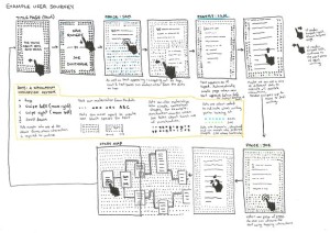
For this blog post I decided to download a free sample of an experimental text only readable online which actually specifies that it is best read on a mobile device. I first heard about it through the Guardian article, What apps next? Publishers and developers embrace ‘unprintable’ fiction, which you can read here. The text is called The Truth About Cats and Dogs, and is the collaborative project of two poets Sam Riviere and Joe Dunthorne. It was published by Visual Editions (collaboratively with Editions At Play), the same publisher who was responsible for Safran Foer’s Tree of Codes, who seem to have a vested interest in producing literature that explores the physicality of its manifestation self-reflexively. The text allows the reader to switch back and forth between the writing of each author at any point during reading, which means that the page being viewed is really the only page that matters at any given moment. And yet there is a sense of linear temporality created as the story moves forward at the mercy of the readers tap. Interestingly the concept of scrolling, which we so easily associate with digital texts, is absent. Instead one navigates the story through the comfortable motion of tapping, creating a similar sensation of ease as akin to playing mindless games on one’s mobile phone. The article includes an illustration that provides a sort of flow chart for visualizing how the reader engages with the navigation of the page (See Figure 1).

Figure 1. Source: Richard Lea, “What apps next? Publishers and developers embrace ‘unprintable’ fiction,” The Guardian (2016): http://www.theguardian.com/books/2016/feb/03/publishers-developers-digital-technology-unprintable-fiction-google-editions-play
In Introduction: Architectures, Ideologies and Materials of the Page, Peter Stoicheff and Andrew Taylor consider the page from three different perspectives: its material, architectural and ideological components. Since my experience with the material components of the page of this text won’t change for me as a user of a single mobile device, I’m going to focus on considering the architecture and ideologies embedded in the pages of this work.
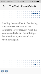
To go back to the motion of tapping through the story – this quality dictates how much text is going to be on any given page, dividing it into very intentional segments. The architecture of the text is therefore influenced by its interactive qualities. Because there is no endless scroll, the text is portioned out onto individual interactive pages. The pages also vary in colour depending on whose writing is being read and vary in design. Generally they look like some version of the page shown in Figure 2.

Figure 2. Source:
As the reader taps through the story, a little circle moves along the grid below, creating an aesthetic sense of progression. Each page is in conversation with the text’s navigational movement, which is certainly a feature that makes the experience of reading this book “unprintable.” This motion embedded within the page reflects our cultural ideology in a big way. The creators of the book were aware of this as publisher Anna Gerber mentions in the article that she wanted to “make books that are… not games and… not apps – they’re all built out of HTML – but each one is impossible to envisage on paper” (Lea). The creators were aware of it having a similar experience to a game or app of some other design, and wanted to explore how they could create a compelling piece of art with similar technology. So there is very much a sense of the experience of the page not being describable in a traditional sense of a printed book, or even within the notions of the digital page found elsewhere, but rather reflecting the architectural and ideological blurring of boundaries between game and book via its navigational technology.
Bibliography
Lea, Richard. “What apps next? Publishers and developers embrace ‘unprintable’ fiction.” The Guardian (2016): http://www.theguardian.com/books/2016/feb/03/publishers-developers-digital-technology-unprintable-fiction-google-editions-play
Riviere, Sam and Joe Dunthorne. The Truth About Cats and Dogs. Visual Editions, 2016.
Stoicheff, Peter, and Andrew Taylor. Introduction to The Future of the Page, 3-25. Toronto: University of Toronto Press, 2004.

Hey Sam:
That’s a really cool book you found there. I like that they took out the option of the scroll. The tap reminds me of the features of Google Glass where you can only tap and scroll up or down to interact with the device. Even the progress bar is something I’ve never seen before. Usually, it’s just the long scroll bar at the bottom. Very interesting! It would be interesting to see if and how they use this in the future.
Hi Amrita!
Yeah, I thought it was really cool and an e-book that actually takes advantage of its digital capabilities in a much bigger way than anything I’ve seen before. The same company released another book that uses Google street view to tell a love story which I really liked as well. There’s some info in the article linked above, although I couldn’t find a free sample for that one. Cheers!