The interaction between content and container is very evident in the world of webcomics. Webcomics are, obviously, comics published on the internet. The experience of reading them is mediated through web browsers and screen size. As well, they exist in their own webspaces that serve not only as the container for the comic, but as an advertising and promotional space for the author(s).
For this post I will look at two webcomics that I read fairly regularly: Hark! A Vagrant by Kate Beaton and Strong Female Protagonist by Brennan Lee Mulligan and Molly Ostertag.
Both have been collected in trade paperbacks, which allow them to be read like a regular comic. This is a stark contrast to their online form. In a bound volume, each comic “page” occupies one whole physical page. Online, each comic “page” has its own web page, but depending on the size and magnification of your browser window, the entire page cannot be displayed. While in a book the page can be viewed in its entirety, on the internet it must be scrolled through and is often truncated, cut off and framed by the browser window. The container mediates the reading experience, often impeding it.

Webcomics do not just exist as straight pages, however. They occupy a space that is as much for advertising as it is for displaying content. Sometimes this aspect of the container is discrete.

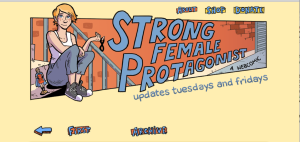
The website header for SFP is mostly occupied by the title and update information. There are small buttons, in the same style as the navigation buttons further down, that lead to the shop and a page to make donations. The advertising is there, but it is unobtrusive and blends in with the content.
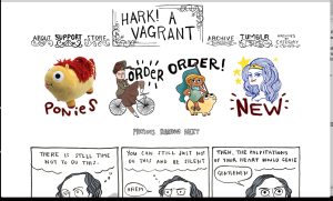
In contrast, the header of Hark! A Vagrant is predominantly advertising and it is very noticeable.

The advertisements are for Kate Beaton’s books and other products related to her comics. Though three buttons are drawn in the same style as her comics, they are in eye-catching colour while her strips are in black-and-white. As well, the “support” (or donation) link is bolded, and options to donate or buy are located right after the link to the description of the comic.
These aspects of the container unapologetically draw attention to themselves. However, the emphasis on the words “order” and “new” may in fact be ironic. Beaton has a dry sense of humour and is often self-deprecating. By making her ads so dominant, she could be critiquing the necessity of ads in the first place. Or, she could just be excited about her books, t-shirts, and stuffed ponies (I know I am).
In looking at these examples, it becomes evident that there is no real line between content and container in the world of webcomics. The content is mediated and imposed upon by the container until it is extricated from it and situated in a new container, the trade paperback.
Links:
Hark! A Vagrant: http://harkavagrant.com/
Strong Female Protagonist: http://strongfemaleprotagonist.com/issue-6/page-27-5/
