Book Lovers, to the Time Booth! We Haven’t Much… Space

If I had a time machine that would allow me to skip around in time, maybe a Time Pogo Stick, I would go to the various periods of change in the format of the book and tell people to “CALM DOWN. Seriously, guys, the book is not going to die. We’re all still reading happily. Chill out.” Sadly, I don’t have a Time Pogo Stick, so I guess I won’t get to yell at all those doomsday predictors. (But, it looks like Stephanie has already done that. So, yay!) No, I only have this old, generic time machine with the panels falling off. One round trip left to make before the Time Batteries finally die. So, I’m going to have to go to the Library of Alexandria. I mean, this is my one chance!

I did a brief stint in Near and Middle Eastern Studies during undergrad. It seemed that every single class was marred by the statement that “So-and-So wrote a history of Mesopotamia, or Egypt, and was a contemporary during such-and-such important historical event. Yes, and their book was enshrined in the Library of Alexandria, where it was lost forever. We have, like, ten paragraphs of it that other contemporary historians referenced in their own works. So, yay for scholarship! *sob*”

The loss of the contents of those books, leaving massive gaps in our knowledge and understanding of history, has always haunted me. It’s not like they were just someone’s personal ramblings. They were important works, embraced by the scholarly community of the time. They were sent to the Library to be preserved and made available to everyone. They are now lost forever.

So, I would go back and say to a librarian, “Look. I know you think this place will last forever. It’s very nice, truly. But there is a whole future to come that you have no control over. The only thing you might be able to control is what is remembered. So you need to start making copies and disseminating them. Hopefully some will survive. Also, do you have these two books? You should copy them first. Wait. I’m just going to wave my magic rectangle over them for a bit. Don’t worry, I’m a librarian too.”

That’s what I think about when I think about the future of the book now: not so much the book as a concept but the information we transmit through it. As we move through different formats and contexts, we need to make sure that we’re preserving that information in ways that can also adapt. We can’t get complacent or put our trust into one form over another, one institution over all others. What I’m trying to say is that this class has taught me to trust in the future of the book. It’s the future of particular books I worry about now.

Note: Readers may have noticed I’ve been quite vague about the inciting works in this post. That is because I can’t remember what they were called or who the authors were. I didn’t save my notes for that class. That just goes to show you never know what might be important down the line.

Week 10: Ownership in the Digital World

When I was researching ereaders, before I got my Kobo, the question of ownership was a bit of a pressing matter to me. This was around the time that Amazon was coming under fire for deleting books off of a user’s Kindle without warning or consent. This was a possibility I had never considered before. My worries about ebooks skewed more toward corrupted files or computer crashes. I thought I could lose ebooks, much like physical books can be misplaced or destroyed, but I did not think that the company I bought them from could take them away.

An NBC article on the controversial action by Amazon clarified that when we think we are buying ebooks we are really licencing them (Johnson 2012).The “buy” button might more properly be labeled “rent” (Johnson 2012). This case motivated me to buy a Kobo rather than a Kindle. While Kobo probably operates in the same way, it has, to my knowledge, never abused its customers. I also wanted the freedom of a Kobo. It’s one of the most open ereaders out there (Neal 2013). As well as supporting multiple formats, with and without DRM, it can be used with the Toronto Public Library. TPL has been offering ebooks for years and is compatible with all major ereaders… except the Kindle.

This research brought me face to face with the contradictions inherent in this kind of digital content. While a huge draw to ebooks is that they are more convenient, their actual convenience depends on the platform or device you use. For instance, I recently learned that one of my favourite authors, Hal Duncan, has ebook versions of his works available. While the major ones are sold on Kobo’s online store, the one’s I want are only available on Amazon. He’s not very well known, so libraries don’t have these titles. I am barred from reading them in ebook form unless I buy them, legally, from Amazon and then break the law to convert them into a format I can read on a Kobo. This seems bizarre, as having bought something I would expect to be able to use it as I want.

Another weakness of ebooks is an inability to lend them to other people. If I read something I like I can’t just grab it off my shelf and force it into someone’s hands. I recently read an excellent series, The Lunar Chronicles by Marissa Meyer. I first got them from the library, digitally, and then bought them from Kobo. They are fairly brick-shaped and it makes more sense to me to own them as virtual copies, especially since that’s how I first read them. But, I don’t recommend them to people that often because there is an enforced lack of follow through. I can’t facilitate their access to the books.

Ebooks thoroughly complicate the idea of book ownership. The problem is that ebook-sellers’ don’t address this up-front. They act like buying an ebook is the same as buying a physical book, even pricing them similarly. Yet, they expect to exert unprecedented power over these purchases.

Articles Referenced:

Johnson, Joel. 2012. “You don’t own your Kindle books, Amazon reminds customer.” NBC News, October 24. Accessed March 26, 2016. http://www.nbcnews.com/technology/technolog/you-dont-own-your-kindle-books-amazon-reminds-customer-1c6626211
Neal, Meghan. 2013. “Do You Ever Own Your E-Books?” VICE, August 19. Accessed March 26, 2016. http://motherboard.vice.com/blog/do-you-ever-own-your-e-books

Week 9: Rough Idea of a Vague Inkling of a Paper Topic

For my paper, I’m going to enlarge on a topic I looked at in week 3: reading manga in translation and scanlation. For those who didn’t read my scintillating post, scanlations are fan-made translations, written on top of scans of the Japanese originals.

Kali made a really interesting comment on that post, raising the question of fan interpretations coming out in the scanlations. This made me think about how authority works in this type of situation. All translations are essentially interpretations. So, whose interpretations are the “right” ones? Are there right ones?

Translations made by licensed publishers are authoritative in that they own the copyright to the works. But, manga fan communities have their own spheres of influence and authority, sometimes to the point of eclipsing the corporate. For instance, a Google search of “sailor moon manga” comes up with two free reading sites that host scanlations, a link to Miss Dream, the main source for Sailor Moon scanlations, and a Sailor Moon themed fan wiki. Only after that does the first Amazon listing appear.

Besides that, interpretations can be problematic. A number of years ago, the publisher Tokyopop did a controversial licensed translation of the series Wish by Clamp. Some characters in the manga were referred to by gender-neutral pronouns in Japanese. Tokyopop decided to change these to gender-specific pronouns in the translation. While they explained their reasonings in the introduction, it was still a questionable change. The application of gendered-pronouns was often inconsistent with what they stated in their introduction. As well, the use of these pronouns had a huge effect on the reading of the series and the characters. It could be argued that a fan translation of the manga might be more authoritative, or a more “correct” reading.

This tension between fan communities and companies, and the issue of translation and interpretation, is very interesting to me.

Week 8: Content and Containers

The interaction between content and container is very evident in the world of webcomics. Webcomics are, obviously, comics published on the internet. The experience of reading them is mediated through web browsers and screen size. As well, they exist in their own webspaces that serve not only as the container for the comic, but as an advertising and promotional space for the author(s).

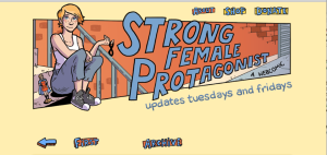
For this post I will look at two webcomics that I read fairly regularly: Hark! A Vagrant by Kate Beaton and Strong Female Protagonist by Brennan Lee Mulligan and Molly Ostertag.

Both have been collected in trade paperbacks, which allow them to be read like a regular comic. This is a stark contrast to their online form. In a bound volume, each comic “page” occupies one whole physical page. Online, each comic “page” has its own web page, but depending on the size and magnification of your browser window, the entire page cannot be displayed. While in a book the page can be viewed in its entirety, on the internet it must be scrolled through and is often truncated, cut off and framed by the browser window. The container mediates the reading experience, often impeding it.

Strong Female Protagonist, issue 6, page 27

Webcomics do not just exist as straight pages, however. They occupy a space that is as much for advertising as it is for displaying content. Sometimes this aspect of the container is discrete.

Screen Shot 2016-03-11 at 11.02.47 AM

The website header for SFP is mostly occupied by the title and update information. There are small buttons, in the same style as the navigation buttons further down, that lead to the shop and a page to make donations. The advertising is there, but it is unobtrusive and blends in with the content.

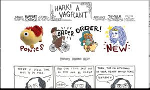
In contrast, the header of Hark! A Vagrant is predominantly advertising and it is very noticeable.

Screen Shot 2016-03-11 at 11.10.05 AM

The advertisements are for Kate Beaton’s books and other products related to her comics. Though three buttons are drawn in the same style as her comics, they are in eye-catching colour while her strips are in black-and-white. As well, the “support” (or donation) link is bolded, and options to donate or buy are located right after the link to the description of the comic.

These aspects of the container unapologetically draw attention to themselves. However, the emphasis on the words “order” and “new” may in fact be ironic. Beaton has a dry sense of humour and is often self-deprecating. By making her ads so dominant, she could be critiquing the necessity of ads in the first place. Or, she could just be excited about her books, t-shirts, and stuffed ponies (I know I am).

In looking at these examples, it becomes evident that there is no real line between content and container in the world of webcomics. The content is mediated and imposed upon by the container until it is extricated from it and situated in a new container, the trade paperback.

Links:

Hark! A Vagrant: http://harkavagrant.com/

Strong Female Protagonist: http://strongfemaleprotagonist.com/issue-6/page-27-5/

Week 7: How We Read, and Why

I have owned a Kobo ereader for about two years now and it’s impacted my reading habits in unexpected ways. I got an ereader particularly so that I could take out library books without waiting so long and read them without the migraines backlit screens give me after a while. I figured I would use it mostly to read library books, in particular nonfiction, which usually weigh about a thousand pounds per book. I was wrong.

Not long after I got my Kobo, it seemed like library ebooks exploded in popularity. Suddenly the holds lists I had been hoping to avoid were digital and even longer, as there are generally less digital than physical copies in the system. It became easier to get physical library books than ebooks, especially if they were in paperback. I still read the same amount of physical library books as I did before.

Certain types of writing influence me. I find it difficult to read authoritative writing (most nonfiction) on an ereader. For some reason, I can’t concentrate on it. Recently, I got an ebook on rabies out from the library. I get periodically obsessed with infectious diseases, and, having read a bunch of zombie books, was burningly curious about this devastating, zombie-plague-like infection. I opened it several times with great excitement, read a page, and found I couldn’t remember anything I had read. I’m curious to see if the physical copy will grab me. I expect it will. However, I do read scholarly articles on screen. This is mostly to save paper, and I purposefully force myself to do school readings digitally.

I generally read comics in physical trades, but if I read issues I need to read them digitally. When Neil Gaiman started publishing his new Sandman story, Overture, I bought the physical issues as they came out in order to get the full Sandman experience. I never read them. I have the same problem that I did with the nonfiction ebook. I have the physical trade on hold at the library so I can read the series.

Mostly, I find instead of reading some genres digitally and some physically, I go through phases. Sometimes I only want to read ebooks. Sometimes I can’t focus on e-text and only read physical books. Currently I’m in a physical phase.

I don’t remember having weird reading habits like these before I got into ebooks. I suppose the amount of choice they afford let me explore all the methods of reading and subconsciously settle on my favourites. Maybe, in terms of nonfiction tomes, I’m still hung up on the perceived authoritativeness of physical text versus ebooks. As many of the ebooks I’ve read have had formatting problems and mistakes (and this includes ones I’ve bought as well as library books) this may not be a completely unfounded assumption.

In case anyone is interested, the book on rabies I will eventually read is called Rabid: a cultural history of the world’s most diabolical virus by Bill Wasik and Monica Murphy.

The Sandman: Overture is a prequel to Neil Gaiman’s excellent Sandman series.

Week 6: Exploring the Expanded Page

I had trouble finding a topic for this post, as most of the digital texts I read adhere to the traditional format of the page. However, Andrew Piper’s comments on the “crowdedness of the digital page” and its resonance with medieval and later scholarly texts got me thinking (2012, 45-46). Crowdedness is indeed not simply a digital phenomenon. It exists in physical texts today, for instance in the pages of magazines. I decided to look at how digital magazines navigate space and the page though the Zinio app for iPad.

This blog post is not about that, however, because as soon as I started to look through Zinio I was blown away by something quite different. I randomly chose a National Geographic magazine from August 2013 (the last time I used this app). It opened onto a horizontal page, the magazine cover, with a photograph of a recumbent lion. Before my eyes, the lion sprang up from its horizontal position and looked around.

IMG_0030IMG_0033IMG_0031

While Piper mentions the “publisher’s dream” of future “enhanced e-books,” with their animation and “pop-up windows,” magazines seem to have already realized it (2012, 46). In the Table of Contents it became clear that multiple stories in the magazine contained audio and video elements along with text.

This was cropped to remove a disturbing image.

Also interesting was the fact that the pages displayed horizontally rather than vertically. For some reason, National Geographic chose to forgo the ancient vertical page format that Stoicheff and Taylor (2004) traced from Sumer to the modern computer screen. The horizontal view does fit the content, though, and it allows photos to dominate the page.

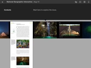
Reading an article in the digital magazine was an interesting experience. Physical magazines are organized like books, with articles spread over multiple pages. The digital National Geographic chose a different approach. The magazine can be read by swiping left, with each photograph occupying a single digital page. However, articles are organized vertically and are read by moving the page up. The thumbnail navigation view shows this best.

IMG_0035

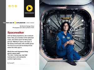
Other articles displayed differently. An interview with astronaut Sunita Williams was displayed on one “page” as a text box that could be scrolled through, accompanied by a large photograph and a linked video.

IMG_0038

The digital magazine combines the best aspects of the physical and the digital. The layout, though crowded, is still easy to read, without the annoying blinking ads and distraction inherent to online articles. However, the digital space allows it to expand the content it offers and make such content easily accessible. The magazine can be read linearly. It can also be roamed, zoomed, and streamed.

As well, magazines like National Geographic are inherently multimedia objects. I mean, who really reads it for the articles? It’s all about the photos. The physical page can only support so much media before its limitations are reached. While still organized in pages, the digital National Geographic manipulates the form and function of the digital page to provide a rich, multimedia reading, viewing, and listening experience.

Note: This was my experience using the Zinio iPad app. Zinio’s web-based reader is quite different.

Zinio is an eMagazine provider. It can be used for free by anyone with a Toronto Public Library card: http://www.torontopubliclibrary.ca/books-video-music/downloads-ebooks/zinio-help.jsp

References:

National Geographic. August 2013.

Piper, Andrew. “Turning the Page (Roaming, Zooming, Streaming).” In Book Was There: Reading in Electronic Times, 45-61. Chicago: University of Chicago Press, 2012.

Stoicheff, Peter, and Andrew Taylor. Introduction to The Future of the Page, 3-25. Toronto: University of Toronto Press, 2004.

Week 5: Encoding Roads Not Taken

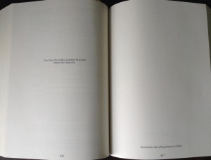
Our group chose to tackle House of Leaves by Mark Z. Danielewski for the encoding challenge. House of Leaves is a deeply complex novel, both in content and form. It is a description of a documentary film, written as a fragmented manuscript by a blind man named Zampano, which is compiled by a young man named Johnny Truant, whose own story unfolds in a series of footnotes, and the whole is commented on by nameless Editors. The documentary is about a bizarre house inhabited by a fictional Pulitzer-prize winning photographer, Will Navidson, and his family. After moving in, the family discovers new spaces appearing inside the house. The interior appears to be larger than the exterior. Passages lead into endless dark spaces full of branching ways, an enormous spiral staircase, and an ominous growl. Navidson and his brother take photographs and video of the phenomenon, eventually taking a documentary film team to explore the recesses of the house.

I always think about this book when considering form and format. It was the first book I read that really played with the link between form and content. Some of my favourite pages in the book arrange the text to reflect Navidson’s physical journey through the house while describing it.

Version 2 IMG_1102

However, those passages have too much form and too little content for this assignment.

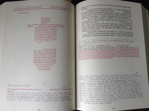
There are several pages we considered for the encoding project, each having their own challenges. The pages below were an option that we didn’t go with.

IMG_1106

Page 336 begins in the middle of a footnote to the main text, where Zampano is quoting another scholar’s interpretation of the documentary. Most of the footnote is struck out, and the main text itself on the next page has been damaged and burned, which is indicated by square brackets enclosing blank space. The destroyed text compares Navidson’s house to Minos’ mythological labyrinth, infamous home of the Minotaur. Page 337, meanwhile, describes the deaths of some members of Navidson’s documentary team, followed in the footnotes by Zampano’s scholarship and Johnny Truant’s reflections. The content of these two pages are in fact a complex web of referentiality, while the form is an equally complex mix of layout and design elements.

With any part of this book, the content is mostly nonlinear, which is a real challenge for encoding. While I have been treating Zampano’s manuscript as the main text in this post, this is really only my interpretation. Johnny Truant’s spiral into paranoia and madness could be equally or more important to some readers. Essentially, all parts of the book are equally important in terms of meaning, and so translating this into hierarchical XML requires implementing a specific reading of the text. Our group is currently figuring out an interpretation of our chosen passage, which is not as visually complex as this one, but is quite complex in its content.

Week 4: TEI in the Wild – Dictionary Edition

One TEI-using project close to home is the Dictionary of Old English Web Corpus (DOE), which has its physical headquarters on the 14th floor of Robarts. The DOE is a compilation of all surviving Old English texts, some in more than one copy. Each text has been XML-encoded and complies with TEI guidelines. Essentially, the DOE contains all of the surviving vocabulary of the Old English period (around 600-1150 CE). It is searchable in a variety of ways and is one of the best resources in the study of Old English.

Unfortunately, the website gives very little detail about its encoding strategies other than that they are compatible with the TEI-P5 2007 guidelines. It does not make its code available for others.

The project has also not published anything about its methods or challenges. The DOE’s editor, Antonette diPaolo Healey, wrote an article about the move from “manuscripts to megabytes” and the digital tools used by the DOE, yet she does not go so far as to talk about the code behind it.

However, in looking for information on the DOE, I did come across a short paper on the use of XML to create electronic texts of medieval manuscripts. The author goes through a few examples of this, and it showcases a current use for XML. It also has a great title.

That article can be found in the UTL catalogue: Powell, Kathryn. “XML and Early English Manuscripts: Extensible Medieval Literature.” Literature Compass 1 (2003): 1-5. doi: 10.1111/j.1741-4113.2004.00061.x.

Bibliography

DOE website: http://tapor.library.utoronto.ca.myaccess.library.utoronto.ca/doecorpus/index.html

DOE About Page: http://www.doe.utoronto.ca/pages/pub/web-corpus.html

Healey, Antonette diPaolo. “The Dictionary of Old English: From Manuscripts to Megabytes.” Dictionaries: Journal of the Dictionary Society of North America 23 (2002): 156-179. doi: 10.1353/dic.2002.0009.

Week 3: Adventures in Representations

I feel the need to begin this post with a disclaimer. I love ebooks. I don’t mind not having the tactile feeling of a physical book as I read. The tactile feeling of my ereader is enough for me. I have noticed differences in how I read and what I retain when reading ebooks versus physical books, and I have some preferences as to what genres I read in either. Still, I’m generally happy either way.

That being said, I’ve had a very bizarre experience reading manga in print and online. Not all manga, but one specific series. Manga, though I’m sure everyone knows this, are Japanese comics. So for me to even read them at all they must go through a pretty significant change. Not only must they be translated into another language, but Japanese characters (ex. for sound effects) are often integrated into the art, which forces the translators to choose between leaving them in, often unexplained, or replacing them with Roman letters. I’ve experienced both.

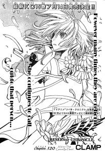
The series I had such a strange time with is Tsubasa: Reservoir Chronicle (hereby called TRC) by the manga artist group Clamp, which was published from 2003-2009. As I was reading it, I quickly became impatient with the speed at which the volumes were released. Chapters of the manga were being published serially in Japan and I had to wait months for them to be collected, translated, and delivered into my greedy hands. So, I started reading them in scanlation. Scanlations are fan-made translations, written on top of scans of the Japanese originals and posted on the internet as they are released. They are often dark and smudgy, retaining the physical look of the paper as well as distortion caused by the scanning process. The translations themselves can be awkward.

tsubasa16_c120_01 copy

Despite this, I read buckets of scanlated manga. TRC itself I read and reread multiple times, eventually obtaining image files of the scans and cobbling together my own PDF ebooks.

Eventually, I decided I should read the legitimate, legal, licenced translations. But, when I got the books from the library the experience was disorienting. The pages were too small compared to what I had on my computer – the images weren’t distinct enough, the print was too small. The need to hold the book open wide so that the gutter wouldn’t distort the illustrations annoyed me. The paper itself was too powdery, but it smelled very nice, more gentle than other books, and gave a creamy cast to the illustrations. I’d read other manga in physical form without noticing anything. Somehow, my brain couldn’t handle switching formats with this particular series.

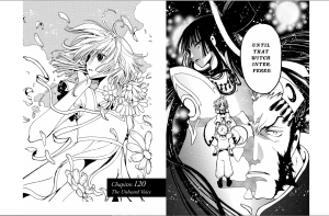
Recently, I started buying TRC in ebook form. That reading experience too is very different. The lines are cleaner and the whites are brighter, which is lovely. And, they come with the licenced translations. Still, one disorienting difference is that the ebooks show the page spreads, both recto and verso. Having read the manga so many times page by page, image file by image file, it’s a strange experience. I am essentially retraining my brain to read this format.

Screen Shot 2016-01-28 at 11.40.43 PM

I have read three different representations of this series, and each time it has been like reading a different thing. The scanlations focused on the textual, linguistic content. That was the reason for their existence, after all. The physical and ebook forms showcase the art more. Yet, the gutters of the physical books obscure some of the image content and page transitions, whereas the flatness of the ebooks makes it almost too easy to move from page to page.

In the end, I suppose I will continue to switch between formats. Each one has its benefits and drawbacks, and each supplies a unique and valuable experience.

Week 2: Form Effects Meaning

I recently read The Secret Journal of Beatrice Hassi Barahal by Kate Elliott, a chapbook companion to Elliott’s Spiritwalker Trilogy, with which I am completely in love. The trilogy focuses on the adventures of two cousins, Catherine (Cat) and Beatrice (Bee). The story is told from Cat’s point of view, so the Secret Journal retells the story from Bee’s perspective using the medium of her sketchbook.

The book is visually beautiful, with 29 black-and-white illustrations by the award-winning fantasy artist Julie Dillon. The pictures and text overlap physically, giving the impression that the book is being written and drawn at the same time. But, the best part is the accompanying discussion between the two cousins written on and around the main text. As you read the Journal, it becomes clear that it is being written, drawn, edited, rewritten, and discussed at the same time. This is facilitated by the use of three different fonts: one for the main text, one for Cat’s notes, and one for Bee’s responses to her. The result is an immersive experience in the world of the books that is also a character study of the two protagonists.

Bee’s sketchbook is an integral part of her character, and it only makes sense for her story to be written within its pages. But the marginalia adds an authenticity to the reading experience. One important use of Bee’s sketchbook is as a facilitator of conversation between her and her cousin in which they write notes back and forth. By including this detail, the chapbook functions as both an addition to the overall story and an artifact from within the story.

Kate Elliott talks about the process behind making the Secret Journal: http://thebooksmugglers.com/2013/10/the-secret-journal-of-beatrice-hassi-barahal-kate-elliott-on-fan-art-giveaway.html

The Journal can be found here in PDF: http://www.kateelliott.com/index.php?pageID=53