Week 11: A More Inclusive History for a More Inclusive Future

Letter-to-Queen-1fk82ic

Source: http://blogs.baylor.edu/armstrongbrowning/category/19th-century-women-writers/

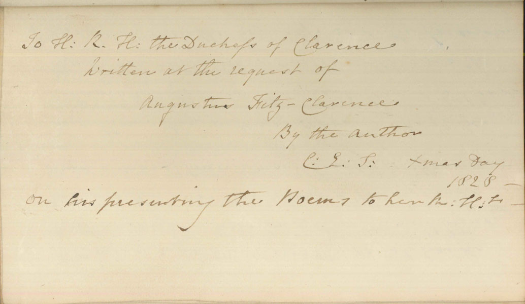
I think that if I could travel back in time, the message I would focus on relaying would be around medium as a reflection of current ideological state, and as something that is flexible and should be open to interpretation. I’m specifically thinking about the roughly 19th Century Anglo/ European audience as a useful target demographic to propagate this idea to, so as to avoid the discounting of manuscripts and letters as worthy candidates for the study of book history. This is in part inspired by one of my book history classes in which we looked at the letter writing of women in this time period and how there was often a dichotomy created between the authority of print and the less authoritative domain of handwriting or manuscript. This would be beneficial for expanding the scope of the field not just in terms of materiality, but also in terms of its socio-cultural engagement in history. The Future of the Book has shown us the flexibility of the definition of a text, and the multitudes of ways that stories can be told effectively outside of the traditional printed codex.

This particular insight might be addressed to a still developing field of book historians and scholars so that they might build up the field with a wider sense of what counts as important to the culture of books (and to consider to what degree it is valuable to draw lines of distinctions around what books are). Even as we turn our gaze towards the future, the boundaries between mediums become less clear. As Matthew Kirschenbaum notes “the tendency to elicit what is ‘new’ about new media by contrasting its radical mutability with the supposed material stolidity of older textual forms is a misplaced gesture, symptomatic of the general extent to which textual studies and digital studies have failed to communicate”(24). Perhaps, then, if we were not so rigid in our original definitions of the book, the field would not struggle to define itself and its breadth today.

Bibliography

Kirschenbaum, Matthew G. “Editing the Interface: Textual Studies and First-Generation Electronic Objects.” Text: An Interdisciplinary Annual of Textual Studies 14 (2002): 15-51. 

Week 10: Updating IRL

Apologies in the delay getting this post to you fellow bloggers, the Easter bunny brought me the flu for Easter so I’m a bit out of sorts, but here goes!

Besides music, the downloading of apps is probably the main way in which my ownership of digital objects gets tested. I find myself mildly annoyed when an app I get accustomed to using in one way, is altered or updated in another way that forces me to re-learn its functions or re-shape my attitudes towards it (I am a creature of habit I suppose).

A very current example would be Instagram, which is purportedly going to be changing its feed algorithms to favour popularity over chronology. This is annoying because it means that it will be harder to follow the famous and non-famous in a peacefully co-existing way, as the more popular content is privileged. However because the app is free rather than a purchased app, it’s difficult to feel too hard done by, after all there are many instances where apps disappear or change after you have purchased them. Also, there is of course the option to turn off automatic app updates so that you can stay with whatever versions is currently being used. The downside of this is that there is sense that you are missing out on something and you have to go through the additional labor of manually updating some things and not others if you do decide to update. This is all just to say that updating is not a bad thing, just merely an interesting aspect of the digital object that contributes to our sense of it as a living, evolving organism rather than a complete creation. FOMO (fear of missing out) seems to eventually get the better of us – you don’t want to update, but what if you miss out on something cool?

If you do purchase an app, these things become even more interesting to think about because the boundaries of ownership become even blurrier – you have access to the app – but it’s being altered and updated by its creators. There is a sense that it really never is yours in quite the same way. When I purchase something digital I know in the back of mind that I may very well be paying for a very temporary experience with something, but instant gratification usually gets the best of me and I will purchase something because I want to use it today without much concern for its use tomorrow.

The sense of the update as being an embedded part of a digital object means that the thing we purchased is a living service rather than something we make a single transaction for in order to acquire a specific item. One simply cannot have control over the app in quite the same way as a physical object (unless you happen to have elite hacking skills). The update complicates our relationship to something we own because it means that what we have paid for is still very much under the control of the original content creator.

Apps already seem to occupy a grey area in terms of ownership as their existence isn’t in conversation with a tangible history the way the digital book is. Part of their identity is defined through their use and purchase, and the tenuous and fragile nature of these digital features. The less control you have over something, the harder it is to feel as though you possess ownership. The concept of control of information comes up in the Adrian John’s article as something that has “become a principal foundation of modern social, economic, and cultural order. As it has become the key commodity in the globalized economy, so control and management of information have vastly increased in overt importance.” (5). Who controls the things we buy is a more intriguing question than ever when the commodity never fully leaves the control of the creator. With apps, whether purchased or not, people are less likely to invest their confidence in them as an enduring commodities, which has created a diluted sense of ownership when it comes to apps.

Bibliography:
Johns, A. (2009). Piracy: the Intellectual Property Wars from Gutenberg to Gates. Chicago: U of Chicago Press.

Week 9: Experimental E-texts

Since I looked at the experimental text The Truth About Cats and Dogs in my blog post from week 6, I have been curious about revisiting this text and others like it in my final paper. My interest in experimental e-books looks specifically at the idiosyncrasies of the touch screen technology of a smartphone in conjunction with the architecture of the page. The smartphone as a platform interests me since it is a unique tool whose screen has unique properties that change depending on the text, operating somewhere along the spectrum between e-book and tablet, or even more closely resembling the screen of a video game app. I would also like to examine the ways that these texts utilize the page in ways which render, as the publisher put it, “unprintable” fiction (Lea). This is a concept that fascinates me and I am contemplating how to use the final paper as an opportunity to explore the implications of this. In what ways does the text really defy print and in what ways might we still see traces of a deeply embedded print culture still at work beneath the layers of the materiality of the text?

Screen Shot 2016-03-17 at 11.17.50 PM

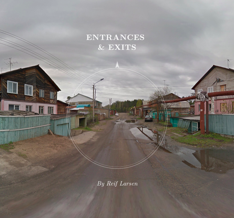
Source: https://entrances-exits.com

One way I see this manifesting is through a comparative analysis of a RPG type video game app versus one of these experimental texts available from Editions at Play. You can view them on this page, and even play free trials. I am really drawn to working with the book (pictured above) Entrances & Exits (link) by Reif Larson, which is described as a:

“Borgesian love story told through Google Street View, in which the narrator discovers a mysterious key in an abandoned bookshop and gradually learns of its power to open and close doors around the world. The story is a beautiful dance between fictional narrative real locations that seamlessly spans the globe” (Larsen).

The simulation of environment is one way that the experimental book seeks to use its digital environment to the fullest, and resembles a gaming experience as well, perhaps blurring the lines between both. Throughout this course we have looked at how the opportunity to create and relay meaning exists in so many aspects of a text. In this vein, in How the Page Matters Bonnie Mak draws our attention to how “words on the page are regularly understood to transmit information through language, but they can convey meaning in other ways” (15). By taking the architecture of the page together with some elements of media studies, I’m hoping to use analyze the way that meaning is created in this book, since its innovative use of its structure is central to the reason behind its creation as a piece of literature. It is a piece of digital literature whose content is inextricable from its container, making it bound to the page more than its designers may have thought.

Bibliography

Larson, Reif. Entrances & Exits. Visual Editions at Play, January 2016. https://editionsatplay.withgoogle.com/#/

Lea, Richard. “What apps next? Publishers and developers embrace ‘unprintable’ fiction.” The Guardian (2016): http://www.theguardian.com/books/2016/feb/03/publishers-developers-digital-technology-unprintable-fiction-google-editions-play

Mak, Bonnie. How the Page Matters. Toronto: University of Toronto Press, 2011.

Week 8: Distortion in Google Maps

The example I ended up with this week looks at instances of digital images being unintentionally distorted in Google Maps. There are some pretty bizarre examples that can be viewed when looking at certain locations, which a digital artist named Kyle F. Williams has captured collectively after scouring Google Maps. I have included a couple of examples below (Figure 1 & 2), but if you want to see a bit more you can check out this article. They are sometimes comical, but mostly just strange, and definitely worth having a look at or trying to find your own. I believe this is a suitable example because it shows the contents of Google Maps having been, quite literally, disrupted (or perhaps disembodied is the more appropriate term) by the technology being used to capture it.

Wk8BlogPostImage Wk8BlogPostImage2

Fig. 1 & Fig. 2 Source: Doug Bolton/ Kyle F. Williams/Google Maps, (The Independent, 2016)

This happens because of errors in the stitching of the panoramas taken by the Google Street View technology, making the end result at odds with Google’s goal of creating a seamless panorama that can situate the viewer within a locale in a life-like way. It is also an interesting example because it only reflects one layer of the containers involved in Google maps, which is at the level of production and capturing of the photos, rather than a glitch within the software itself. However this still has real repercussions since Google’s photography in this circumstance is intended to be a faithful vehicle of representation.

In A Deep History of Electronic Textuality, Whitney Anne Trettien remarks on the pros and cons of reproduction in photography in relation to print when she notes that, “even as photography helped far-flung bibliographers collaborate on collating versions, it also threatened to disrupt the field with forgeries and even devalue the work of bibliography itself” (para.4). This only serves to highlight the fact that the difference between intention and result can be vast when seeking to represent something as a digital image. Ultimately these are inaccuracies that interrupt the experience the user is meant to have, and these images from Google Maps demonstrate that the experience is especially jarring when the object being represented is supposed to be reality.

Bibliography

Bolton, Doug. “Artist Captures Bizarre Distorted Images on Google Maps.”    The Independent, 18 Feb. 2016. <http://www.independent.co.uk/life-style/gadgets-and-tech/news/google-maps-photo-spheres-kyle-f-williams-keelayjams-a6881396.html>.

Trettien, Whitney Anne. “A Deep History of Electronic Textuality: The Case of Eng/ish Reprints Jhon Milton Areopagitica.” Digital Humanities Quarterly. Volume 7 Number 1, 2013. <http://www.digitalhumanities.org/dhq/vol/7/1/000150/000150.html#shillingsburg1996b>.


Week 7: Long Live Print (& My Eyesight)

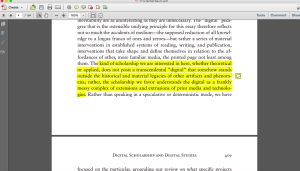
My reading habits are actually fairly clear-cut since I almost always prefer print. It is possible that this is partly because I don’t own an e-reader, so perhaps I just don’t know what I’m missing out on, but that is the current state of the way I read. Pretty much the only reason I read on a screen is because of school and the scholarly articles we’re asked to engage with in our coursework (usually downloaded in PDF format which I hoard on my desktop as seen in figure 1).

Screen Shot 2016-03-03 at 11.19.47 PM Figure 1. PDF

My preferred method of reading is still print, and I often find myself tracking down print versions of readings even when they are available online. The reason comes from the pretty mundane fact that reading on a screen really strains my eyes. Maybe it’s time for an eye exam, but in my experience this is a pretty standard complaint of folks regardless of whether they have perfect vision or glasses.

Preferring print has less to do with disliking the format or the features of the online article. I really enjoy the ease of annotating PDF texts, I find it incredibly easy to add sticky notes, bookmarks, and highlight and search the document (provided the text is compatible), which lends itself to a proactive style of academic reading. If I suspend my disbelief and imagine a world where reading on a screen doesn’t hurt my eyes I think I would prefer to read scholarly articles in this format anyway. This is due to the necessity of engaging with them with a more in depth manner than reading other types of material and therefore the aforementioned ease of the annotation process. Thus the environment and style of reading reflects the content, as I could never imagine taking my laptop to the park to casually read a novel.

However even when I am reading scholarly articles, I still miss the  tactility that goes along with reading print. I believe that the physicality of reading is a big part of how we experience and internalize the information we take in while reading. The ease of rifling through pages and getting a tangible sense of what you are dealing with, creates a sense of control and understanding of a document as an entity. I often find myself losing my place and having a tough time referring back to pages in the PDF format. That being said, it saves my desk from becoming even worse of a mess than it already is!

The other type of “reading” I do on screen is via the consumption of images through social media on my iPhone. I will occasionally happen upon an article (for example, a news article – not so different from a scholarly article in terms of content and length) I actually wish to read, in which case I’ll hop on my laptop and read it there so that the text is larger and more visible (I realize I’m starting to sound seriously elderly here). I suppose in some regards it comes down to the length of the text. I can handle reading an article on my laptop because I know it won’t be extremely long, so its feels like a feasible thing to stick out. I can’t imagine trying to read an entire book off a laptop screen without my eyes drying up completely.

I am aware that some e-reader screens offer a slightly different experience that is not supposed to strain your eyes in quite the same way. I could perhaps get used to reading in that format, but because I grew up reading books in the traditional sense, the process of reading and enjoying reading is not just a mental and emotional experience but deeply physical.

Week 6: The Navigational Page

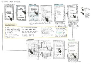
For this blog post I decided to download a free sample of an experimental text only readable online which actually specifies that it is best read on a mobile device. I first heard about it through the Guardian article, What apps next? Publishers and developers embrace ‘unprintable’ fiction, which you can read here. The text is called The Truth About Cats and Dogs, and is the collaborative project of two poets Sam Riviere and Joe Dunthorne. It was published by Visual Editions (collaboratively with Editions At Play), the same publisher who was responsible for Safran Foer’s Tree of Codes, who seem to have a vested interest in producing literature that explores the physicality of its manifestation self-reflexively. The text allows the reader to switch back and forth between the writing of each author at any point during reading, which means that the page being viewed is really the only page that matters at any given moment. And yet there is a sense of linear temporality created as the story moves forward at the mercy of the readers tap. Interestingly the concept of scrolling, which we so easily associate with digital texts, is absent. Instead one navigates the story through the comfortable motion of tapping, creating a similar sensation of ease as akin to playing mindless games on one’s mobile phone. The article includes an illustration that provides a sort of flow chart for visualizing how the reader engages with the navigation of the page (See Figure 1).

4893

Figure 1. Source: Richard Lea, “What apps next? Publishers and developers embrace ‘unprintable’ fiction,” The Guardian (2016): http://www.theguardian.com/books/2016/feb/03/publishers-developers-digital-technology-unprintable-fiction-google-editions-play

In Introduction: Architectures, Ideologies and Materials of the Page, Peter Stoicheff and Andrew Taylor consider the page from three different perspectives: its material, architectural and ideological components. Since my experience with the material components of the page of this text won’t change for me as a user of a single mobile device, I’m going to focus on considering the architecture and ideologies embedded in the pages of this work.

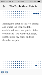
To go back to the motion of tapping through the story – this quality dictates how much text is going to be on any given page, dividing it into very intentional segments. The architecture of the text is therefore influenced by its interactive qualities. Because there is no endless scroll, the text is portioned out onto individual interactive pages. The pages also vary in colour depending on whose writing is being read and vary in design. Generally they look like some version of the page shown in Figure 2.

unnamed

Figure 2. Source:

As the reader taps through the story, a little circle moves along the grid below, creating an aesthetic sense of progression. Each page is in conversation with the text’s navigational movement, which is certainly a feature that makes the experience of reading this book “unprintable.” This motion embedded within the page reflects our cultural ideology in a big way. The creators of the book were aware of this as publisher Anna Gerber mentions in the article that she wanted to “make books that are… not games and… not apps – they’re all built out of HTML – but each one is impossible to envisage on paper” (Lea). The creators were aware of it having a similar experience to a game or app of some other design, and wanted to explore how they could create a compelling piece of art with similar technology. So there is very much a sense of the experience of the page not being describable in a traditional sense of a printed book, or even within the notions of the digital page found elsewhere, but rather reflecting the architectural and ideological blurring of boundaries between game and book via its navigational technology.


Bibliography 

Lea, Richard. “What apps next? Publishers and developers embrace ‘unprintable’ fiction.” The Guardian (2016): http://www.theguardian.com/books/2016/feb/03/publishers-developers-digital-technology-unprintable-fiction-google-editions-play

Riviere, Sam and Joe Dunthorne. The Truth About Cats and Dogs. Visual Editions, 2016.

Stoicheff, Peter, and Andrew Taylor. Introduction to The Future of the Page, 3-25. Toronto: University of Toronto Press, 2004.


Week 5: Tree of Codes

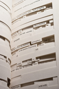
Tree of Codes by Jonathan Safran Foer is, in many respects, an artist’s book that experiments with the material possibilities of print. It was published by Visual Editions in 2010, using the die-cutting technique to create a book that is sculptural and complex in nature. Each page cuts out various lines of text, leaving physical spaces in the paper through which the reader can see onto the next page, which then contains its own unique formation of text (see Figure 1). It reads like an experimental work since it very much occupies the grey area between poetry and prose. In actuality the text is from a book of short stories called Street of Crocodiles by Polish author Bruno Schulz. Foer then takes a pre-existing text and attempts to create a new piece by experimenting with the unique capabilities of the printed book and its encompassing technologies.

5264794042_0c33b206a9 Figure 1.

The practicalities of attempting to represent this text in code seem beyond the scope of the required skills of the course, but I still wanted to blog about it because of the interesting thought experiment it poses. The main issue at the heart of rendering such a text in code would be around representing the space or negative space within a printed text, versus the screen.

The problem then is that when you attempt to go down the path of encoding, the impulse is to focus on representing the content how it falls on the page using our traditional sense of what a page is. However the process of representing the text and space on any given page is not terribly different from marking up for regular prose, and the end result could easily be an accurate representation of the text but with its variety represented only in one dimensional space. The problem that then arises is that it leaves out the key structural feature of the book: the three dimensional space that is  created by the depth of the cutouts in the book.

The caveat of this book is really that it is an artist’s book, a book that is self-reflexive in nature and very much in conversation with the unique capabilities of print. Even its title reflects its dependency on paper. Rendering it in code would change the project completely. Trying to really stay true to representing the physical book in a digital format might then be more effective if it were to be simply photographed, and since I don’t have an e-reader, I wasn’t able to get a sense of how digital versions cope with this.

On the other hand, the title is also in conversation with our understanding of language as “code,” and one could imagine the possibilities of the new values it could take on through the process of markup. Attempting to represent this text in code would be engaging with much of the same processes that Foer engaged with when he decided to take a pre-existing text and make it something new by drastically altering its physical structure. Coding this text seems like natural next step in the process of experimenting with the reader’s perception of a single text in various artistic formats. My group has discussed using concrete poetry as being a challenge to code, which is of course, because of the challenge of representing the way poetry plays with word placement and space. Tree of Codes looks at the same problem in multiple dimensions and would be doubly challenging, and to consider how to cope with that would be an artistic undertaking in and of itself. For that reason we won’t be pursuing it, but I thought it presented an interesting conundrum for considering something like XML.


Bibliography

Foer, Jonathan Safran. Tree of Codes. Belgium: Visual Editions, 2011. Print.

Week 4: TEI in the REEDs

Records of Early English Drama, (REED) is an online “international scholarly project” aimed at “establishing for the first time the context from which the drama of Shakespeare and his contemporaries grew” (Records of Early English Drama). It brings together resources (namely transcriptions of historical documents related to the topic) from all over the world, including U of T, and makes them open and accessible from one online location.

The project is fairly transparent about the construction of the resource through a document it makes available called the “Fortune White Paper.” It discusses their TEI encoded prototype edition in depth and is accessible from the drop down menu under Online Resources, then Building EREED. It’s quite a lengthy document but if you scroll down to section 3 (Editorial Work: Technology) it starts to discuss their servers as well as their use of Oxygen in their TEI work. They describe their records as beginning in Microsoft Word MS and then converted to TEI-XML. Section 4 details how they chose to work with TEI’s Guidelines for Electronic Text Encoding and Interchange, based on the eXtensible Markup Language. The document continues to give a detailed breakdown of each decision and method employed with regards to the creation of the markup of the REEDs project, and even offers a sample segment of code using a random item. It doesn’t offer a downloadable XML file from within this document, however if one returns to the Building EREED page and clicks the Downloadable Script link, a page is made available with two different downloadable TXT files as well as a schema. The first one is described as “A TXT file of a PERL script, which parses REED document text files, converting REED’s markup into TEI-Lite conformant XML, … [which] populates the REED database”, while the second one notes it was prepared as an experiment and is a “TXT file of a drafted PERL script, which queries the REED database and formats the resulting data as Microsoft Word RTF output” (Records of Early English Drama). I get the sense that these are still examples of how the database works rather than actual samples of XML from the actual records made available online, but it does seem fairly in depth overall. Unlike the Folger Shakespeare example, one cannot download the code directly from the page of the record one is viewing, so the level of transparency is not quite on par, but there is a great deal of information prepared and made accessible about the project online.

Bibliography

Records of Early English Drama. University of Toronto. 2016. Online. February 2016.

Week 3: EEBO

When thinking about where I have encountered issues with representation, I thought of my experience using the database Early English Books Online (EEBO). It’s not quite as specific of an example as the Beatles and Sgt. Pepper’s, but my experience of this database was probably my first encounter with issues of representing print online, and how different projects privilege different types of representation. You can find the site here, and should be able to sign in through U of T.

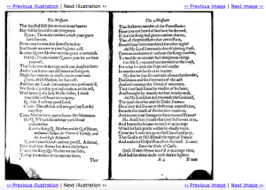
In my third year of my undergraduate I was taking a Shakespeare course, and my professor had us do an assignment that asked us to engage with a variety of scholarly resources for a single project. Using EEBO was one of the tasks, while going to see a 1511 edition of Ovid’s Metamorphosis were among the other tasks we were given in our scholarly scavenger hunt (The assignment was focusing on Shakespeare’s education and the texts he would have read). This was the first time I had ever seen a rare book, and the first time I had consulted a database that replicated early printed text. Going to see the rare was obviously one of the most incredible experiences of my life and everything sensory about it stayed with me – the colour and feel of the paper, the binding, the woodcuts, the printed Latin I couldn’t read – but when I searched around various texts on EEBO, I naturally felt fairly underwhelmed comparatively. While the content and layout remained, that characteristic aged colour of the paper was gone, and there was only the pure white of a scanned image (see Figure 1).

Screen Shot EEBOFigure 1.

This makes sense considering EEBO is database of digital facsimiles rather than a digital preservation project with high-resolution photos of actual rares. However the juxtaposition was especially jarring after having been looking at the real thing. I suddenly became aware that while the representation served a purpose, it was missing a great deal of the aspects of reading an early printed book. It also brought an awareness that the medium of a text could inform a reader’s experience in pretty exceptional ways. What was missing from the digital facsimile helped me appreciate the tactile and visual aspects of early print and the importance of conserving it.

It also gave way to further thoughts around representation and choice. It’s important to think of digitization as representation because there is a motive behind the act of taking a text and altering it so that it exists in a new state. Digitization both reveals and obscures in the sense that it has an awareness and an opinion about what the end product should say and do, which intentionally guides the reader in subtle (and less subtle) ways that are important to consider when engaging with any text.

Week 2: JPod by Douglas Coupland

One book that has made a lasting impression on me in terms of its materiality has been Douglas Coupland’s JPod. As the story engages with the digital world of video game programmers, so does the format, pushing the boundaries between print and the digital.

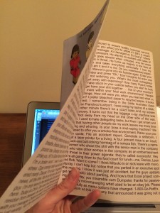
There are a number of unusual characteristics that are in conversation with the digital text. There are continuous streaming sentences right on the insides of the book covers and first pages (which are usually left blank) in a Helvetica-esque modern looking sans serif font (Figure 1.).

IMG_5624 Figure 1.

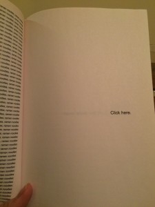
There are also just pages that list numbers and computer code. At one point in the book a character locates a website that generates the first hundred thousand digits of pi and Coupland subsequently lists them page after page. The book even sets up the reader to engage with the story as if it were setting up a video game, giving the reader the option to “Play as Gene Simmons” or “Play as Iron Man” among the prefatory pages. Among  these pages, one cleverly fuses print and the digital and simply says: “Click Here” (Figure 2.). This particular example stood out for me because it implies an action on the reader’s behalf, a reference to a totally different type of reading experience that can’t be explored in print, and yet is cheekily employed here.

IMG_5627 Figure 2.

The sense of self aware hybridity is especially intriguing as it serves to further Emphasize Matthew Kirschenbaum and Sarah Werner’s discussion of how “all books today are ‘born digital’ in the sense that at some point in their composition, editing, layout and printing they become (re)configured as data objects” (41). JPod works in almost the opposite sense, seeking to make the reader self aware of the book as digital in ways it can’t typically be. The aforementioned title page, encourages the reader to think of the narrative of the story in a leaping hyperlink sort of way, jumping to the next page instead of turning it. This serves the purpose of making the reader aware of how they read in different environments. It also serves to further blur the lines between the print and digital dichotomy bringing the migratory nature of text into the spotlight.

Bibliography:

Coupland, Douglas. JPod. Toronto: Vintage Canada, 2007. Print

Kirschenbaum, Matthew and Sarah Werner. “Digital Scholarship and   Digital Studies: The State of the Discipline”. Book History, Volume 17, 2014: 406-458. Online Journal.