International Children’s Digital Library

Larger scale digitization projects by virtue changes the way people engage with the objects. One example is the International Children’s Digital Library.
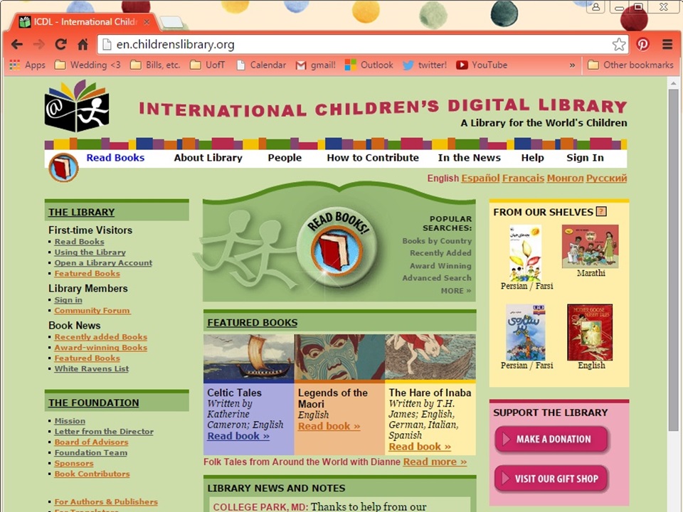
The ICDL is the result of internationally-motivated research out of the Human-Computer Interaction Laboratory at the University of Maryland. The ICDL is very socially-oriented, their aspiration being to “have every culture and language represented so that every child can know and appreciate the riches of children’s literature from the world community” (Mission).

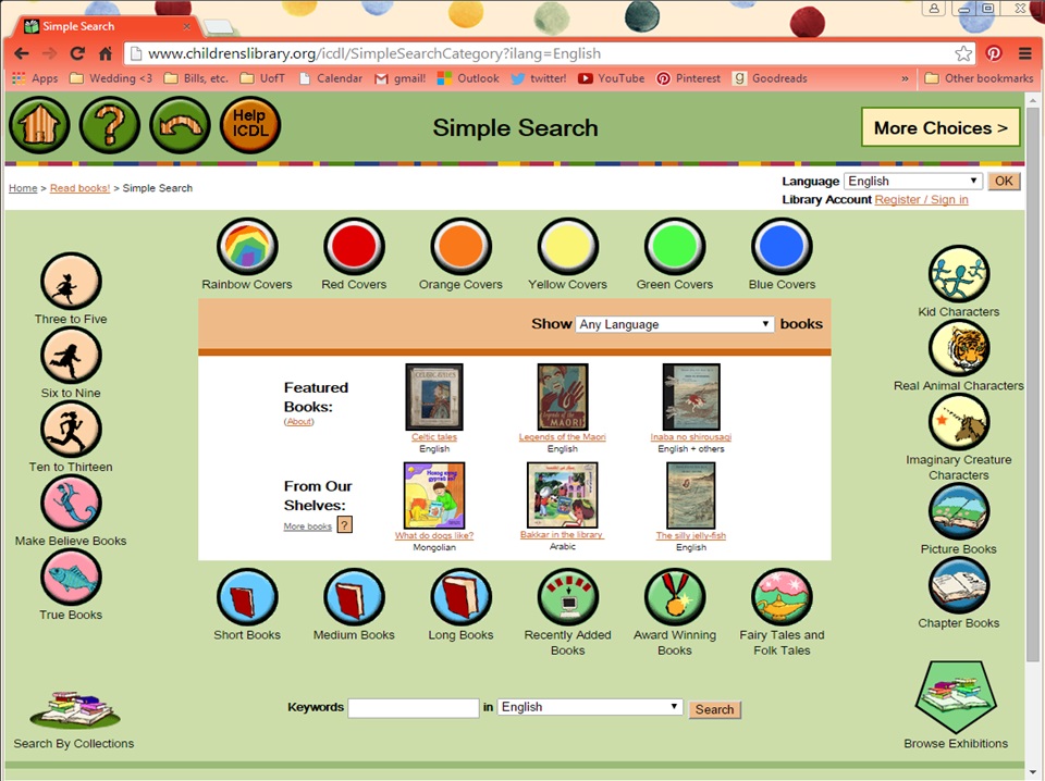
There are several aspects of this library that differentiate it from other digitized collections. One of these is the kid-friendly interface.
 

ICDL 2

Besides searching by keywords and advanced search, the ICDL uses the “Simple Search” tool to allow kids to browse books. Just as a physical library, they can look at the whole selection and flip through the pages until something catches their eye. However, the ICDL allows kids to combine unique characteristics (such as cover colour and type of character) in order to construct unique searches that would be difficult to replicate in a physical library.

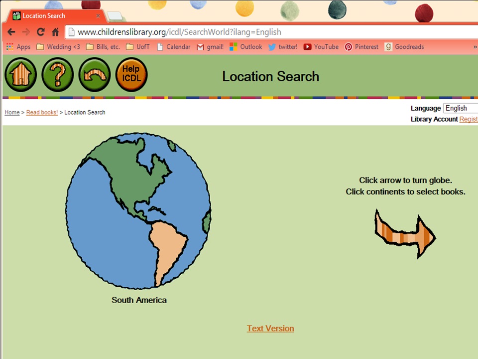
Digital space is used well in this project because it allows for unique functionality that would be almost impossible in a physical collection that can’t be rearranged to taste or on a whim (for good reason). There is also a way of searching by geography:
ICDL 3

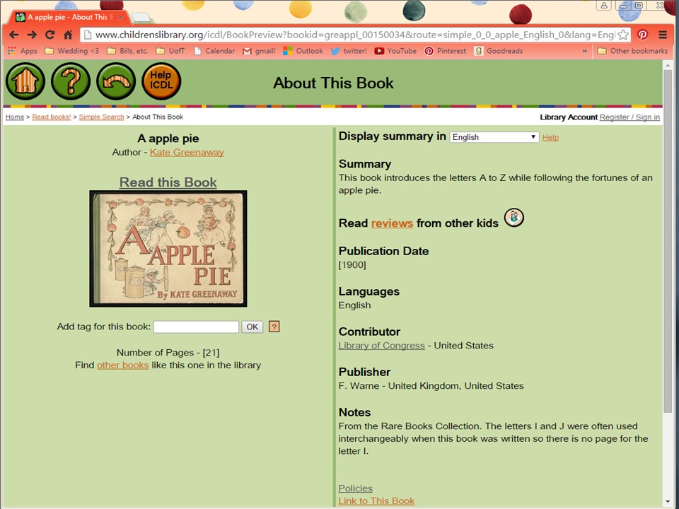
Once you select a book, the corresponding catalogue page opens. There is usually quite a bit of metadata and sometimes interesting notes. There is even a link to WorldCat. One of the interesting things about the digitized versions of these books is that they allow for reviews. This gives kids an opportunity to share their reactions and “leave a mark” on the book.
ICDL 4

One consequence of their interface design is that all of the pages open in a spreadsheet and you can start the book from any page (and choose between a single page or spread view). The ability to skip to a specific part of the story makes it a lot easier to engage with the texts in a non-linear fashion, which is interesting.
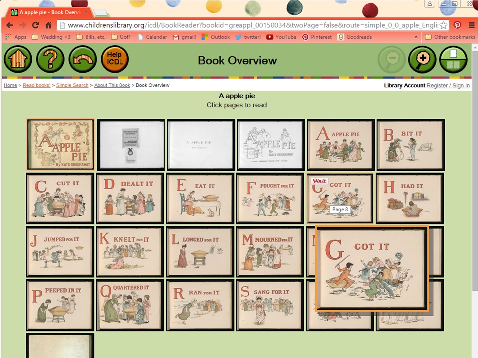
ICDL 5

Of course, the selection of books is quite outdated for the most part, since most are in the public domain. The interface that allows for interaction with the digitized objects, however, shows the possibilities for creative forms of interaction with texts through the “Simple Search” function and the (perhaps less intentional) book overview page in the image above.

Week 3: Digitization & Representation – eMagazines

This week’s topic inspired me to take a look at my boyfriend’s collection of eMagazines on his iPad. I often see him reading them, but have never taken much of an interest, save for peeking over his shoulder at photos in between chapters of my print books 😉 I selected the February 2016 issue of National Geographic for my analysis, and was thoroughly impressed with its representation of information.

What pleased me the most, perhaps, were the navigational features of the digital form of the magazine. Being that magazines are meant for browsing, I have found myself frustrated with print editions because they are not actually very conducive to it. Having to flip back to the table of contents (which is often hard to relocate); scanning the table to find the article you want (which can be difficult in itself, as titles do not often match up with the headings from the cover); and then moving forward to the desired page (which is often missing, as publishers do not want to obscure the first page of an article with a page number) are some issues that readers run into.

In terms of improving navigation, the Nat Geo eMagazine has done a bang-up job. As with ebooks, they offer a button which takes you to the table of contents, which eliminates the need to scroll back to the start of the issue. They also provide a function which shows a mid-sized image of each page (like a thumbnail but larger) so that you have a birds-eye view of the whole issue when scrolling. This allows readers to easily identify and select an article based on image, which I suppose is similar to print magazines, but eliminates the possibilities of pages sticking together, being overwhelmed by advertisements (which are blissfully absent from the e-version), and otherwise skipping over a page.

Some other navigation features which delighted me include the pop-up caption: photos in the eMagazine are full page, and captions only appear when you click the + button in the bottom right-hand corner. This allows readers to fully enjoy the photo without distraction before deciding to read the caption. Another was a page which displayed four photos of insects, and had a button which read “Tap photos for graphic.” Once you clicked on a photo, a diagram and caption appeared in its place, and reverted back to the original photo when clicked again.

These options which allow for more agency on the part of the reader are quite progressive in the ebook world, based on what I have seen. Perhaps magazines, which contain mixed-media to begin with, are a more natural fit in the digital world than are purely textual books. National Geographic also has videos embedded in their eMagazines, which I have yet to see in the ebook world, except for enhanced or expanded editions. Sperberg-McQueen’s statement that “In designing representations of texts inside computers, one must seek to reveal what is relevant, and obscure only what one thinks is negligible” (p. 34) begs the question: what is being left out of this representation? It would be an interesting exercise to compare the print and digital versions of the same issue, and note differences in content and consequences of layout decisions.