
Museum of Natural History, Berlin. (http://www.nytimes.com/2015/10/20/science/putting-museums-samples-of-life-on-the-internet.html).
Okay, bear with me on this one. There’s a bunch of wormhole-y tangents that I hope will come together to make some sort of sense. I started this off thinking about attempts to digitize completely physical objects, things that exist undoubtedly in natural form. So, how about nature itself? It turns out that the Berlin Museum of Natural History is ambitiously undertaking a project that uses digital technology to create 3D images of the museum’s entire collection of insects. Erik Olsen describes how these are not simply scanned images of specimen drawers – rather, specimens are placed on “a rotating drum in a lightbox and photographed at many angles with a macro lens,” then, using computer software, the team stitches the photographs together which can be downloaded and seen from up to 100 angles (as many as 500 images can be taken of a single angle, and 3,000-5,000 images of a single specimen) (Olsen, 2015). Olsen notes that the team uses compression and an algorithm to load small portions of the resulting massive image at a time. See the result, called ‘ZooSphere’ here: http://www.zoosphere.net/. You can also see a video describing the project here: http://nyti.ms/1kkig5z.
This raised a lot of questions for me. There are numerous degrees of separation/representation going on here – there was the insect living in the wild, then the dead insect physically pinned/preserved in a drawer in the museum, then the digital 3D rendering of the image, posted publicly online – searchable, downloadable, viewable as a panorama. While not a ‘text’ per se, although perhaps in McKenzie’s broad definition – these insects still speak to Sperberg-McQueen’s assertion that “tools always shape the hand that wields them; technology always shapes the minds that use it. And so as we work more intimately with electronic texts, we will find ourselves doing those things that our electronic texts make easy for us to do” (1991, 34). How is it different for a biologist or researcher, to interact with these insect specimens online – ‘three-dimensional’ on a flat, digital screen? What do they ‘make easy for us to do’, or not? Are there aspects that couldn’t be observed in person, interacting with a fragile, precious specimen? Similarly, is there an ‘aura’ to the insect that is lost in digital form? That is untranslatable?
In a strange leap of brainstorming – this question also took me on a couple of separate (but I hope related) tangents.
One is London-based artist Stanza’s ‘The Binary Graffiti Club’, referred to as “a user friendly public participatory spectable [sic] and public engagement event across urban space creating new narratives for the playfull [sic] engagement of the environment, spectacle, performance, politics and art” (Stanza, 2013). The participants, made up by young members of the public, “[encode] the city with messages of binary code” (Stanza, 2013). Check it out here: http://stanza.co.uk/binary_club/index.html.
People dressed in black and white binary hoodies roam the city, tagging physical objects with messages in binary code. There’s something here, I’m just not sure what, yet. Stanza opened the Frequency Festival of Digital Culture in 2013 in Lincoln, England. The festival co-director noted that, “youths dressed in black hoodies swarmed the historic city streets of Lincoln during Frequency Festival 2013, their backs emblazoned with bold white digits, the zeros and ones. Their ominous presence was marked with a series of binary code graff-tags on official buildings throughout the city; messages of insurrection for a digital cult now active among us or analogue reminders of the digital soup of signals we wade through on a daily basis? There’s an engaging playfulness and an aesthetic pleasure to Stanza’s work that pays rewards on deeper investigation. His urban interventions remind us of the invisible occupation of the cyberspace around us and encourages us to ask whose hand manipulates these systems of control.” (Hale, 2013 in Stanza).
Speaking of hands, all of this has also made me think about the flurry of news a few years ago regarding the ghostly figures of Google book scanners’ hands appearing in books. Artist Benjamin Shaykin collected examples of this and other scanning mishaps and published them in a book called “Google Hands” (http://benjaminshaykin.com/Google-Hands). A similar collector, Paul Soulellis, curates ‘Library of the Printed Web’ (http://libraryoftheprintedweb.tumblr.com/), consisting of stuff pulled from the internet and bound into paper books, including a print-on-demand novel by Sean Raspet called “2GFR24SMEZZ2XMCVI5L8X9Y38ZJ2JD 25RZ6KW4ZMAZSLJ0GBH0WNNVRNO7GU 2MBYMNCWYB49QDK1NDO19JONS66QMB
2RCC26DG67D187N9AGRCWK2JIHA7E2
2H1G5TYMNCWYM81O4OJSPX11N5VNJ0 A Novel,” (http://libraryoftheprintedweb.tumblr.com/post/52408927041/raspet-sean-2gfr24smezz2xmcvi5l8x9y38zj2jd) which is “an accumulation of CAPTCHA test results,” which are “designed to verify that a user is human by requiring her to perform a visual recognition task (such as deciphering a distorted string of characters) and input the result into a text field. They thus screen out automated programs or “bots” from exploiting website weaknesses” (http://thehighlights.org/#captcha).
Again, I can’t help but think about the human labour of digitizing Google books (and how, despite attempts to efface it, it still sneaks its way into the final, digital product). Or about how the random results of tests meant to see if a computer user is human are now being compiled by humans, using computers, and printed on demand in physical book form. Or about humans dressed up as physical representations of binary code and tagging the city itself with binary messages that humans, not computers, will process and decipher. Or 3D digital renditions of insects, created in part, as a way “of documenting what we are about to lose” (Wheeler in Olsen, 2015). So, what have we lost? What is being reclaimed?
Bibliography:
Goldsmith, Kenneth. (2013). The artful accidents of google books. The New Yorker. http://www.newyorker.com/books/page-turner/the-artful-accidents-of-google-books.
Olsen, Erik. (2015). Museum specimens find new life online. The New York Times. http://www.nytimes.com/2015/10/20/science/putting-museums-samples-of-life-on-the-internet.html.
Olsen, Erik. (2015). Digitizing natural history. The New York Times. http://www.nytimes.com/video/science/100000003978105/digitizing-natural-history.html?smid=pl-share.
Shaykin, Benjamin. (2009). Google hands. http://benjaminshaykin.com/Google-Hands.
Soulellis, Paul. Library of the printed web. http://libraryoftheprintedweb.tumblr.com/.
Sperberg-McQueen, C.M. (1991). Text in the electronic age: Textual study and text encoding, with examples from medieval texts. Literary and Linguistic Computing, 6 (1), 34-46.
Stanza (2013). The binary graffiti club. http://stanza.co.uk/binary_club/index.html.
The highlights. http://thehighlights.org/#captcha.
ZooSphere. http://www.zoosphere.net/.
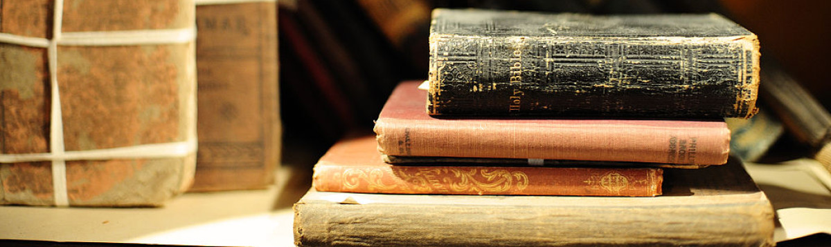
 Figure 1.
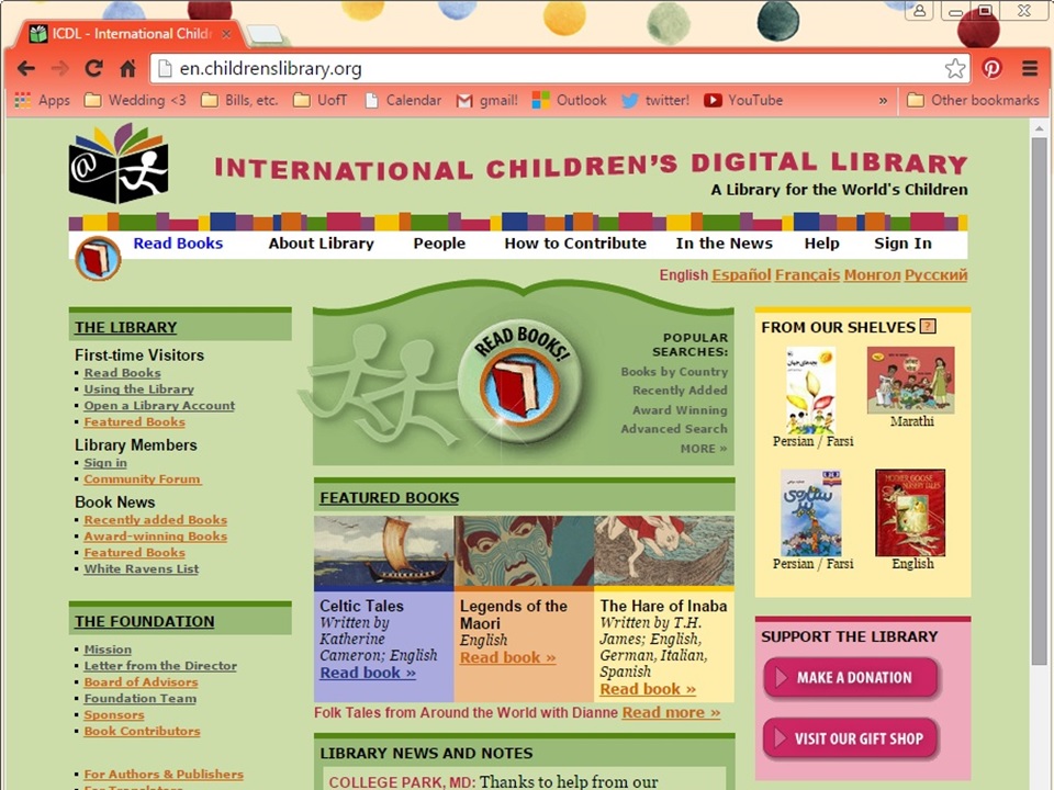 The ICDL is the result of internationally-motivated research out of the Human-Computer Interaction Laboratory at the University of Maryland. The ICDL is very socially-oriented, their aspiration being to “have every culture and language represented so that every child can know and appreciate the riches of children’s literature from the world community” (
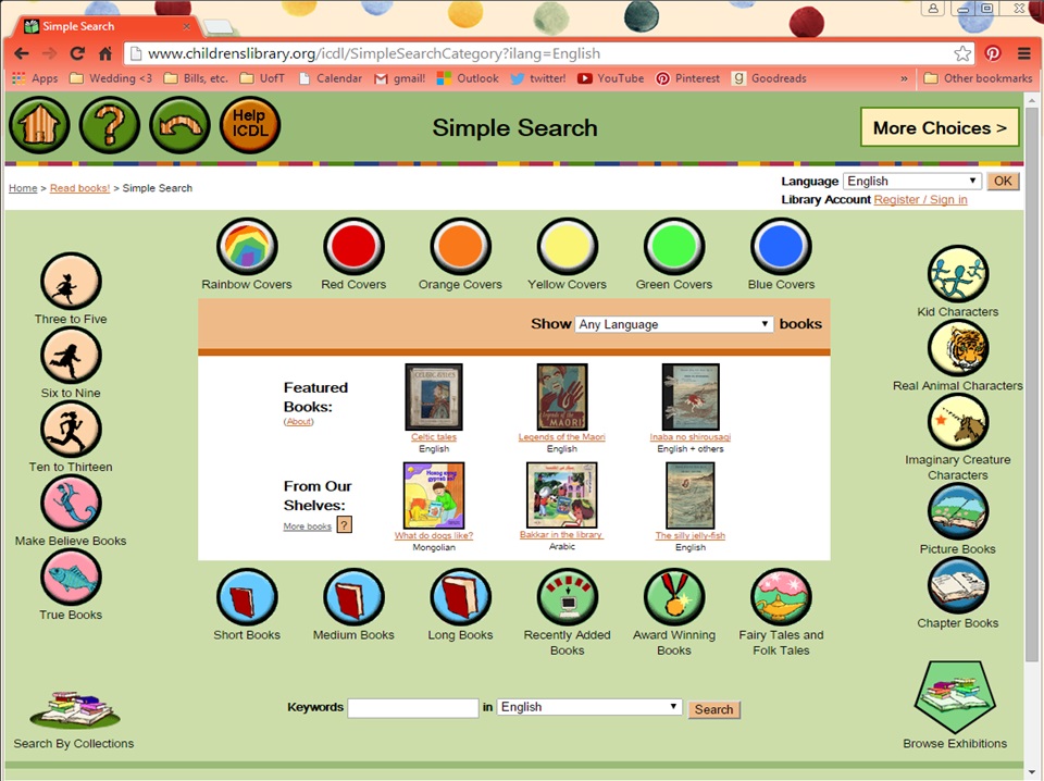
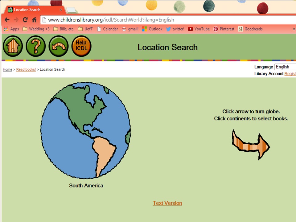
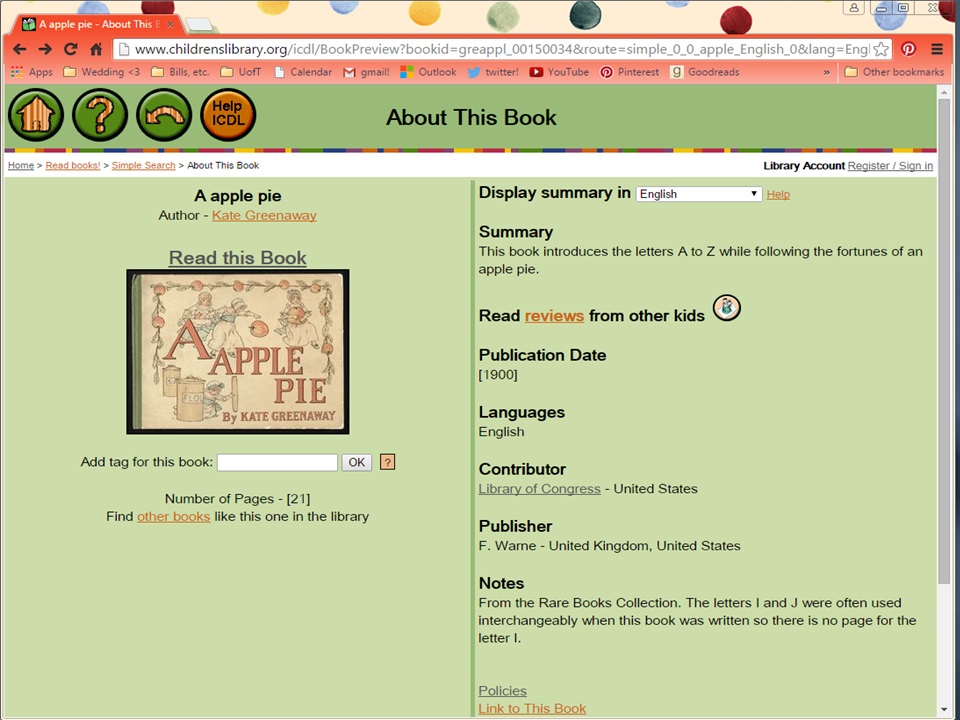
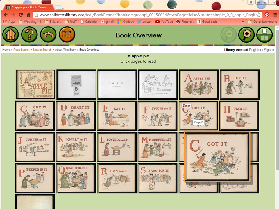


 Figure 1.
 Figure 2.