The example I ended up with this week looks at instances of digital images being unintentionally distorted in Google Maps. There are some pretty bizarre examples that can be viewed when looking at certain locations, which a digital artist named Kyle F. Williams has captured collectively after scouring Google Maps. I have included a couple of examples below (Figure 1 & 2), but if you want to see a bit more you can check out this article. They are sometimes comical, but mostly just strange, and definitely worth having a look at or trying to find your own. I believe this is a suitable example because it shows the contents of Google Maps having been, quite literally, disrupted (or perhaps disembodied is the more appropriate term) by the technology being used to capture it.
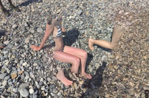
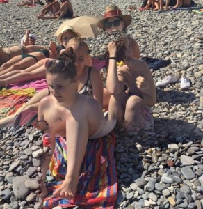
Fig. 1 & Fig. 2 Source: Doug Bolton/ Kyle F. Williams/Google Maps, (The Independent, 2016)
This happens because of errors in the stitching of the panoramas taken by the Google Street View technology, making the end result at odds with Google’s goal of creating a seamless panorama that can situate the viewer within a locale in a life-like way. It is also an interesting example because it only reflects one layer of the containers involved in Google maps, which is at the level of production and capturing of the photos, rather than a glitch within the software itself. However this still has real repercussions since Google’s photography in this circumstance is intended to be a faithful vehicle of representation.
In A Deep History of Electronic Textuality, Whitney Anne Trettien remarks on the pros and cons of reproduction in photography in relation to print when she notes that, “even as photography helped far-flung bibliographers collaborate on collating versions, it also threatened to disrupt the field with forgeries and even devalue the work of bibliography itself” (para.4). This only serves to highlight the fact that the difference between intention and result can be vast when seeking to represent something as a digital image. Ultimately these are inaccuracies that interrupt the experience the user is meant to have, and these images from Google Maps demonstrate that the experience is especially jarring when the object being represented is supposed to be reality.
Bibliography
Bolton, Doug. “Artist Captures Bizarre Distorted Images on Google Maps.” The Independent, 18 Feb. 2016. <http://www.independent.co.uk/life-style/gadgets-and-tech/news/google-maps-photo-spheres-kyle-f-williams-keelayjams-a6881396.html>.
Trettien, Whitney Anne. “A Deep History of Electronic Textuality: The Case of Eng/ish Reprints Jhon Milton Areopagitica.” Digital Humanities Quarterly. Volume 7 Number 1, 2013. <http://www.digitalhumanities.org/dhq/vol/7/1/000150/000150.html#shillingsburg1996b>.
Hi Sam,
I think this is a very interesting example. It is the first time I have been creeped out by a digital mistake. I think you were right when you mentioned that the difference between intention an result can vary when representing a digital image and that the inaccuracies interrupt the experience the user is meant to have. But I also think that people regardless of intention experience pictures and prices of writing based on perception. With the artist bringing his out perception to the pieces by turning them into artwork he is further providing the viewers with a second experience with the images. In this way he is changing the container, resulting in the change of the viewers experience.
Hi Kali! You bring up a really interesting point about the artist’s role in all of this. It would have been interesting to actually see the exhibit he put together and how his perception really comes into this beyond the locating and framing of these images. It’s a difficult example because there are so many “containers” at work, so how do we know where to focus when thinking about these sorts of questions? I think you’re right that it changes the viewers perception even more, making this interruption a consideration of art and the viewer where it wasn’t before.
I can’t even imagine the challenge of coding Google Maps. I like the idea that these mistakes take the viewer out of the intended experience. I wonder what people consider the “intended experience” of Google Maps to be?
Sam,
I thought this post was especially interesting as it links in funny ways to my own exploration of hands in Google books – in both cases there is an interruption in Google’s, as you aptly put it, “faithful vehicle of representation” – which both Google books and Google maps are intended to be. Also in both cases, people have actively sought out examples of these mistakes to compile, and have turned them into art. I think it is so fascinating a) that these mistakes have become part of an ongoing discussion regarding accountability and the ‘Googleization’ of everything and b) that by being made into art, they are somehow being recreated as new standalone objects – I have been wondering if this reincarnation as art is one way of speaking back to Google, and showing discontent over processes which we really have very little control, although that impact our lives greatly. In both cases as well, there is certainly something uncanny about this ‘human residue’ in Google’s digital representation of our world.