Week 7: How We Read, and Why

I have owned a Kobo ereader for about two years now and it’s impacted my reading habits in unexpected ways. I got an ereader particularly so that I could take out library books without waiting so long and read them without the migraines backlit screens give me after a while. I figured I would use it mostly to read library books, in particular nonfiction, which usually weigh about a thousand pounds per book. I was wrong.

Not long after I got my Kobo, it seemed like library ebooks exploded in popularity. Suddenly the holds lists I had been hoping to avoid were digital and even longer, as there are generally less digital than physical copies in the system. It became easier to get physical library books than ebooks, especially if they were in paperback. I still read the same amount of physical library books as I did before.

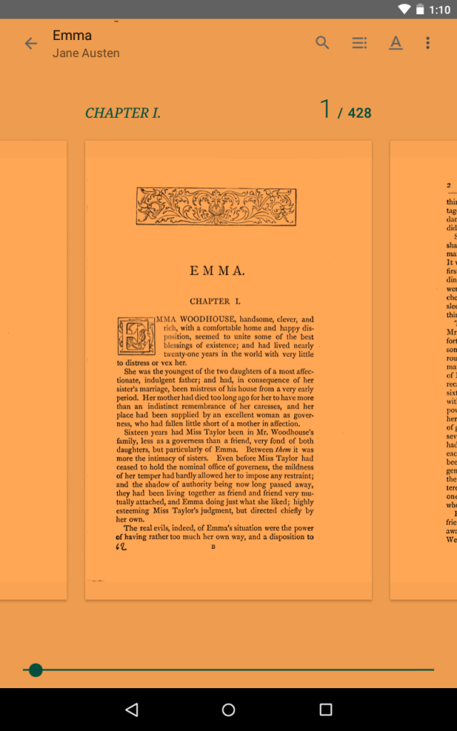
Certain types of writing influence me. I find it difficult to read authoritative writing (most nonfiction) on an ereader. For some reason, I can’t concentrate on it. Recently, I got an ebook on rabies out from the library. I get periodically obsessed with infectious diseases, and, having read a bunch of zombie books, was burningly curious about this devastating, zombie-plague-like infection. I opened it several times with great excitement, read a page, and found I couldn’t remember anything I had read. I’m curious to see if the physical copy will grab me. I expect it will. However, I do read scholarly articles on screen. This is mostly to save paper, and I purposefully force myself to do school readings digitally.

I generally read comics in physical trades, but if I read issues I need to read them digitally. When Neil Gaiman started publishing his new Sandman story, Overture, I bought the physical issues as they came out in order to get the full Sandman experience. I never read them. I have the same problem that I did with the nonfiction ebook. I have the physical trade on hold at the library so I can read the series.

Mostly, I find instead of reading some genres digitally and some physically, I go through phases. Sometimes I only want to read ebooks. Sometimes I can’t focus on e-text and only read physical books. Currently I’m in a physical phase.

I don’t remember having weird reading habits like these before I got into ebooks. I suppose the amount of choice they afford let me explore all the methods of reading and subconsciously settle on my favourites. Maybe, in terms of nonfiction tomes, I’m still hung up on the perceived authoritativeness of physical text versus ebooks. As many of the ebooks I’ve read have had formatting problems and mistakes (and this includes ones I’ve bought as well as library books) this may not be a completely unfounded assumption.

In case anyone is interested, the book on rabies I will eventually read is called Rabid: a cultural history of the world’s most diabolical virus by Bill Wasik and Monica Murphy.

The Sandman: Overture is a prequel to Neil Gaiman’s excellent Sandman series.

How We Read and Why

There are several items which I read distinctly on screen and on paper formats. I tend to read for pleasure on paper, therefore books and magazines will take this format. I read websites, emails, the news and journal articles on a screen. The main factors influencing my choice of formats are Convenience, Quality of Reading, and Emotional Influence.

For ease of use and availability I tend to read emails and the news on a screen. I do not feel the need to print them as typically one read through is enough and as I have a smart phone they can be referred back to later if I have forgotten something. Finding and buying a newspaper is inconvenient so I tend to opt to check the news through the CBC app. The app is much more portable and can be checked at a moments notice while waiting in line or commuting. I also tend to read journal articles on my laptop. This is not how I prefer to read them but to print the many articles I must read each week for school is very expensive and far heavier then finding them on my laptop.

Quality of reading is very important in my choice of reading on a screen versus paper. When I read off of a screen I have the tendency to skim rather than read deeply and I am far easier to distract and I am not alone. Many articles have been published with the results that readers who read off a screen over paper will skim and their comprehension will suffer (Rosenwald, 2015).

For this reason though I read articles on my laptop I will print my study notes and papers for proof reading. This allows me to concentrate on what is available without email notices popping up or distracting websites a click away.

The most important factor that influences my format choices is emotional influence. Aside from quality of reading, emotional influence also impacts my choice to study my notes on paper versus on a screen. Flipping pages while I study provides me with a sense of accomplishment and progress that I do not feel when I scroll. This is the same feeling I have when I am struggling through a text chapter in hard cover versus digital. This of accomplishment has been explained as a sensory offload that is supported by visual progress (Flood, 2014).

Though convenience is an important factor it does not always outweigh emotional impact. As I travel a lot on weekends for a time I switched to a Kobo reader because it is smaller and much lighter for packing. However while reading the kobo on the bus I found I could not read for as long and I would be more interested in what other people are doing then the story. Another aspect of emotional influence comes from my lack of luck with technology. I have dowloaded viruses at the most inconvenient of times and had accidents with three laptops resulting in a loss of all my notes. These incidents have cause me to develop a lack of trust in technology, trusting the tangibility of a book. I think I fear buying ebooks and having my Kobo die either by breaking or the soft or hardware becoming obsolete.  Needless to say I have switched back to paper books.

Emotional influence also influences my choice to read through pleasure on paper through nostalgia. I think most people who love books appreciate the smell of a new book and the feeling of a book in your hands. That is something one just does not experience on a laptop, iPad or eBook. Most of my reading happens on vacation or before sleeping. As a masters student I spend all day looking at a screen, doing work and reading a paper book allows me to disconnect from technology. I find I fall asleep faster and sleep better when I have the opportunity to read a paper book before falling asleep. This phenomenon has been examined in several studies that have found the light emitted by the reader causes the reader to become less sleepy and may take almost 10 minutes longer to fall asleep. Furthermore eReaders can cause less REM sleep and reduce reader alertness the next day (Flood, 2014).

IMG_0914

References

Flood, Alison. (2014). Ebooks at night won’t help you sleep tight, US study finds. The Guardian. Retrieved from: http://www.theguardian.com/books/2014/dec/23/ebooks-affect-sleep-alertness-harvard-study

Flood, Alison. (2014). Readers absorb less on Kindles then on paper, study finds. The Guardian. Retrieved from: http://www.theguardian.com/books/2014/aug/19/readers-absorb-less-kindles-paper-study-plot-ereader-digitisation

Rosenwald, Michael. (2015). Why digital natives prefer reading in print. Yes you read that right. The Washington Post. Retrieved from: https://www.washingtonpost.com/local/why-digital-natives-prefer-reading-in-print-yes-you-read-that-right/2015/02/22/8596ca86-b871-11e4-9423-f3d0a1ec335c_story.html

Week 6: The Page in the Digital Era

For this weeks blog, I took a look at the new app for the Toronto Star called “Star Touch”. After seeing numerous advertisements for the new app, I was curious to see how the layout compares to the traditional view of a page in the newspaper.

photo

The app has definitely taken a new approach to presenting content, making it more interactive and taking advantage of the digital medium to include more images and multimedia features. The app allows the reader to highlight words and gives the options to copy, define, or search Wikipedia (I apologize for the blurry image).

image[5]

Each “page” (a page referring to the content presented when one option is selected since the traditional term for a page within a newspaper can no longer be applied in this case) presents the content of an article in a column style view. In order to read the entire column, the reader scrolls down the column and can read through the article. In this way, the Star Touch continues to present the newspaper in a somewhat traditional format by holding on to the idea that newspapers present content in a column format.

image[2]

The app also allows the reader to view the article in “Full screen”, which opens individual column in a “page” with black text on a white background. This page goes even further and offers an automatic scroll down option (readers can control the speed) and three text views (Normal, Sepia and Night). This feature is great for individuals, like myself, who find the illustrates in the “page” very distracting.

image (2)

However, there are also a number of instances where content was presented in a way that is unique to digital versions of newspapers. If you see the example below, the content of these commentaries only appears when the individual option is selected.  This content would traditionally be represented in a side column on the same page of the article, allowing the reader to take in all the information and available content at a glance (see image below for a comparison of the more “traditional” view of a newspaper article). The Star Touch breaks down some articles into sections, making the reader click through numerous “pages” in order to get all the content related to the article.

image
Star Touch View
parent-article
“Traditional” View

Piper’s hope is that “we continue to look beyond the page”. I think that the Star Touch app has reinvented the way that we view a page within the newspaper by changing the way we view the page to adapt to the medium by which it is delivered. Star Touch embraced the technology that would be presenting the content, and encourages the reader to touch, read and view the content within. I think it has really lived up to its advertisements in which it boasts at having reinvented the way we look at news. I think that Star Touch has looked beyond the page, and created a more interactive way of engaging with the content.

Bibliography

Piper, Andrew. “Turning the Page (Roaming, Zooming, Streaming).” InBook Was There: Reading in Electronic Times, 45-61. Chicago: University of Chicago Press, 2012.


Week 6: The Navigational Page

For this blog post I decided to download a free sample of an experimental text only readable online which actually specifies that it is best read on a mobile device. I first heard about it through the Guardian article, What apps next? Publishers and developers embrace ‘unprintable’ fiction, which you can read here. The text is called The Truth About Cats and Dogs, and is the collaborative project of two poets Sam Riviere and Joe Dunthorne. It was published by Visual Editions (collaboratively with Editions At Play), the same publisher who was responsible for Safran Foer’s Tree of Codes, who seem to have a vested interest in producing literature that explores the physicality of its manifestation self-reflexively. The text allows the reader to switch back and forth between the writing of each author at any point during reading, which means that the page being viewed is really the only page that matters at any given moment. And yet there is a sense of linear temporality created as the story moves forward at the mercy of the readers tap. Interestingly the concept of scrolling, which we so easily associate with digital texts, is absent. Instead one navigates the story through the comfortable motion of tapping, creating a similar sensation of ease as akin to playing mindless games on one’s mobile phone. The article includes an illustration that provides a sort of flow chart for visualizing how the reader engages with the navigation of the page (See Figure 1).

4893

Figure 1. Source: Richard Lea, “What apps next? Publishers and developers embrace ‘unprintable’ fiction,” The Guardian (2016): http://www.theguardian.com/books/2016/feb/03/publishers-developers-digital-technology-unprintable-fiction-google-editions-play

In Introduction: Architectures, Ideologies and Materials of the Page, Peter Stoicheff and Andrew Taylor consider the page from three different perspectives: its material, architectural and ideological components. Since my experience with the material components of the page of this text won’t change for me as a user of a single mobile device, I’m going to focus on considering the architecture and ideologies embedded in the pages of this work.

To go back to the motion of tapping through the story – this quality dictates how much text is going to be on any given page, dividing it into very intentional segments. The architecture of the text is therefore influenced by its interactive qualities. Because there is no endless scroll, the text is portioned out onto individual interactive pages. The pages also vary in colour depending on whose writing is being read and vary in design. Generally they look like some version of the page shown in Figure 2.

unnamed

Figure 2. Source:

As the reader taps through the story, a little circle moves along the grid below, creating an aesthetic sense of progression. Each page is in conversation with the text’s navigational movement, which is certainly a feature that makes the experience of reading this book “unprintable.” This motion embedded within the page reflects our cultural ideology in a big way. The creators of the book were aware of this as publisher Anna Gerber mentions in the article that she wanted to “make books that are… not games and… not apps – they’re all built out of HTML – but each one is impossible to envisage on paper” (Lea). The creators were aware of it having a similar experience to a game or app of some other design, and wanted to explore how they could create a compelling piece of art with similar technology. So there is very much a sense of the experience of the page not being describable in a traditional sense of a printed book, or even within the notions of the digital page found elsewhere, but rather reflecting the architectural and ideological blurring of boundaries between game and book via its navigational technology.


Bibliography 

Lea, Richard. “What apps next? Publishers and developers embrace ‘unprintable’ fiction.” The Guardian (2016): http://www.theguardian.com/books/2016/feb/03/publishers-developers-digital-technology-unprintable-fiction-google-editions-play

Riviere, Sam and Joe Dunthorne. The Truth About Cats and Dogs. Visual Editions, 2016.

Stoicheff, Peter, and Andrew Taylor. Introduction to The Future of the Page, 3-25. Toronto: University of Toronto Press, 2004.


Re-discovering Emma on/and the page

This is also a post made long by pictures…

While not necessarily a remarkable example of a ‘digital page’, this week’s blog post did give me some greater insight into digital pages generally. I have a difficult time reading digital texts and have spent almost no time exploring the different interfaces and options that are available. That being said, when I was considering this topic, I remembered that I do own a nexus tablet (albeit one that mostly gathers dust). It was a gift, and at the time I received it, I can remember going onto Project Gutenberg and downloading some of their free EPUB style e-books into my Google books ‘library’. I promptly never looked at it since. I decided that this would be a good opportunity to explore it further. I chose Jane Austen’s Emma as my text of focus and found many fascinating features that I had no idea existed. To begin, there certainly is a seemingly greater freedom on the part of readers with regards to page layout, look, and design. The most macro view reminds me of Andrew Piper’s notion of ‘zooming’ – “if roaming expands the horizontal edges of the page, zooming bursts through the page’s two-dimensionality” (56). Using two fingers you can change the scale of the text in question to see an expanded view of the page that includes multiple fragments of the preceding and following pages (as well as extra-textual material and setting symbols) :

Screenshot_2016-02-26-01-01-16

Alternatively, you can zoom in to the macro view of the page as a single unit:

Screenshot_2016-02-26-01-03-22

On a side note – the funny amber hue of the page that you can see is the ‘night light’ feature, which claims, in romantic tones – “as the sun sets, Night Light gradually filters the blue light from your screen, replacing it with a warm, amber light that’s better for reading.” Who knew?

It turns out that if you rotate the tablet, the auto-rotate screen will provide you with both the verso pages and recto pages (although without a gutter margin…), thus bringing back Piper’s assertion of ‘pages as mirrors’ into the e-book equation; once again “pages face each other; they comment, reflect, illustrate, or confound one another” (52). Only in this mode can pages exist side by side.

Screenshot_2016-02-26-01-04-17

Of course, in a digital text, the ‘pages’ are not a fixed unit of text (this is something I have always found unsettling – trying to read a text which moves independently of its page numbers). Thus, what you can see in this latest image is not in fact a new recto page, but merely an extension of the text on the verso side, which in the landscape view, can stretch out slightly.

In playing around with the features, I discovered the ‘maxed out’ micro view, essentially where the screen is focused on a small handful of words – helpful for magnifying, although to the point where the words lose their context in relation to the page as a whole.

Screenshot_2016-02-26-01-06-32

Here I also discovered some of the additional features (I’m sure seasoned readers of e-books are laughing at my naiveté by now…). Again, who knew that with just one finger tap you can copy, annotate, highlight, search, and define? The possibilities seem endless. What of Piper’s assertion that, “it may be that we should no longer even call this reading,” or that “we are breeding generations of distracted readers, people who simply cannot pay attention long enough to finish a book” (46) – what do these many opportunities and rabbit holes entail for the process of reading itself?

Another thing I have never been able to wrap my head around is the sort of generic, robotic seeming uni-font that most e-books employ. I discovered in my explorations that in this particular case I had the option to see the ‘original pages’ of the text (scanned by Google books):

Screenshot_2016-02-26-01-10-10

I can’t help but wonder if the friendly and familiar ornamentation and illustrated initial helped me feel more at home with this variation of the page. On this note, I discovered the ‘read aloud’ setting, no doubt a wonderful accessibility feature – although in the advanced settings, found that you could opt for a ‘high-quality voice’ which claims to “use a more natural voice to read aloud” – so what of a more ‘high-quality page’? One that appears ‘more natural’? More than anything, I was struck by the strange physicality of the digital page (or lack thereof) – the digital ghost page requires such little human intervention – try interacting with, or try touching a physical book in the same way – it is utterly ineffective, clumsy, and potentially damaging (you would risk crumpled or ripped pages to say the least…). Once again, a different physicality of reading, the embodiment, the motions, has to be learned here – is not intuitive (at least at first). I found interacting with this book to be clumsy, like learning another language.

I am certainly intrigued by the options provided by digital texts within this type of platform, although I am hard pressed to imagine this digital hologram as a sort of stand in for the printed page; as Piper puts it, “the digital page, by contrast, is a fake, a simulation called up from distributed data. It is not really there” (54). This seems to be where I’m stuck – no matter how much I swipe, and zoom, and pinch, I just can’t seem to feel anything.

References:

Austen, Jane. (1886). Emma: A novel [Play Books EPUB version]. Retrieved from Project Gutenberg. http://www.gutenberg.org/ebooks/158.

Piper, Andrew. (2012). Turning the page (roaming, zooming, streaming). In Book was there: Reading in electronic times (pp. 45-61). Chicago: The University of Chicago Press.

FB Iconography

This week I decided to take a closer look at a page that (for better or worse) I view frequently: The Facebook Page. I chose this site because I believe it is a good jumping off point to begin a discussion of Andrew Piper’s work. Perhaps because I spend a good deal of time answering questions about “reading” websites for library patrons- of particular interest to me are his ideas concerning the shifting nature of literacy in the presence of digital pages.

You’ll notice in the top right corner of the Facebook screenshot a series of icons. Due to the somewhat unsettling fact that I have been using this social networking site for eight years, and because I frequently use computers and other ICTs, I know that the pictures of an arrow, lock, globe, and speech bubbles are symbols. For example, the globe is a label for my notifications button. As other long-time users of Facebook can attest to, this has not always been the case. At one time that button said ‘notifications.’ This use of symbols is not isolated to Facebook: when exactly did three horizontal lines stacked on top of one another come to mean “Menu”? This language of symbols is not self-evident to people who seldom use computers, or who are learning to use them for the first time. Yesterday, as I helped a patron access information for tax purposes, they asked “Was it hard for you to learn computers?” I had no satisfactory answer for this question, as I cannot recall the first time I used a computer, although I must have been around eight years old, old enough to remember such things.

Piper writes: “Sentences have become pixilated, divorced from their normal grammar in the same way that the digital page is no longer connected to the spine of a book” (56). Here, the imagery of pixilation captures the iconography of the internet which is gradually doing away with written words in its adoption of a language of symbols that consists of images without context. It isn’t until you try to explain to an adult much older than yourself why the three horizontal lines means menu that the taken-for-granted connection between signifier and signified is disrupted.

***

Piper, Andrew. “Turning the Page (Roaming, Zooming, Streaming).” In Book Was There: Reading in Electronic Times. University of Chicago Press, 2012.

Flushing the Page

For this week’s blog post I was not really sure what to do. During my research I came across two instances of books on toilet paper: the first was intended as a joke, the second a purposeful publication.

Usually, when we think of a book and its pages we associate it with a permanent, solidified existence and the digital realm as ephemeral. According to Stoicheff and Taylor, digital texts are viewed for their flexibility, ease of use, and dissemination around the globe for commentary (2004, p. 4). On the other hand, physical pages carry authority because of its long history in academic and intellectual pursuits. Our understanding of the page is rooted in its history (ibid, p. 8).

What I find interesting about the toilet paper novels is that they symbolize the impermanence of text. They are not meant to last, they are single use only. The first book on toilet paper that I came across was Moby Dick. The novel was typed out on toilet paper and transformed the book from a codex back to a scroll.

Toilet paper book
© Melville House

By doing so, the toilet paper book no longer facilitated discontinuous or selective reading, but changed it to continuous. The pages could no longer be viewed as an individuation according to Piper’s definition; it became a scroll where only the recto side could be seen. Consequently, Piper’s view of the page as a mirror is also changed with the toilet paper as we cannot read the pages in opposition of each other (2012, p. 52).

Piper also discusses how we read pages: we use actions such as roaming, zooming, and streaming (p. 55-58). However, with a toilet paper novel the actions of zooming and streaming are not possible. We cannot zoom the text of the toilet paper novel as it is very much tied to the materiality of the paper it is printed on. On the other hand, streaming talks of the ephemerality of the page because once a piece is used it is discarded and the information on it is gone. So too is the page of the toilet paper novel: once it has been used, it is no longer there, you cannot revisit it.

The difference between the Moby Dick novel and the Japanese novel is the way the information is laid out on the paper. The horror novel relies on Japanese folklore and superstitions as the basis for being published on toilet paper.

toiletpaper book
©Koji Suzuki

The Japanese novel is laid out to emulate the page in how it incorporates white space, possibly due to the vertical writing of the Japanese language as opposed to the horizontal writing of English. However, it does play with the permanence of published material. It defies the logic of the preservation of the page and instead focuses on what Piper describes as writing as a stream (2012, p. 58). Either way, it is not the type of thing one thinks about when you say book, page, or novel.

References

Piper, Andrew. “Turning the Page (Roaming, Zooming, Streaming).” InBook Was There: Reading in Electronic Times, 45-61. Chicago: University of Chicago Press, 2012.

Robins, Ellie. (2012). Moby Dick Toilet Paper. Melville House. Retrieved from http://www.mhpbooks.com/done-moby-dick-toilet-paper/

Ryall, Julian. (2009). Japanese publisher prints horror novel on toilet roll. Retrieved from http://www.telegraph.co.uk/news/newstopics/howaboutthat/5381234/Japanese-publisher-prints-horror-novel-on-toilet-roll.html

Stoicheff, Peter, and Andrew Taylor. Introduction to The Future of the Page, 3-25. Toronto: University of Toronto Press, 2004.

Week 6: Exploring the Expanded Page

I had trouble finding a topic for this post, as most of the digital texts I read adhere to the traditional format of the page. However, Andrew Piper’s comments on the “crowdedness of the digital page” and its resonance with medieval and later scholarly texts got me thinking (2012, 45-46). Crowdedness is indeed not simply a digital phenomenon. It exists in physical texts today, for instance in the pages of magazines. I decided to look at how digital magazines navigate space and the page though the Zinio app for iPad.

This blog post is not about that, however, because as soon as I started to look through Zinio I was blown away by something quite different. I randomly chose a National Geographic magazine from August 2013 (the last time I used this app). It opened onto a horizontal page, the magazine cover, with a photograph of a recumbent lion. Before my eyes, the lion sprang up from its horizontal position and looked around.

IMG_0030IMG_0033IMG_0031

While Piper mentions the “publisher’s dream” of future “enhanced e-books,” with their animation and “pop-up windows,” magazines seem to have already realized it (2012, 46). In the Table of Contents it became clear that multiple stories in the magazine contained audio and video elements along with text.

This was cropped to remove a disturbing image.

Also interesting was the fact that the pages displayed horizontally rather than vertically. For some reason, National Geographic chose to forgo the ancient vertical page format that Stoicheff and Taylor (2004) traced from Sumer to the modern computer screen. The horizontal view does fit the content, though, and it allows photos to dominate the page.

Reading an article in the digital magazine was an interesting experience. Physical magazines are organized like books, with articles spread over multiple pages. The digital National Geographic chose a different approach. The magazine can be read by swiping left, with each photograph occupying a single digital page. However, articles are organized vertically and are read by moving the page up. The thumbnail navigation view shows this best.

IMG_0035

Other articles displayed differently. An interview with astronaut Sunita Williams was displayed on one “page” as a text box that could be scrolled through, accompanied by a large photograph and a linked video.

IMG_0038

The digital magazine combines the best aspects of the physical and the digital. The layout, though crowded, is still easy to read, without the annoying blinking ads and distraction inherent to online articles. However, the digital space allows it to expand the content it offers and make such content easily accessible. The magazine can be read linearly. It can also be roamed, zoomed, and streamed.

As well, magazines like National Geographic are inherently multimedia objects. I mean, who really reads it for the articles? It’s all about the photos. The physical page can only support so much media before its limitations are reached. While still organized in pages, the digital National Geographic manipulates the form and function of the digital page to provide a rich, multimedia reading, viewing, and listening experience.

Note: This was my experience using the Zinio iPad app. Zinio’s web-based reader is quite different.

Zinio is an eMagazine provider. It can be used for free by anyone with a Toronto Public Library card: http://www.torontopubliclibrary.ca/books-video-music/downloads-ebooks/zinio-help.jsp

References:

National Geographic. August 2013.

Piper, Andrew. “Turning the Page (Roaming, Zooming, Streaming).” In Book Was There: Reading in Electronic Times, 45-61. Chicago: University of Chicago Press, 2012.

Stoicheff, Peter, and Andrew Taylor. Introduction to The Future of the Page, 3-25. Toronto: University of Toronto Press, 2004.

Pages as (Wild) Cards

Check out this screenshot:

Screenshot 2016-02-25 at 10.25.56 AM
Screen capture of Google search for “what is a page” – with results showing a card in the form of a definition. (By author, Feb. 25, 2016.)

Okay, let’s cover the basics. This is a webpage. At the bottom of the image there are the familiar list of blue links that lead to other webpages. Below those links are more links, and finally navigation at the bottom of the page to go to the next page of search results. Unsurprisingly, there are over 5 billion “hits” for the query – so there are a lot of pages. But the search engine organizes these in order of relevancy – that’s what makes a search engine like Google so useful, of course.

But Google evidently does not think that links sorted by relevancy is useful enough – so they went a step further. They introduced “cards.” These are relatively new features of Google searches (and they can also be found in a lot Google products with “material design”, such as Google Now.) They are discrete, framed, drop-shadowed rectangles that tries to distill the most useful information related to a search. In the example above, Google provides the definition of what a page is in a card.

In a way, this card is a page within a page. That is, there is the webpage of search results and – floating and framed just below the search field – is a page in the form of a “card.” It is easy to see how cards are a response to the information overload that even relevancy-based sorting still produces. Put simply, a bunch of blue links with descriptions can be a lot more than is needed. As Andrew Piper notes in general about digital reading, “There is just too much stuff on the screen now” (p. 26). Interestingly, these Google cards can be viewed as an evolution of pages, especially in the context of Piper’s notion of pages as frames: “Pages are an attempt to grasp that which is around us, to bring it down to size, to order it” (49). This sounds exactly like what Google does with its various cards. What is intriguing is just how small these cards are – the “bring[ing] it down to size” is so small that Google’s framed results resemble more of an index card than a book page…

Bibliography:

Piper, Andrew. “Turning the Page (Roaming, Zooming, Streaming).” In Book Was There: Reading in Electronic Times. University of Chicago Press, 2012.

The Reinvented Page: The Uber App

When considering the future of the page as I haven’t experienced many ebooks- especially innovative or unique ones- what first came to mind were apps. Apps are continuously being invented and their immense numbers require the apps to be innovative or exciting to capture user attention. One app in particular that I will be discussing is the Uber app. When the user opens the Uber app an interactive map appears which tracks the user’s location through GPS. The user is able to request a pick up and drop off location after selecting the type of car or the user may select Uber eats which delivers take out. The user is then billed directly through the app.

When reading Peter Stoicheff and Andrew Taylor’s article (2004),  “Introduction to The Future of the Page” several interesting points of the components of a page that are similarly reflected in the Uber app.The article states that the page became the most important place for displaying information and determined intellectual authority, logical arguments and useful information (Stoicheff, & Taylor, 2004). Cell phones and iPads have become so much a part of our everyday and for many the main source of news and communication it can be argued that they have achieved the same attributes. The Uber app for many is a regular source of transportation and a very useful tool.  Their article also states that the rectangular shape, format and layout of the page has become so familiar to us that we do not even notice it (Stoicheff, & Taylor, 2004). I believe that this can be applied further to applications on a cell phone or iPad whose screens are so familiar we have begun to not notice their format and even the layout of most cell phones follows that same rectangular shape. Stoicheff and Andrew (2004) reflect that the book is never fully encountered except as an expectation, recollection or when closed. The same can be said for the Uber app. The user can only be experienced one page at a time and the user may never see the backend of the program.

While it may be argued that the architecture of the page has not changed significantly  since it’s early years, I believe this has shifted with the creation of the digital page. As stated by Stoicheff and Andrew (2004), “the advent of the digital page has created a writing space of tremendous flexibility and ease of use”. The Uber app demonstrates flexibility with it’s interactive, non- static nature and by displaying live maps along with text.

IMG_0912 IMG_0913

Reference:

Stoicheff, Peter and Andrew Taylor. Introduction to The Future of the Page. University of Toronto Press, 2004. 3-25.