
I had trouble finding a topic for this post, as most of the digital texts I read adhere to the traditional format of the page. However, Andrew Piper’s comments on the “crowdedness of the digital page” and its resonance with medieval and later scholarly texts got me thinking (2012, 45-46). Crowdedness is indeed not simply a digital phenomenon. It exists in physical texts today, for instance in the pages of magazines. I decided to look at how digital magazines navigate space and the page though the Zinio app for iPad.
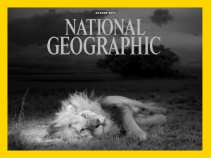
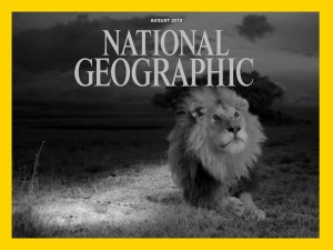
This blog post is not about that, however, because as soon as I started to look through Zinio I was blown away by something quite different. I randomly chose a National Geographic magazine from August 2013 (the last time I used this app). It opened onto a horizontal page, the magazine cover, with a photograph of a recumbent lion. Before my eyes, the lion sprang up from its horizontal position and looked around.
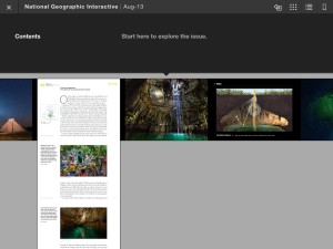
While Piper mentions the “publisher’s dream” of future “enhanced e-books,” with their animation and “pop-up windows,” magazines seem to have already realized it (2012, 46). In the Table of Contents it became clear that multiple stories in the magazine contained audio and video elements along with text.

Also interesting was the fact that the pages displayed horizontally rather than vertically. For some reason, National Geographic chose to forgo the ancient vertical page format that Stoicheff and Taylor (2004) traced from Sumer to the modern computer screen. The horizontal view does fit the content, though, and it allows photos to dominate the page.
Reading an article in the digital magazine was an interesting experience. Physical magazines are organized like books, with articles spread over multiple pages. The digital National Geographic chose a different approach. The magazine can be read by swiping left, with each photograph occupying a single digital page. However, articles are organized vertically and are read by moving the page up. The thumbnail navigation view shows this best.
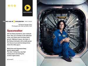
Other articles displayed differently. An interview with astronaut Sunita Williams was displayed on one “page” as a text box that could be scrolled through, accompanied by a large photograph and a linked video.
The digital magazine combines the best aspects of the physical and the digital. The layout, though crowded, is still easy to read, without the annoying blinking ads and distraction inherent to online articles. However, the digital space allows it to expand the content it offers and make such content easily accessible. The magazine can be read linearly. It can also be roamed, zoomed, and streamed.
As well, magazines like National Geographic are inherently multimedia objects. I mean, who really reads it for the articles? It’s all about the photos. The physical page can only support so much media before its limitations are reached. While still organized in pages, the digital National Geographic manipulates the form and function of the digital page to provide a rich, multimedia reading, viewing, and listening experience.
Note: This was my experience using the Zinio iPad app. Zinio’s web-based reader is quite different.
Zinio is an eMagazine provider. It can be used for free by anyone with a Toronto Public Library card: http://www.torontopubliclibrary.ca/books-video-music/downloads-ebooks/zinio-help.jsp
References:
National Geographic. August 2013.
Piper, Andrew. “Turning the Page (Roaming, Zooming, Streaming).” In Book Was There: Reading in Electronic Times, 45-61. Chicago: University of Chicago Press, 2012.
Stoicheff, Peter, and Andrew Taylor. Introduction to The Future of the Page, 3-25. Toronto: University of Toronto Press, 2004.
Hi Isabel,
Great post! I was looking at the digital version of National Geographic in Week 3, and was really impressed with how efficient it was in terms of space and layout. I loved the fact that it was interactive, and you could view more or less information as desired. You are right about the pictures being one of the main draws of the magazine, and I appreciated the fact that with the digital version you could minimize captions to view the picture all on its own. Often in the print version, captions obscure part of the image and take away from its overall effect.
Check out my post here for more of my thoughts on its navigational tools: http://metadefect.com/2016/01/week-3-digitization-representation-emagazines/
Hi Stephanie,
That’s so funny! I should probably read this blog more carefully.