My Time Machine Kinda Sucks…

So, I plan on going back just three years, to 2013.  My time machine isn’t very advanced, I suppose.

This is the year that the alleged first bookless public library opened: BiblioTech in San Antonio. This library loans out ereaders and, of course, ebooks while forgoing print books. My message would be about books and about libraries.

Regarding books, I would caution the library – and the world at large – that a binary decision between ebooks and print books is a false choice. In 2016, it is looking more and more likely that a hybrid model of books is here to stay for the short-to-medium term.

Regarding libraries, I would remind them that the immediate embrace of a bookless physical space may fail to capitalize on the library brand. Indeed, a 2010 OCLC survey showed that 75% of people associate libraries first and foremost with books (Gauder 38). This strong book brand should still be leveraged. Plus, in light of concerns about the longevity of digital media, “[p]aper is still the best medium of preservation, and libraries still need to fill their shelves with… paper” (Darnton 109-110). To that end, any local histories might be best stored as print books, not ebooks. An all digital collection is preparing for a future that may never becoming the present in our lifetimes.
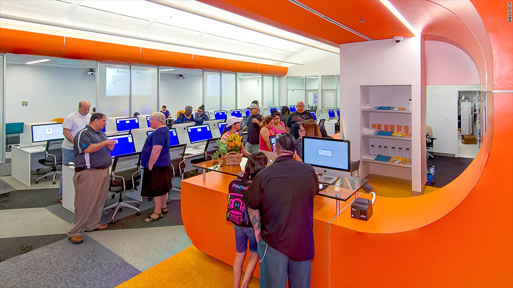
Bookless Library
BiblioTech in San Antonio – the first all-digital, bookless public library. Source: http://money.cnn.com/2013/10/08/technology/innovation/bibliotech-ebook-library/

Bibliography:

Darnton, Robert. The Case for Books: Past, Present, and Future. New York: PublicAffairs , 2009. Print.

Gauder, Brad, ed. Perceptions of Libraries, 2010: Context and Community. Dublin, Ohio: OCLC, 2011. Print.

It’s About the Journey, Not the Ownership

This week’s question lends itself to so many specific examples, I felt a bit dizzy trying to decide what particular examples to write about in relation to the changing nature ownership in my lifetime. (Short answer: so many things.)

So, I figured I’d take a step back and discuss the changing nature of ownership in general – specifically, how the pleasure of ownership has been replaced with the pleasure leading up to ownership. (Hence the overly cute title of this blog post… apologies.)

In 2013, Russell Belk updated his landmark study published in the Journal of Consumer Research with a game-changing finding: The up-and-coming Generation Y is the first cohort not to rank ownership as the most appealing part of shopping. Rather, it was the decision process leading up to that decision, usually in the form of reading online reviews and comparing options for purchase (Belk).

This rings true.

For me, the process of discovery for books – let’s use that as an example – is more important and satisfying than ownership. This could involve browsing GoodReads or library shelves. Even the act of finding a good deal at a used bookstore like BMV is more of the appeal of shopping than the ownership of the product, in my experience. While I may insist on having all of the books by a favorite author, I am happy to borrow books and add them to a reading log (e.g. GoodReads) in place of ownership.

That said, all of the choices and information about products can make even the simplest decisions comically fraught

Set of book icons in flat design style.
Some colourful books to make this post more fun! (Licensed image owned by author).

Works cited:

Belk, Russell W. “Extended Self in a Digital World.” Journal of Consumer Research 40 (3): 477-500. 2013. Web. 20 March 2016.

The Future of… Reading Motivation

The more I think about it, the more I realize the concept of “the future of the book” is limiting, if not downright problematic. At first glance, it implies that books are artifacts akin to smartphones, which annually undergo upgrades that largely (though not always) are the product of technological advances and “upgrades.” In other words, “the future of the book” gives the implication that books are mere artifacts that evolve in a vacuum with some Steve Jobs-like figure (maybe Jeff Brezos?) deciding on new features for books – even though we know the field encompasses much more than its moniker may initially suggest.

For my research paper, I’m considering examining readers of books. Books have no future if there are no readers. Along these lines, I plan on looking at reading motivation of books. This kind of motivation – especially in the form of library programs and personal practices – has a role in determining how much prominence the reading of the books has in society.

A prime example of personal practices that seem to have gained popularity in recent years are reading challenges, which encourage readers to read more and read more widely.

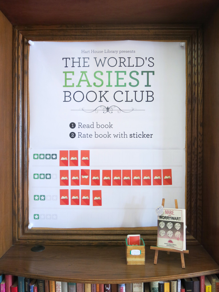
Also, there are many, many examples of libraries that try to encourage reading through general and specific means. Below is a picture of a small passive program to motivate patrons to read at Hart House Library:

Mary - Final Picture
Taken by author. Hart House Library, Toronto. March 3, 2016.

I hope to examine how and why reading motivation programs and practices have changed over time – and to attempt to determine where they might go in the future.

Boom Mics and Other Movie “Mistakes”

There are entire websites devoted to instances when elements of the production of a film (which forms the container) accidentally appears in the final film (the content). I’m looking at you, MovieMistakes.com. More than a typo in a book, or broken code on a website, a visible mistake in a film – such as the reflection of a camera in a doorknob – is more uncanny. Why? My assessment is that film is ostensibly a more immersive medium, its artifice not being as apparent as a bunch of pages with ink on them, for example.

Here is a nifty video that outlines some of the intrusions of films’ productions within the film itself (caution: there is some PG-13-level gore in the scenes between 4:00-5:00 minutes in the Gladiator scenes):

Careful attention to detail during the shooting and editing phases is required to ensure these mistakes don’t take the viewer “out of the story.” And certain shots with mirrors become a bit of a technical hurdle when telling a story in film – think of all the shots that were never attempted or scraped because of worrying about the fourth wall being broken because of simple reflections.

Interestingly, in faux-documentaries TV shows like The Office and Arrested Development this intrusion is played with from time to time. Namely, there are running gags – or maybe you could just call them stylistic flourishes – of boom mics entering the frame, intentionally. So whereas mistakes in the films shown in the above clip are accidentally turned into content, those same mistakes are turned into content in those shows intentionally. The container and content become messily combined.

Bibliography

Screen Rant. “10 Movie Mistakes That Slipped Through Editing.” Online video. 11 July 2015. YouTube. https://www.youtube.com/watch?v=_TWbD3MKfM. 10 March 2016.

Newspapers – More Like Nuisance-papers (I am so sorry…)

This post is about how I do not enjoy reading traditional print newspapers. (Gosh, talk about kicking an industry while it’s down…) I prefer to read my news on screens, be it phones, tablets or laptops.

Here are some reasons why:

  • Cost. I would rather suffer online ads than spend a loonie for the physical thing, which also has ads.  After all, I tend only to buy reading material I want to collect – and my paper mache days are behind me. (This is an obvious, unexciting reason, but still important.)
  • Ease of use. This is a big factor. Trying to read traditional, folding newspaper – the ones that fold out to the size of a small continent (feel free to add the formal term for them in the comments, if you know it off the top of your head – is it broadsheets?) – can be cumbersome to read. Sections fall out, strange creases develop, and everybody standing next to you on a packed subway car is looking at you like you’re a demon when you try to expand it and fold it over to a new section (an reaction to which I’m sympathetic). Even after I cull out the “Sports” section, a weekend newspaper is not ideal for travelling. I think it’s telling that non-traditional newspapers like NOW and 24 and Metro are bound like magazines, making them much more user friendly insofar as they are travel friendly. But even those publications are gigantically cumbersome compared to a reading surface that fits in the palm of your hand for consuming news during rush hour on the TTC. That’s why I prefer to read news on my smartphone.
  • I sometimes get ink smudges on my hands and then they get all over my face – alas…

Pages as (Wild) Cards

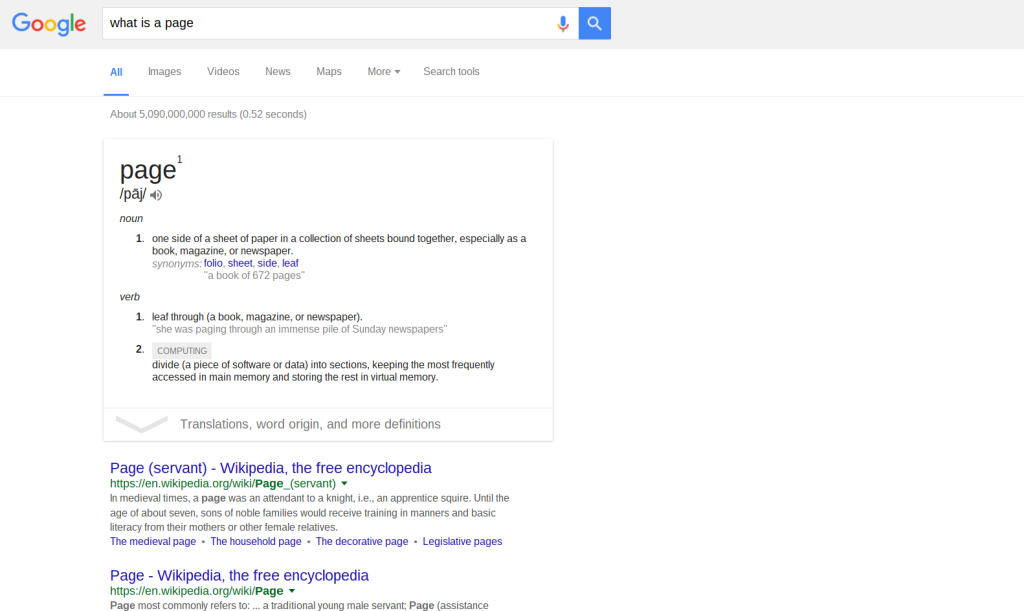
Check out this screenshot:

Screenshot 2016-02-25 at 10.25.56 AM
Screen capture of Google search for “what is a page” – with results showing a card in the form of a definition. (By author, Feb. 25, 2016.)

Okay, let’s cover the basics. This is a webpage. At the bottom of the image there are the familiar list of blue links that lead to other webpages. Below those links are more links, and finally navigation at the bottom of the page to go to the next page of search results. Unsurprisingly, there are over 5 billion “hits” for the query – so there are a lot of pages. But the search engine organizes these in order of relevancy – that’s what makes a search engine like Google so useful, of course.

But Google evidently does not think that links sorted by relevancy is useful enough – so they went a step further. They introduced “cards.” These are relatively new features of Google searches (and they can also be found in a lot Google products with “material design”, such as Google Now.) They are discrete, framed, drop-shadowed rectangles that tries to distill the most useful information related to a search. In the example above, Google provides the definition of what a page is in a card.

In a way, this card is a page within a page. That is, there is the webpage of search results and – floating and framed just below the search field – is a page in the form of a “card.” It is easy to see how cards are a response to the information overload that even relevancy-based sorting still produces. Put simply, a bunch of blue links with descriptions can be a lot more than is needed. As Andrew Piper notes in general about digital reading, “There is just too much stuff on the screen now” (p. 26). Interestingly, these Google cards can be viewed as an evolution of pages, especially in the context of Piper’s notion of pages as frames: “Pages are an attempt to grasp that which is around us, to bring it down to size, to order it” (49). This sounds exactly like what Google does with its various cards. What is intriguing is just how small these cards are – the “bring[ing] it down to size” is so small that Google’s framed results resemble more of an index card than a book page…

Bibliography:

Piper, Andrew. “Turning the Page (Roaming, Zooming, Streaming).” In Book Was There: Reading in Electronic Times. University of Chicago Press, 2012.

Encoding Meets Overlapping

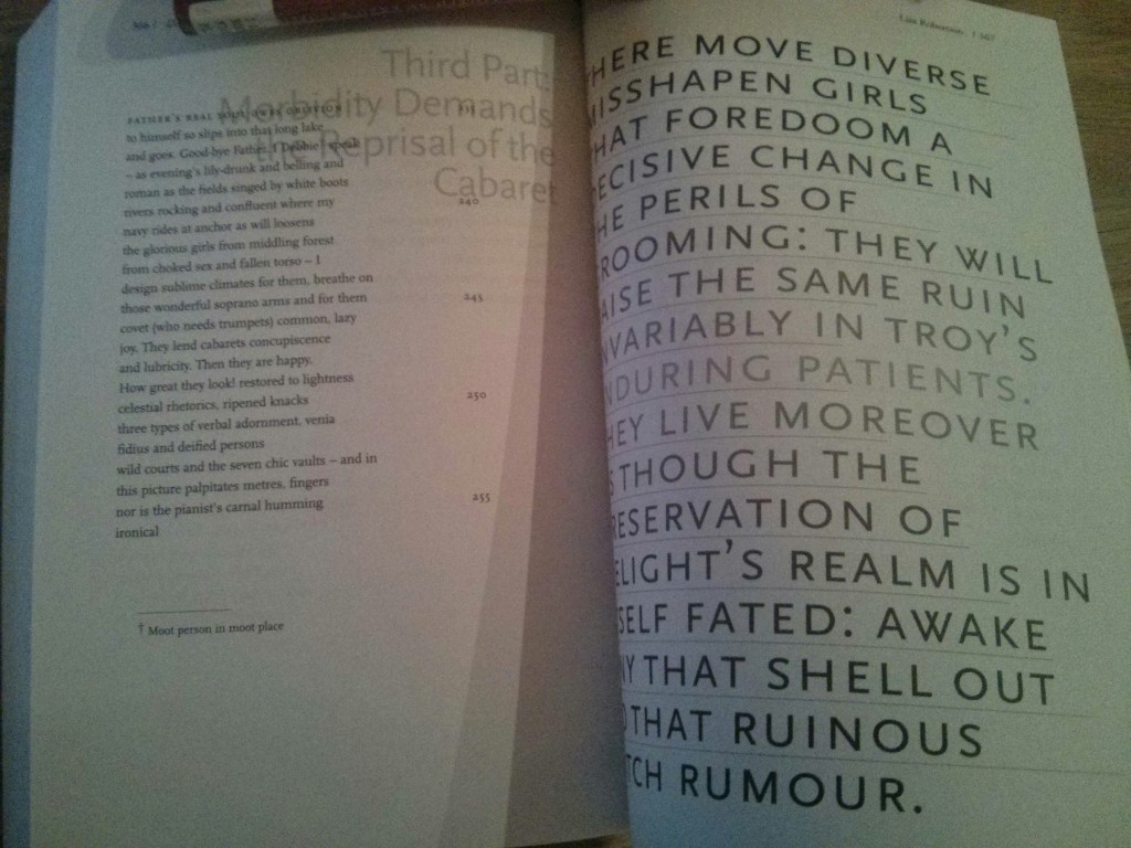
My terrible photo below (low light + bad phone) shows two pages of Canadian poet Lisa Robertson‘s long poem, “Debbie: An Epic.”

IMG_20160211_201329

To start, let’s just consider the left page. There are a couple of interesting features to consider if encoding this text.

Most obviously, there is the overlapping content in the top right corner. (This is repeated on other pages – but it is specific to this poem.) What exactly would you tag the non-traditional text? Where would it be sequenced in relation to the standard column of poetry? Before? After? What about the issue of legibility? As discussed in class, the detail of classification of the tags – as well as the amount of effort one might put into specifying a particular feature – might depend on the audience. Another key consideration would be how much time a scholar has to encode a text. If this were part of a well-funded project that expects the most detailed possible encoding work, than more specificity and consideration could be applied to this feature.

Other notable features are the line numbers (which are specific to the poem, not the anthology) and the dagger footnote. For the line numbers, how would you make it clear that these are an integral part of the poem rather than an editor’s addition? For the footnote, is the shape important? Indeed, these are the kind of questions that make applying TEI as tricky as the text at hand.

Bibliography:

Robertson, Lisa. “Debbie: An Epic.” In The New Long Poem Anthology, edited by Sharon Thesen, 347-371. Vancouver: Talonbooks, 2001.

Stressing TEI

There are a lot of online scholarly projects that feel like graveyards even when they first launch – at least that’s my experience. The usefulness of some of these sites seems limited, especially in terms their potential audience. But For Better for Verse is a relatively practical site for all students of poetry to practice scansion. (Maybe my enthusiasm stems from my own difficulties around scansion…) Users of the site can guess where stresses go in a poem – specific to the syllable – and have their guesses checked. As discussed in class, this site uses TEI as a way of tagging something that is not presentational: syllables.

TEI features this site on its “Projects” page, in which an overview of the project’s use of TEI is given:

“The several dozen poems in the site are marked up with TEI P5 coding, especially subsection 6 on Verse. We introduced slight modification of the marking of syllable divisions within a word but chiefly followed the TEI protocols.”

The actual website of For Better for Verse, however, does not contain any of this information (or even a link to the TEI page). The XML is not available to access.  The site was developed by the University of Virginia Department of English. Contact information is given, and so it is possible that the contacts may be able to share the source code with anyone interested in the site’s use of TEI.

Bibliography:

 “For Better for Verse.” Text Encoding Initiative. Accessed February 3, 2016. http://www.tei-c.org/Activities/Projects/fo02.xml.

Cardboard to Circuit Board

Board games are really popular right now (especially in Toronto). At first glance, this tactile, in-person social phenomenon seems to be a rebuke of all things digital, or at least a respite from them. Cardboard over circuit boards. Dice over devices.

But alongside board games are digital apps that recreate these games, ostensibly not changing anything about the game. The rules are the same. The artwork is often exactly the same.  It’s just on your iPad – well, kind of…

A photo of the physical version of the game. By Laszlo Molnar. Source: Board Game Geek (https://boardgamegeek.com/image/464308/small-world)

One of these games to make such a transition is designer Philippe Keyaerts’ Small World (Days of Wonder, 2009). And it’s a game I’ve played in its digital form. This is a game for 2-4 players . It plays like a streamlined Risk, players competing directly for territories. Here are some of the big differences between the physical and digital versions:

  • There is music in the digital version. This music, by my ears, seems to reinforce the lightheartedness of the game with a lulling, cheery soundtrack.
  • The game has quite a bit of math in it. But the digital version, as you’d expect, handles this digitally. On the one hand this ensures that the points keeping is more accurate. On the other hand, if this is being used as an educational activity for children, then the digital version’s automatic calculations would be a disadvantage compared to the physical version’s need for human brainpower.
  • But the most significant change between the two versions is that the digital version allows AI opponents that a single player can compete against. Unlike the physical version, which requires in-person social interaction between players, the digital version does not. It’s easy to see why that may change the experience of the game. If board games are synonymous with in-person social activities, is any digital port of a board game really a board game?

XXL Book

It may not sound very exciting, but I picked a book that was simply bigger than most other books.

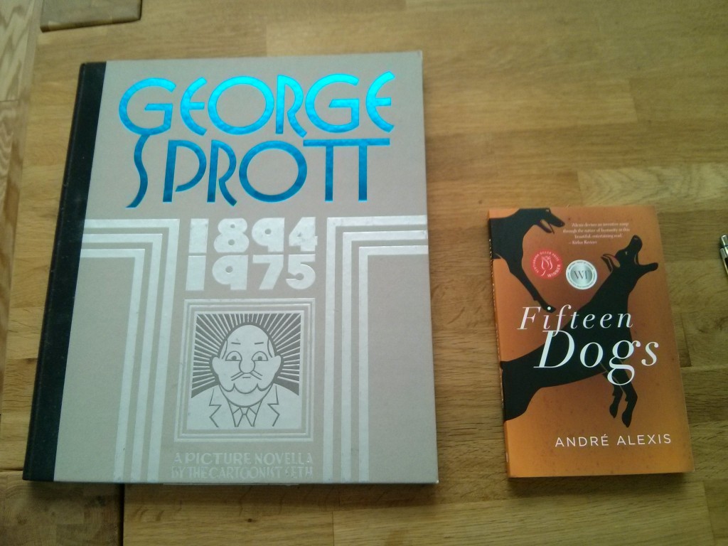
Actually, it’s quite a bit bigger. It’s Seth’s  graphic novel – or to use the author’s term, “a picture novella” – entitled George Sprott: (1894-1975)Check out the image below for a side-by-side match-up with a book of more common proportions.

Photo by author.
Photo by author.

Okay, so why is this interesting? I’ve jotted down my commentary into two sections: (1) practical issues and (2) the reading experience.

Practical Issues

  • The book is too big to fit on most shelves – either at home or in institutions. I happen to own the book, but it has been exiled to a closet rather than my bookshelves. At the library I volunteer for, this book would not be eligible for acquisition because it can’t fit on any of the shelves. So, despite its large size which at first seems to make it its own poster, the book is surprisingly unmarketable – either at home or at libraries and, I imagine, at bookstores.
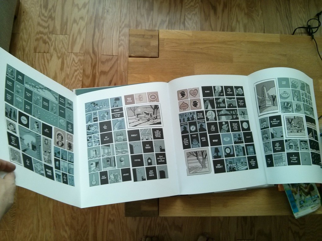
  • Reading this book simply requires a lot of space. A “subway read” this is not. It is decidedly not portable. This is especially the case with the pull-out pages shown in the image below.
  • Not unlike a large print version of a book, some of the pages are easier to read. Everything is blown up. Other pages, like the ones in the image below, can be packed with more content, including as many as seven rows of panels.
IMG_20160122_151541
Photo by author.

The Reading Experience

  • One part of me feels like a child when reading a book that shares dimensions that you might associate with Clifford The Big Red Dog. Because Seth’s book, geared at adults, shares the form of some children’s books, it kind of feels like one. (This is enhanced by the board book-esque cover.)
  • Another part of me feels like a veritable grown-up when reading this book. That’s because the large format reminded me of an coffee table art book. The sheer size of the pages made me more conscious of the visuals and physicality of the book. Personally, this made me less immersed in the story because the the unusual format was distracting. Of course, that could be the point.
  • Until companies release some kind of ereader projector, any “big book experience” would be hard to recreate on an ereader’s relatively limited range of physical dimensions. (Maybe the new, large screen iPad Pro would be a close approximation.)

Bibliography

Seth. George Sprott: (1894-1975). New York: Drawn & Quarterly, 2009