Week 2

When I first read the blog question for this week, I could’t think of a book to discuss. After reading some of your earlier posts, a few childhood pop-up books and the like came to mind, but nothing in my memory really stuck out. However, when I went back to my notes on the Kirschenbaum and Werner reading, a light bulb turned on and I almost yelled “Eureka!”. Werner discusses annotations made by authors and readers, and the influence such annotations have on the content of the book. Werner also touches on  Annotated Books Online, the digital archive of early modern annotated books.

It was Werner’s discussion of annotation that brought to mind the Northrop Frye collection found at the E.J. Pratt Library at UofT. The collection includes material that was annotated by the literary scholar, among other items. It is interesting to note that is it not the books that give the collection its rarity but the annotations within these books that give them their true value. Frye’s personal thoughts are hand written between the margins of these books, giving them an additional dimension and influence, if not change, the meaning presented by the original author of the books.

This collection also came to mind because the annotations within the books pose a challenge for some forms of digital reading. I work for the Accessible Content E-Portal, as service offered by OCUL that provides digitized scans of materials for students with accessibility needs, offering these books in a variety of accessible formats. When selecting materials to scan for this service, I look for books with no marginalia. In cases where there has been marginalia made with a pencil, I am required to remove this marginalia so that it does not interfere with the OCR’s ability to translate the content of the PDF into a text format. However, removing these annotations is upsetting to some users who want to have the same experience as other readers, including the flow of thoughts of pervious readers. The additional dimension added with annotations is unobtainable for these users, and they cannot experience the affect they have on the original material.

If you would like more information about the Northrop Frye collection, please visit this website.

If you are interested in the ACE project, there is more information found here.


XXL Book

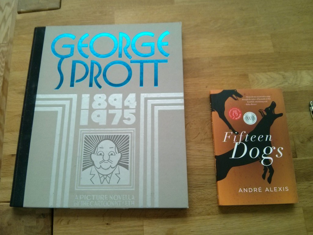
It may not sound very exciting, but I picked a book that was simply bigger than most other books.

Actually, it’s quite a bit bigger. It’s Seth’s  graphic novel – or to use the author’s term, “a picture novella” – entitled George Sprott: (1894-1975)Check out the image below for a side-by-side match-up with a book of more common proportions.

Photo by author.
Photo by author.

Okay, so why is this interesting? I’ve jotted down my commentary into two sections: (1) practical issues and (2) the reading experience.

Practical Issues

  • The book is too big to fit on most shelves – either at home or in institutions. I happen to own the book, but it has been exiled to a closet rather than my bookshelves. At the library I volunteer for, this book would not be eligible for acquisition because it can’t fit on any of the shelves. So, despite its large size which at first seems to make it its own poster, the book is surprisingly unmarketable – either at home or at libraries and, I imagine, at bookstores.
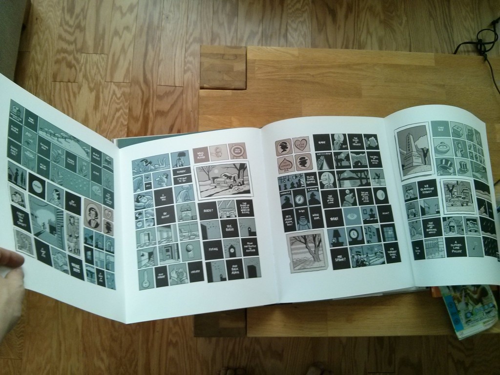
  • Reading this book simply requires a lot of space. A “subway read” this is not. It is decidedly not portable. This is especially the case with the pull-out pages shown in the image below.
  • Not unlike a large print version of a book, some of the pages are easier to read. Everything is blown up. Other pages, like the ones in the image below, can be packed with more content, including as many as seven rows of panels.
IMG_20160122_151541
Photo by author.

The Reading Experience

  • One part of me feels like a child when reading a book that shares dimensions that you might associate with Clifford The Big Red Dog. Because Seth’s book, geared at adults, shares the form of some children’s books, it kind of feels like one. (This is enhanced by the board book-esque cover.)
  • Another part of me feels like a veritable grown-up when reading this book. That’s because the large format reminded me of an coffee table art book. The sheer size of the pages made me more conscious of the visuals and physicality of the book. Personally, this made me less immersed in the story because the the unusual format was distracting. Of course, that could be the point.
  • Until companies release some kind of ereader projector, any “big book experience” would be hard to recreate on an ereader’s relatively limited range of physical dimensions. (Maybe the new, large screen iPad Pro would be a close approximation.)

Bibliography

Seth. George Sprott: (1894-1975). New York: Drawn & Quarterly, 2009

Week 2: Form Effects Meaning

I recently read The Secret Journal of Beatrice Hassi Barahal by Kate Elliott, a chapbook companion to Elliott’s Spiritwalker Trilogy, with which I am completely in love. The trilogy focuses on the adventures of two cousins, Catherine (Cat) and Beatrice (Bee). The story is told from Cat’s point of view, so the Secret Journal retells the story from Bee’s perspective using the medium of her sketchbook.

The book is visually beautiful, with 29 black-and-white illustrations by the award-winning fantasy artist Julie Dillon. The pictures and text overlap physically, giving the impression that the book is being written and drawn at the same time. But, the best part is the accompanying discussion between the two cousins written on and around the main text. As you read the Journal, it becomes clear that it is being written, drawn, edited, rewritten, and discussed at the same time. This is facilitated by the use of three different fonts: one for the main text, one for Cat’s notes, and one for Bee’s responses to her. The result is an immersive experience in the world of the books that is also a character study of the two protagonists.

Bee’s sketchbook is an integral part of her character, and it only makes sense for her story to be written within its pages. But the marginalia adds an authenticity to the reading experience. One important use of Bee’s sketchbook is as a facilitator of conversation between her and her cousin in which they write notes back and forth. By including this detail, the chapbook functions as both an addition to the overall story and an artifact from within the story.

Kate Elliott talks about the process behind making the Secret Journal: http://thebooksmugglers.com/2013/10/the-secret-journal-of-beatrice-hassi-barahal-kate-elliott-on-fan-art-giveaway.html

The Journal can be found here in PDF: http://www.kateelliott.com/index.php?pageID=53

Week 2: Form & Function – Pocket Books

In my stocking this year I got a copy of The Pocket Pema Chodron, which is approximately 3 x 4 inches in size. Published by Shambhala, it is part of their Pocket Classics series and contains “108 short selections from the best-selling books of Pema Chodron, the beloved Buddhist nun.” The compact size of the book is its distinguishing feature, and affects the book’s meaning principally by limiting its content.

As spiritual readings can tend to be quite dense, and consequently inaccessible, the layout of the book is geared towards providing quick snapshots of Pema’s teachings to facilitate consumption. In thinking about the book as an object, we can see how readers would use this differently than they might use, say, a coffee table book or a hardcover volume in a comfy reading chair. While these larger books are used in a more stationary setting and when the reader has a good chunk of time, pocket books are much more portable and can be read during the in-between moments of their day.

In Darnton’s article, he poses three questions for book historians:

  • How do books come into being?
  • How do they reach readers?
  • What do readers make of them? (Darnton 2007, p. 495)

He also briefly touches on the history of distribution and sales (Darnton 2007, p. 499), which got me thinking about how this book came into being. While I believe that this book format has the potential to be useful to readers, I wonder to what extent it is a marketing tool for publishers to make a quick buck. Just as manufacturers change their packaging to sell more units, the new condensed format of the pocket book may be a mere gimmick to appeal to readers who are too busy to sit down and read a full format book. By simplifying content and reducing volume, how much meaning is lost? In an age where Buzzfeed and other click-bait articles which barely skim the surface are becoming more and more standard, what values are being fostered? Is it worth sacrificing depth of meaning for breadth of use? Perhaps… Perhaps not.

Bibliography

Chodron, Pema. The Pocket Pema Chodron, Edited by Eden Steinberg. Boston: Shambhala Publications, Inc., 2008.

Darnton, Robert. “”What is the History of Books?” Revisited.” Modern Intellectual History 4, no. 3 (2007): 495-508.

Griffin & Sabine

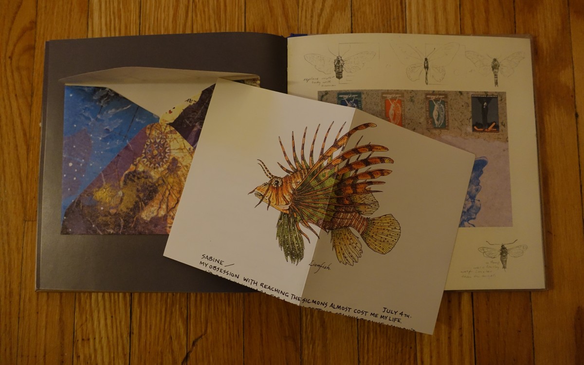
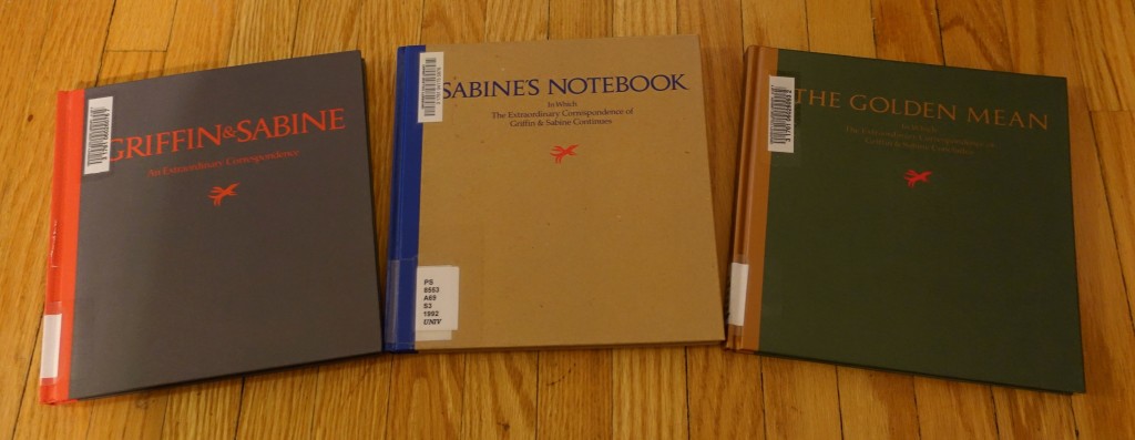
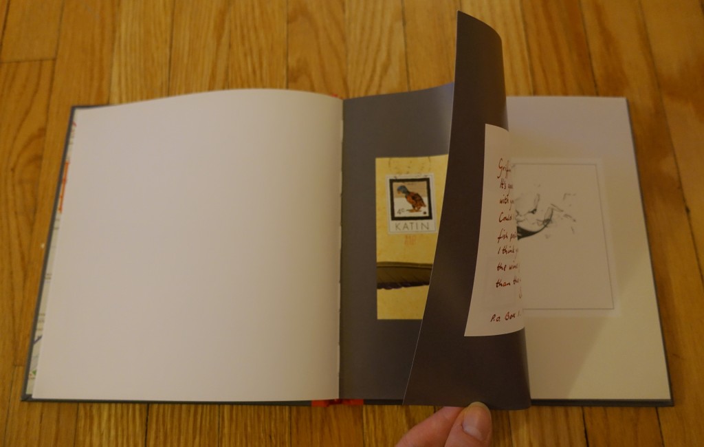
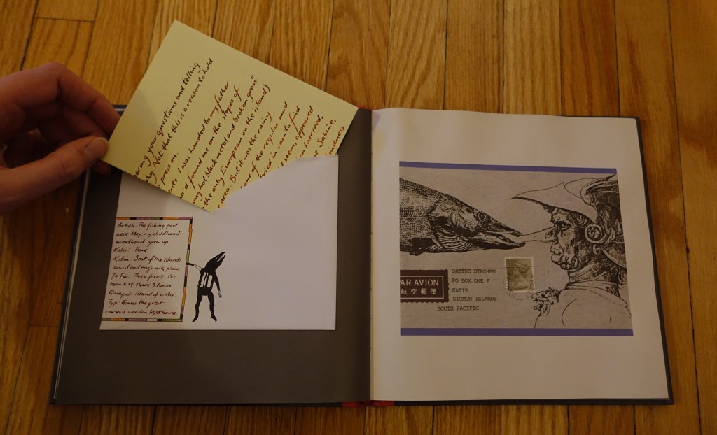
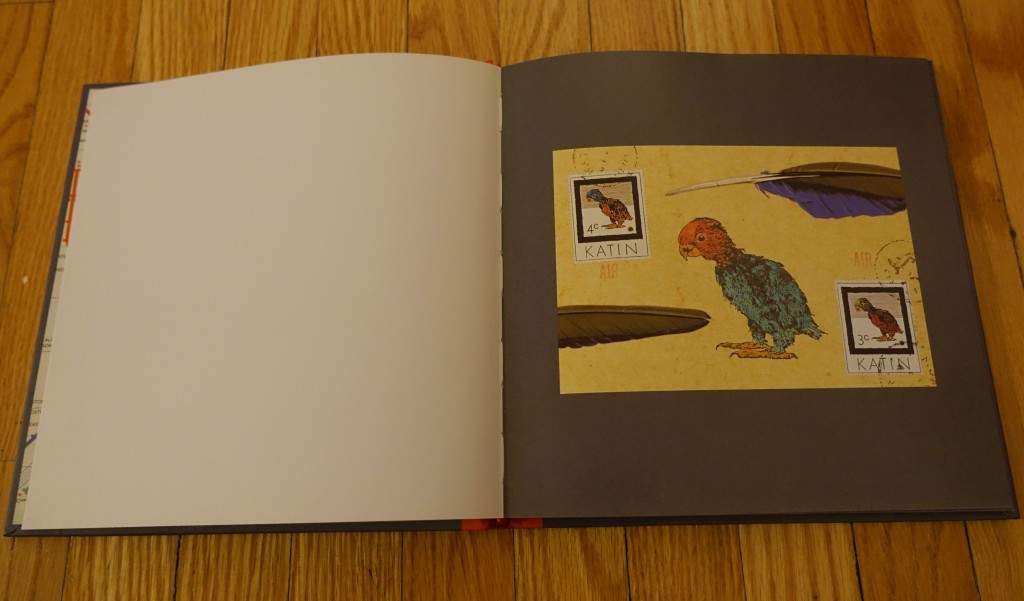
Griffin & SabineI recently came across Griffin & Sabine: An Extraordinary Correspondence by Nick Bantock. The book is the first part of an epistolary trilogy, which was later followed by a second trilogy, Morning Star. All of the books follow the correspondence of two artists, Griffin and Sabine, as they discover their peculiar connection. The books are filled with Bantock’s art, both on the postcards and the envelopes.
DSC02391

DSC02392

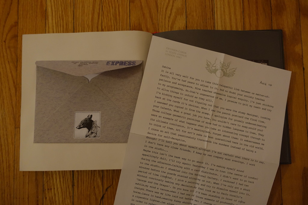
The series is impressive in the artwork and storytelling, but the interactive form is largely what allows for the art and story to come together. The two images below show a letter from Sabine to Griffin and a letter from Griffin to Sabine, respectively. Bantock uses the style of the paper and the implied production of the text (handwriting versus typewriting) to not only differentiate between the characters, but to show the differences in their characters. Sabine is a whimsical stamp artist living on the Simcon Islands, a fictional group of islands in the South Pacific. Griffin is a jaded graphic artists stuck in his uninspired London studio. There is a larger issue of the representation of the “exotic East” in this series but that might be for another time.

DSC02394 DSC02397 The benefit of the form is that Bantock can keep the correspondence free from obvious authorial intervention and really allow for the two characters to speak with their own voice. Unlike a typical epistolary novel, which is usually structured like a regular novel (maybe with various fonts to represent characters), this form allowed Bantock to show much of the characterization through the way the characters styled their letters.
Although the format allows for a more complex narrative than a traditional epistolary novel (no spoilers), it is still a relatively familiar form. What is fascinating about this series is that it will once gain be renewed, but this time digitally by the Bound Press (a wonderfully named digital content and VR developer, but that name is a whole other analysis).

Last year, Bound Press launched a Kickstarter campaign for Griffin & Sabine: The Interactive Trilogy, which was unfortunately unsuccessful. I would encourage you to take a look at the video on this page to get a sense of their proposed adaptation. Bound is still looking to do this adaptation as an app for iOS and Android: Griffin & Sabine App

Taking it a step further, they developed an Oculus-optimized Virtual Reality version of Griffin’s Studio. In some ways, these moves are logical since they are really just taking the immersive quality of Bantack’s books a step further. I’m interested to see how the App will be developed and how (or if) it will change the experience of this story. Will it lose its unique epistolary feel once you have to merely click on the letters to open them? Will that even matter if the digital form can add further insight into the characters?


Bantock, Nick. Griffin & Sabine: An Extraordinary Correspondence. San Francisco: Chronicle Books, 1991.

Find it at: UTL or TPL

This book also inspired a parody, Sheldon and Mrs. Levine: An Excruciating Correspondence, which is sadly not available at the libraries.


Form, Function, and Digitization of Books

I am an avid lover of ancient history. My weekends as a child were spent cloistered in my aunt’s library reading mythology. I enjoyed books like The Iliad, The Odyssey, and comic book short stories from the Bhagavad Gita. As cheesy as it sounds, my love of history turned into a passion when I saw the movie Stargate. I was hooked on history like never before; I read encyclopedias to learn more about Ancient Egypt and went so far as to attempt to learn hieroglyphics. A few years ago, while working at Indigo Books, I came across a coffee table book on King Tut, The Treasures of Tutankhamun.

Cover of Treasures of Tutankhamun
The Treasures of Tutankhamun – © Jaromir Malek

Continue reading “Form, Function, and Digitization of Books”

form, function, and affairs of the heart

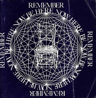
Beherenowcvr.jpg

Ram Dass. (1971). Be here now. New Mexico: Hanuman Foundation.

I find this question tricky to answer… I am a self-professed lover of printed books (the whole look, feel, smell – sensory interaction thing). I find it nearly impossible to read texts through a screen (whether computer or e-reader). This bias is hard to avoid when it comes to evaluating the relationship between a text’s form and its meaning. I have a large home library – for me, printed, physical, very ‘present’, non-virtual books, they carry weight. They take up space, they have an emotional significance, and they are invested with meaning and memory. Almost no book more so than my copy of Ram Dass’ Be Here Now. Heavily used, well-loved, traveled, annotated, dog-eared, and bookmarked – it stands as a testament to my own personal and spiritual development over many years. When I see its iconic blue cover, I can remember glancing at it for the first time in Seekers Books on Bloor. The shredded bits of paper ephemera mark pages that have had particular resonance for me, some of which I have photocopied and pasted onto walls of houses past.

The middle section of the book, the thickest and most substantial, is recognizable by its illustrations printed on brown craft paper. The pages themselves are tactile – they have texture, roughness, weight. They flip and unfold. The pages of my copy have warped with moisture over time, giving them additional dimension. To read this section, the book must be turned vertically, and read like a scroll – with text and image blending seamlessly across both pages. Reading this book is an immersive experience.

Amazon tells me that you can purchase Be Here Now in e-book form, as an ‘enhanced edition’, including guided video meditations, a video retrospective of Ram Dass’ journey, as well as a copy of the first chapter of his latest book, Be Love Now.

I guess the issue here is this – I can’t imagine the physical form of this book being easily replicated in digital form, considering what would be ‘lost’. Perhaps this comes back to the issue, as Johanna Drucker puts it, to do with e-book design itself: “rather than thinking about simulating the way a book looks, then, designers might do well to consider extending the way a book works” (2009, 166). So, how would Be Here Now work digitally? Or, to put it differently, since it clearly already exists in digital form – how would it work for me? My web browsing has led me to a website where someone has scanned and uploaded each individual page of the book, and so, rather than flip through successive pairs of pages, the reader can simply scroll continuously (see: http://beherenow.dc7.us/corebook00.htm#THE HEART CAVE) – how does this affect/effect a different meaning?

I was fascinated to read Matthew Kirschenbaum and Sarah Werner describe the symbiotic potential between digital and physical forms of book production: “digital media cohabitate with the codex, not just in close physical proximity…but occupying conceptually coterminous textual and narrative space” (2014, 443). They note, too, that computers are “responsible for key aspects of what we might think of as a widespread renaissance in the appreciation of the book as material object” (2014, 445-446).

Similarly, Drucker suggests that “by looking to scholarly work for specific understanding of attitudes toward the book as literal space and virtual espace, and to artists and poets for evidence of the way the spaces of a book work, we realize that the traditional codex is also, in an important and suggestive way, already virtual” (2009, 174). Claims such as this help disrupt and broaden my understanding of the terms ‘physical’, ‘literal’, ‘virtual’, or ‘digital’, and what constitutes a ‘book’ or ‘bookishness’.

While I can’t imagine my experience with this text as distinct from the physical form that holds and delivers it, I can begin to think in new ways about how exactly Be Here Now communicates meaning, and how – while my own experience of it is deeply personal – through reading it in different systems and platforms, new readers might encounter a completely different effected/affected meaning – and I concede, that’s kinda neat.

On meaning, form & function

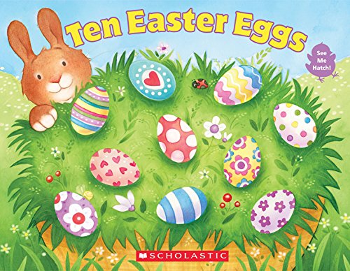
Bodach, V. & Logan, L. (2015). Ten Easter eggs. Scholastic: New York.

I left last Monday’s class thinking about the relationship between bibliographic form and meaning. What print books would be impossible to translate in a digital form without losing meaning integral to the text? An answer to this question was literally handed to me the next evening by a young girl during my shift at the Cobourg Public Library. She presented me with one of the library’s board books, Ten Easter Eggs, concerned it had been broken. For those unfamiliar with children’s library collections, a board book refers to a book designed for infants and toddlers with stiff, cardboard pages. In our readings this week Kirschenbaum and Werner write (2014) “… most digitizations focus on the value of the object as a text to be read” (p.419), board books are objects with value extending beyond their printed text. As a result, digitization of board books is difficult to achieve without losing meaning essential to the object.

Board books are designed not only to be read. Manufactured with durable materials, they allow for use specific to the developmental stage of infants: the reader may put the book in their mouth, or grab it by one page and wave it around. Ten Easter Eggs is an interesting board books as its pedagogical function extends beyond the lessons of the text (such as counting to ten, and simple addition and subtraction) to sensorial learning.

The book contains ten three-dimensional eggs. For example, page one contains one 3D egg and nine egg shaped cut-out holes, which reveal the other nine eggs contained in the book. As the page is flipped, a fuzzy chick made with felt is revealed below the egg. Page three now contains nine eggs and one felt chick. The verso pages contain egg-shaped holes. This process continues until ten felt chicks are revealed. This design allows the reader to explore the book with their hands, feeling the holes, the felt chicks and the smooth 3D eggs. This sensory experience could not be replicated in a digitized version of the text. Furthermore, eBook platforms such as eReaders or tablets are not designed for children to put them in their mouths or throw them around. As a result, the child’s relationship to the object would be shaped by greater caution in a digital format (enforced, most likely, by adults) and as a result, would look quite different.

I mentioned earlier this book was handed to me by a young library patron. She was concerned because several of the 3D eggs had been “punched-in” by previous readers, rendering their shape less than egg-like. Rather than understanding the book as damaged, this can be read as a productive interaction between the reader and the text-object. Through using the book in a way it was not designed to be used (applying great pressure to the eggs) the child reader has the ability to change the shape of the egg, creating a very different sensory experience for future readers. In this way the text effects meaning unintended by its designers.

A late greeting

Hello everyone!

My name is Aneta Kwak, I am a second year LIS and KMIM student with one last semester to go! I completed my undergraduate studies here at UofT in History and Polish Studies.

I am interested in pursuing a career in academic librarianship and felt that this course will bring to light current trends and issues in the digital humanities. I also heard many great things about Professor Galey and his teaching, so this class was the perfect fit.

As for my personal interests, I am an avid skier and angler, so my weekends are booked all year round. I also have an adorable chihuahua named Rambo (yes, he is as tough and fierce as his name suggests).

I look forward to our discussions, and for those who are graduating this June, we’re almost there!!

Rambo